Skip to content · ⁨ข้ามไปยังเนื้อหา⁩

Exploring One-Variable Data · ⁨การสำรวจข้อมูลตัวแปรเดียว⁩

AP Statistics · Topic 1 · ⁨หัวข้อ 1⁩

Video lesson for this topic · ⁨บทเรียนวิดีโอสำหรับหัวข้อนี้⁩ Open the video page · ⁨เปิดหน้าวิดีโอ⁩
9:03

การสำรวจข้อมูลตัวแปรเดียว

วัดสิ่งเดียวกันสองสิบครั้ง แล้วคุณจะไม่ได้รับคำตอบที่เหมือนกันสองสิบครั้ง นักเรียนสองสิบคนวัดโต๊ะตัวเดียวกัน ค่าที่ได้มีความแตกต่างกัน นั่นไม่ใช่…

English narration · English + 中文 subtitles burned in · ⁨การบรรยายภาษาอังกฤษ · คำบรรยายภาษาอังกฤษ + 中文 ลอยตัวบนภาพ⁩

1.1

Introducing Statistics: What Can We Learn from Data? · ⁨แนะนำสถิติ: เราเรียนรู้จากข้อมูลได้อย่างไร?⁩

Syllabus · ⁨หลักสูตร⁩
English

Enduring Understanding (VAR-1): Given that variation may be random or not, conclusions are uncertain.

Learning Objective VAR-1.A: Identify questions to be answered, based on variation in one-variable data. [Skill 1.A]

  • VAR-1.A.1 Numbers may convey meaningful information, when placed in context.
ไทย

ความเข้าใจที่ยั่งยืน (VAR-1): เนื่องจากความแปรปรวนอาจเป็นแบบสุ่มหรือไม่ ดังนั้นข้อสรุปจึงมีความไม่แน่นอน

จุดประสงค์การเรียนรู้ VAR-1.A: ระบุคำถามที่ต้องการตอบ โดยอ้างอิงจากความแปรปรวนในข้อมูลหนึ่งตัวแปร [ทักษะ 1.A]

  • VAR-1.A.1 ตัวเลขอาจส่งผ่านข้อมูลที่มีความหมาย เมื่อถูก đặtอยู่ในบริบท
Source: College Board AP Course and Exam Description · ⁨แหล่งที่มา: คำอธิบายหลักสูตรและข้อสอบ College Board AP⁩

English

Statistics 统计学 is the science of learning from data 数据 – numbers or labels collected from the real world. Data vary, so we describe patterns and account for the variation 变异 rather than expecting every value to match. A statistical question anticipates an answer based on data that vary.

Two distinctions run through the whole course. A parameter 参数 is a numerical summary of a whole population; a statistic 统计量 is a numerical summary of a sample - we use the statistic to estimate the parameter we cannot measure directly. And descriptive statistics 描述统计 only summarise the data set in hand, while inferential statistics 推断统计 use a sample to make and test claims about the larger population.

ไทย

สถิติ คือวิทยาศาสตร์แห่งการเรียนรู้จาก ข้อมูล – ตัวเลขหรือฉลากที่เก็บมาจากโลกจริง ข้อมูลมีความแปรปรวน ดังนั้นเราจึงอธิบายรูปแบบและคำนึงถึง ความแปรปรวน แทนที่จะคาดหวังให้ทุกค่าตรงกัน คำถามทางสถิติคาดการณ์คำตอบโดยอิงจากข้อมูลที่มีการเปลี่ยนแปลง

มีความแตกต่างสองประการ贯穿整个课程。 Parameter คือสรุปตัวเลขของ ประชากร ทั้งหมด; Statistic คือสรุปตัวเลขของ ตัวอย่าง – เราใช้ statistic เพื่อประมาณ parameter ที่เราไม่สามารถวัดโดยตรงได้ และ descriptive statistics สรุปเฉพาะชุดข้อมูลที่มีอยู่เท่านั้น ในขณะที่ inferential statistics ใช้ตัวอย่างเพื่อสร้างและทดสอบ claims เกี่ยวกับประชากรขนาดใหญ่กว่า

Vocabulary · ⁨คำศัพท์⁩ Train · ⁨ฝึกฝน⁩
English ไทย
Statistics/stəˈtɪstɪks/ สถิติ
data/ˈdeɪtə/ ข้อมูล (data)
variation/ˌveərɪˈeɪʃn/ ความหลากหลาย (Variation)
parameter/pəˈræmɪtə/ พารามิเตอร์
statistic/stəˈtɪstɪk/ ค่าสถิติ
descriptive statistics/dɪˈskrɪptɪv stəˈtɪstɪks/ สถิติเชิงพรรณนา
inferential statistics/ɪnfəˈrenʃl stəˈtɪstɪks/ สถิติเชิงอนุมาน
variable/ˈveərɪəbl/ ตัวแปร
1.2

The Language of Variation: Variables · ⁨ภาษาของความแปรปรวน: ตัวแปร⁩

Syllabus · ⁨หลักสูตร⁩
English

Enduring Understanding (VAR-1): Given that variation may be random or not, conclusions are uncertain.

Learning Objective VAR-1.B: Identify variables in a set of data. [Skill 2.A]

  • VAR-1.B.1 A variable is a characteristic that changes from one individual to another.

Learning Objective VAR-1.C: Classify types of variables. [Skill 2.A]

  • VAR-1.C.1 A categorical variable takes on values that are category names or group labels.
  • VAR-1.C.2 A quantitative variable is one that takes on numerical values for a measured or counted quantity.
    • Illustrative examples for VAR-1.C:
      • Categorical variables:
        • Dominant hand
        • Age group (young or old)
        • Highest degree earned
      • Quantitative variables:
        • Age of a structure
        • Height of a child
        • Concentration of a sample
ไทย

ความเข้าใจที่ยั่งยืน (VAR-1): เนื่องจากความแปรปรวนอาจเป็นแบบสุ่มหรือไม่ ดังนั้นข้อสรุปจึงมีความไม่แน่นอน

จุดประสงค์การเรียนรู้ VAR-1.B: ระบุตัวแปรในชุดข้อมูล [ทักษะ 2.A]

  • VAR-1.B.1 ตัวแปรคือลักษณะที่เปลี่ยนแปลงจากบุคคลหนึ่งไปยังอีกบุคคลหนึ่ง

จุดประสงค์การเรียนรู้ VAR-1.C: จำแนกประเภทของตัวแปร [ทักษะ 2.A]

  • VAR-1.C.1 ตัวแปรเชิงหมวดหมู่รับค่าที่เป็นชื่อหมวดหมู่หรือฉลากกลุ่ม
  • VAR-1.C.2 ตัวแปรเชิงปริมาณคือตัวแปรที่รับค่าตัวเลขสำหรับปริมาณที่วัดหรือนับ
    • ตัวอย่างประกอบสำหรับ VAR-1.C:
      • ตัวแปรเชิงหมวดหมู่:
        • มือที่ถนัด
        • กลุ่มอายุ (เด็กหรือผู้สูงอายุ)
        • ระดับการศึกษาสูงสุดที่ได้รับ
      • ตัวแปรเชิงปริมาณ:
        • อายุของโครงสร้าง
        • ส่วนสูงของเด็ก
        • ความเข้มข้นของตัวอย่าง

Source: College Board AP Course and Exam Description · ⁨แหล่งที่มา: คำอธิบายหลักสูตรและข้อสอบ College Board AP⁩

English

A variable 变量 is a characteristic that can differ between individuals. Two kinds:

  • Categorical 分类 (qualitative): values are labels/groups (eye colour, brand).
  • Quantitative 定量: values are numbers you can do arithmetic on (height, age). Quantitative variables are discrete (countable) or continuous (measured).

Choosing the right graph and summary depends on which kind you have.

ไทย

ตัวแปร คือคุณลักษณะที่แตกต่างกันระหว่างบุคคลได้ มีสองประเภท:

  • Categorical (qualitative): ค่าคือฉลาก/กลุ่ม (สีตา, แบรนด์)
  • Quantitative: ค่าคือตัวเลขที่สามารถคำนวณทางคณิตศาสตร์ได้ (ส่วนสูง, อายุ) ตัวแปร quantitative เป็น discrete (นับได้) หรือ continuous (วัดได้)

การเลือกกราฟและสรุปที่เหมาะสมขึ้นอยู่กับว่าคุณมีประเภทใด

Explore · ⁨สำรวจ⁩

Categorical or quantitative? · ⁨Categorical หรือ quantitative?⁩

Every variable is either categorical (it labels each unit with a group) or quantitative (a measured number you can average). Which kind it is decides the graphs and summaries you are allowed to use. · ⁨ตัวแปรทุกตัวเป็นeither ประเภท (ซึ่งระบุกลุ่มให้กับหน่วย) หรือ ปริมาณ (ตัวเลขที่วัดได้ที่คุณสามารถหาค่าเฉลี่ยได้) ประเภทไหนจะเป็นตัวกำหนดกราฟและสรุปผลที่คุณสามารถใช้ได้⁩

Vocabulary · ⁨คำศัพท์⁩ Train · ⁨ฝึกฝน⁩
English ไทย
Categorical/ˌkætɪˈɡɒrɪkl/ ประเภท
Quantitative/ˈkwɒntɪteɪtɪv/ ปริมาณ
1.3

Representing a Categorical Variable with Tables · ⁨แสดงตัวแปร categorical ด้วยตาราง⁩

Syllabus · ⁨หลักสูตร⁩
English

Enduring Understanding (UNC-1): Graphical representations and statistics allow us to identify and represent key features of data.

Learning Objective UNC-1.A: Represent categorical data using frequency or relative frequency tables. [Skill 2.B]

  • UNC-1.A.1 A frequency table gives the number of cases falling into each category. A relative frequency table gives the proportion of cases falling into each category.

Learning Objective UNC-1.B: Describe categorical data represented in frequency or relative tables. [Skill 2.A]

  • UNC-1.B.1 Percentages, relative frequencies, and rates all provide the same information as proportions.
  • UNC-1.B.2 Counts and relative frequencies of categorical data reveal information that can be used to justify claims about the data in context.
ไทย

ความเข้าใจที่ยั่งยืน (UNC-1): กราฟและสถิติช่วยให้เราระบุและแสดงคุณลักษณะสำคัญของข้อมูลได้

วัตถุประสงค์การเรียนรู้ UNC-1.A: แสดงข้อมูลเชิงหมวดหมู่โดยใช้ตารางความถี่หรือความถี่สัมพัทธ์ [ทักษะ 2.B]

  • UNC-1.A.1 ตารางความถี่แสดงจำนวนกรณีในแต่ละหมวดหมู่ ตารางความถี่สัมพัทธ์แสดงสัดส่วนของกรณีในแต่ละหมวดหมู่

วัตถุประสงค์การเรียนรู้ UNC-1.B: อธิบายข้อมูลเชิงหมวดหมู่ที่แสดงในตารางความถี่หรือตารางความถี่สัมพัทธ์ [ทักษะ 2.A]

  • UNC-1.B.1 เปอร์เซ็นต์ ความถี่สัมพัทธ์ และอัตรา ล้วนให้ข้อมูลที่เหมือนกันกับสัดส่วน
  • UNC-1.B.2 จำนวนและความถี่สัมพัทธ์ของข้อมูลเชิงหมวดหมู่เปิดเผยข้อมูลที่สามารถใช้เพื่อสนับสนุนข้ออ้างเกี่ยวกับข้อมูลในบริบทนั้นๆ

Source: College Board AP Course and Exam Description · ⁨แหล่งที่มา: คำอธิบายหลักสูตรและข้อสอบ College Board AP⁩

English

A frequency table 频数表 lists each category's count (frequency); a relative frequency 相对频率 table lists each category's proportion 比例 (count ÷ total). Relative frequencies let you compare groups of different sizes fairly.

ไทย

Frequency table列出每个类别的 count (frequency); Relative frequency table列出每个类别的 proportion (count ÷ total). Relative frequencies ช่วยให้คุณเปรียบเทียบกลุ่มที่มีขนาดต่างกันได้อย่างยุติธรรม

Vocabulary · ⁨คำศัพท์⁩ Train · ⁨ฝึกฝน⁩
English ไทย
frequency table/ˈfriːkwənsi ˈteɪbl/ ตารางความถี่ (frequency table)
relative frequency/ˈrelətɪv ˈfriːkwənsi/ ความถี่สัมพัทธ์
proportion/prəˈpɔːʃn/ proportion
1.4

Representing a Categorical Variable with Graphs · ⁨แสดงตัวแปร categorical ด้วยกราฟ⁩

Syllabus · ⁨หลักสูตร⁩
English

Enduring Understanding (UNC-1): Graphical representations and statistics allow us to identify and represent key features of data.

Learning Objective UNC-1.C: Represent categorical data graphically. [Skill 2.B]

  • UNC-1.C.1 Bar charts (or bar graphs) are used to display frequencies (counts) or relative frequencies (proportions) for categorical data.
  • UNC-1.C.2 The height or length of each bar in a bar graph corresponds to either the number or proportion of observations falling within each category.
  • UNC-1.C.3 There are many additional ways to represent frequencies (counts) or relative frequencies (proportions) for categorical data.

Learning Objective UNC-1.D: Describe categorical data represented graphically. [Skill 2.A]

  • UNC-1.D.1 Graphical representations of a categorical variable reveal information that can be used to justify claims about the data in context.

Learning Objective UNC-1.E: Compare multiple sets of categorical data. [Skill 2.D]

  • UNC-1.E.1 Frequency tables, bar graphs, or other representations can be used to compare two or more data sets in terms of the same categorical variable.
ไทย

ความเข้าใจที่ยั่งยืน (UNC-1): กราฟและสถิติช่วยให้เราระบุและแสดงคุณลักษณะสำคัญของข้อมูลได้

วัตถุประสงค์การเรียนรู้ UNC-1.C: แสดงข้อมูลเชิงหมวดหมู่ด้วยกราฟ [ทักษะ 2.B]

  • UNC-1.C.1 แผนภูมิแท่ง (หรือกราฟแท่ง) ใช้แสดงความถี่ (จำนวน) หรือความถี่สัมพัทธ์ (สัดส่วน) สำหรับข้อมูลเชิงหมวดหมู่
  • UNC-1.C.2 ความสูงหรือความยาวของแต่ละแท่งในแผนภูมิแท่งสอดคล้องกับจำนวนหรือสัดส่วนของการสังเกตที่ตกอยู่ในแต่ละหมวดหมู่
  • UNC-1.C.3 ยังมีวิธีการเพิ่มเติมอีกมากมายในการแสดงความถี่ (จำนวน) หรือความถี่สัมพัทธ์ (สัดส่วน) สำหรับข้อมูลเชิงหมวดหมู่

วัตถุประสงค์การเรียนรู้ UNC-1.D: อธิบายข้อมูลเชิงหมวดหมู่ที่แสดงด้วยกราฟ [ทักษะ 2.A]

  • UNC-1.D.1 การแสดงผลด้วยกราฟของตัวแปรเชิงหมวดหมู่เปิดเผยข้อมูลที่สามารถใช้เพื่อสนับสนุนข้ออ้างเกี่ยวกับข้อมูลในบริบทนั้นๆ

วัตถุประสงค์การเรียนรู้ UNC-1.E: เปรียบเทียบชุดข้อมูลเชิงหมวดหมู่หลายชุด [ทักษะ 2.D]

  • UNC-1.E.1 ตารางความถี่ แผนภูมิแท่ง หรือการแสดงผลอื่นๆ สามารถใช้เพื่อเปรียบเทียบชุดข้อมูลสองชุดขึ้นไปใน terms ของตัวแปรเชิงหมวดหมู่เดียวกัน

Source: College Board AP Course and Exam Description · ⁨แหล่งที่มา: คำอธิบายหลักสูตรและข้อสอบ College Board AP⁩

English

Bar charts 条形图 show the count or proportion of each category as separated bars; a pie chart shows each category's share of the whole. The bar heights (or slices) let you compare categories at a glance. Bars may be ordered by size or by a natural category order.

ไทย

Bar charts แสดง count หรือ proportion ของแต่ละ category เป็นแท่งแยก; Pie chart แสดงสัดส่วนของแต่ละ category ของทั้งหมด ความสูงของแท่ง (หรือชิ้นส่วน) ช่วยให้คุณเปรียบเทียบ categories ได้ทันที แท่งอาจเรียงตามขนาดหรือตามลำดับ category ตามธรรมชาติ

Explore · ⁨สำรวจ⁩

Show a categorical variable as a pie chart · ⁨แสดงตัวแปรประเภทด้วยแผนภูมิวงกลม⁩

A pie chart turns each category's share of the whole into a slice: a bigger share is a bigger slice, and every slice together makes 100%. It is a picture of a relative-frequency table. · ⁨แผนภูมิวงกลม แปลงสัดส่วนของแต่ละหมวดหมู่ของทั้งหมดให้เป็นชิ้นส่วน: สัดส่วนที่ใหญ่ขึ้นคือชิ้นส่วนที่ใหญ่ขึ้น และทุกชิ้นส่วนรวมกันเป็น 100% มันคือภาพของตาราง ความถี่สัมพัทธ์⁩

Vocabulary · ⁨คำศัพท์⁩ Train · ⁨ฝึกฝน⁩
English ไทย
Bar charts/bɑː tʃɑːts/ แผนภูมิแท่ง
1.5

Representing a Quantitative Variable with Graphs · ⁨แสดงตัวแปร quantitative ด้วยกราฟ⁩

Syllabus · ⁨หลักสูตร⁩
English

Enduring Understanding (UNC-1): Graphical representations and statistics allow us to identify and represent key features of data.

Learning Objective UNC-1.F: Classify types of quantitative variables. [Skill 2.A]

  • UNC-1.F.1 A discrete variable can take on a countable number of values. The number of values may be finite or countably infinite, as with the counting numbers.
  • UNC-1.F.2 A continuous variable can take on infinitely many values, but those values cannot be counted. No matter how small the interval between two values of a continuous variable, it is always possible to determine another value between them.
    • Illustrative examples for UNC-1.F:
      • A discrete variable:
        • Number of students in a class
      • A continuous variable:
        • Height of a child

Learning Objective UNC-1.G: Represent quantitative data graphically. [Skill 2.B]

  • UNC-1.G.1 In a histogram, the height of each bar shows the number or proportion of observations that fall within the interval corresponding to that bar. Altering the interval widths can change the appearance of the histogram.
  • UNC-1.G.2 In a stem and leaf plot, each data value is split into a "stem" (the first digit or digits) and a "leaf" (usually the last digit).
  • UNC-1.G.3 A dotplot represents each observation by a dot, with the position on the horizontal axis corresponding to the data value of that observation, with nearly identical values stacked on top of each other.
  • UNC-1.G.4 A cumulative graph represents the number or proportion of a data set less than or equal to a given number.
  • UNC-1.G.5 There are many additional ways to graphically represent distributions of quantitative data.
ไทย

ความเข้าใจที่ยั่งยืน (UNC-1): กราฟและสถิติช่วยให้เราระบุและแสดงคุณลักษณะสำคัญของข้อมูลได้

วัตถุประสงค์การเรียนรู้ UNC-1.F: จำแนกประเภทของตัวแปรเชิงปริมาณ [ทักษะ 2.A]

  • UNC-1.F.1 ตัวแปรแบบไม่ต่อเนื่องสามารถมีค่าจำนวนนับได้ จำนวนค่าอาจเป็นจำกัดหรือนับได้ไม่สิ้นสุด เช่นเดียวกับจำนวนนับ
  • UNC-1.F.2 ตัวแปรแบบต่อเนื่องสามารถมีค่าได้ไม่จำกัด แต่ค่าเหล่านั้นไม่สามารถนับได้ ไม่ว่าช่วงระหว่างค่าสองค่าของตัวแปรแบบต่อเนื่องจะเล็กเพียงใด ก็ยังคงสามารถหาค่าอื่นระหว่างสองค่านั้นได้เสมอ
    • ตัวอย่างประกอบสำหรับ UNC-1.F:
      • ตัวแปรแบบไม่ต่อเนื่อง:
        • จำนวนนักเรียนในห้องเรียน
      • ตัวแปรแบบต่อเนื่อง:
        • ส่วนสูงของเด็ก

วัตถุประสงค์การเรียนรู้ UNC-1.G: แสดงข้อมูลเชิงปริมาณด้วยกราฟ [ทักษะ 2.B]

  • UNC-1.G.1 ในฮิสโตแกรม ความสูงของแต่ละแท่งแสดงจำนวนหรือสัดส่วนของการสังเกตที่ตกในช่วงที่ตรงกับแท่งนั้น การปรับความกว้างของช่วงสามารถเปลี่ยนรูปลักษณ์ของฮิสโตแกรมได้
  • UNC-1.G.2 ในแผนภูมิก้านและใบ ข้อมูลแต่ละค่าจะถูกแบ่งเป็น "ก้าน" (หลักแรกหรือหลักแรกๆ) และ "ใบ" (มักจะเป็นหลักสุดท้าย)
  • UNC-1.G.3 แผนภูมิจุดแสดงการสังเกตแต่ละค่าด้วยจุด โดยตำแหน่งบนแกนแนวนอนสอดคล้องกับค่าข้อมูลของการสังเกตนั้น โดยมีค่าที่ใกล้เคียงกันมากซ้อนทับกัน
  • UNC-1.G.4 กราฟสะสมแสดงจำนวนหรือสัดส่วนของชุดข้อมูลที่มีค่าน้อยกว่าหรือเท่ากับค่าที่กำหนด
  • UNC-1.G.5 ยังมีวิธีการเพิ่มเติมอีกมากมายในการแสดงผลด้วยการกระจายตัวของข้อมูลเชิงปริมาณ

Source: College Board AP Course and Exam Description · ⁨แหล่งที่มา: คำอธิบายหลักสูตรและข้อสอบ College Board AP⁩

English

For numbers, use a dotplot 点图, stem-and-leaf plot 茎叶图, or histogram 直方图 (bars over value intervals called bins). These show the distribution 分布 – how the values spread out. A histogram's bin width changes the picture, so choose it to reveal the shape.

ไทย

สำหรับตัวเลข ใช้ dotplot, stem-and-leaf plot, หรือ histogram (แท่งเหนือช่วงค่าที่เรียกว่า bins). เหล่านี้แสดง distribution – cáchที่ values กระจายออก Width ของ histogram เปลี่ยนภาพดังนั้นเลือกมันเพื่อ reveal的形状

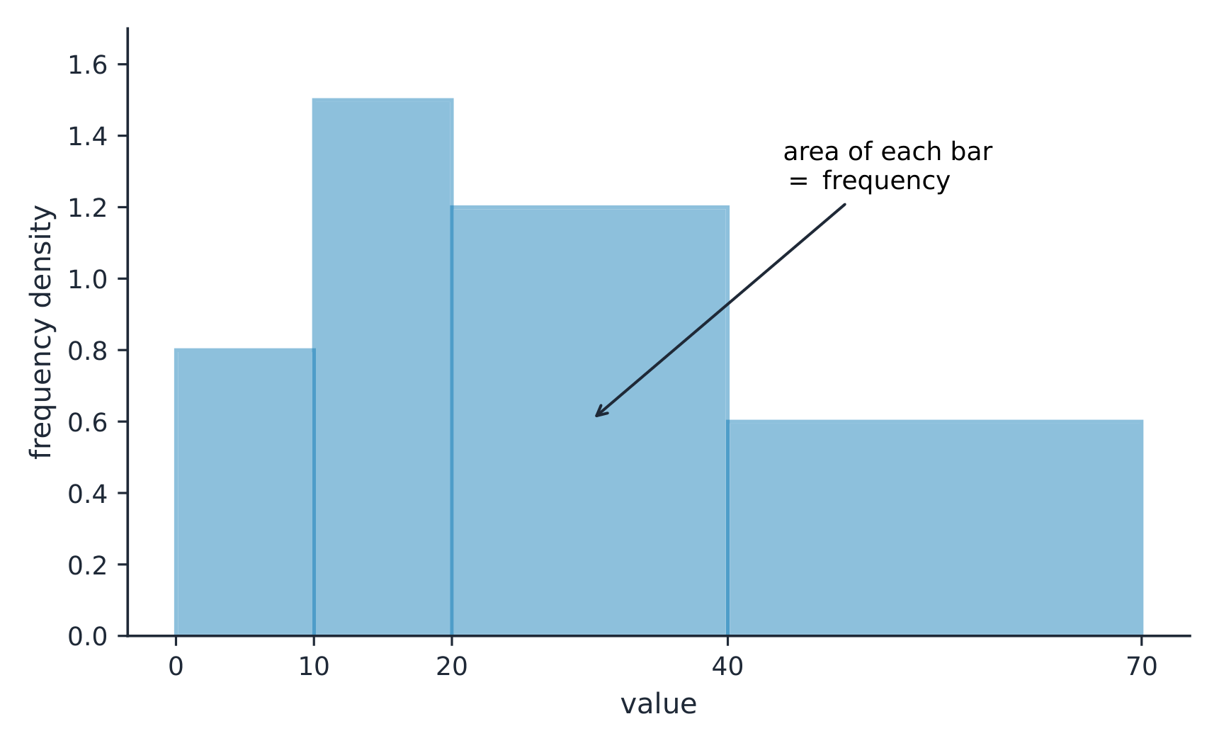
บนฮิสโตแกรมที่มีช่วงข้อมูลไม่เท่ากัน พื้นที่ของแท่งคือความถี่
Explore · ⁨สำรวจ⁩

Explore how bin width shapes a histogram · ⁨สำรวจว่าขนาดvron (bin width) ก่อรูปฮิสโตแกรมอย่างไร⁩

A histogram groups data into equal-width bins and draws a bar over each. Change the bins and notice how the same data can look jagged (too narrow) or smooth (too wide) — the shape is a choice. · ⁨ฮิสโตแกรม จัดกลุ่มข้อมูลลงใน vron ที่มีความกว้างเท่ากันแล้ววาดแท่งบนแต่ละvron เปลี่ยนvronและสังเกตว่าข้อมูลชุดเดียวกันอาจดู หยาบ (แคบเกินไป) หรือ เรียบ (กว้างเกินไป) — รูปทรงเป็นทางเลือก⁩

Vocabulary · ⁨คำศัพท์⁩ Train · ⁨ฝึกฝน⁩
English ไทย
dotplot/ˈdɒtplɒt/ แผนภูมิจุด (dotplot)
stem-and-leaf plot/stem ænd liːf plɒt/ แผนภูมิก้านและใบ (stem-and-leaf plot)
histogram/ˈhɪstəɡræm/ ฮิสโตแกรม
distribution/ˌdɪstrɪˈbjuːʃn/ การกระจาย
1.6

Describing the Distribution of a Quantitative Variable · ⁨อธิบาย distribution ของตัวแปร quantitative⁩

Syllabus · ⁨หลักสูตร⁩
English

Enduring Understanding (UNC-1): Graphical representations and statistics allow us to identify and represent key features of data.

Learning Objective UNC-1.H: Describe the characteristics of quantitative data distributions. [Skill 2.A]

  • UNC-1.H.1 Descriptions of the distribution of quantitative data include shape, center, and variability (spread), as well as any unusual features such as outliers, gaps, clusters, or multiple peaks.
  • UNC-1.H.2 Outliers for one-variable data are data points that are unusually small or large relative to the rest of the data.
  • UNC-1.H.3 A distribution is skewed to the right (positive skew) if the right tail is longer than the left. A distribution is skewed to the left (negative skew) if the left tail is longer than the right. A distribution is symmetric if the left half is the mirror image of the right half.
  • UNC-1.H.4 Univariate graphs with one main peak are known as unimodal. Graphs with two prominent peaks are bimodal. A graph where each bar height is approximately the same (no prominent peaks) is approximately uniform.
  • UNC-1.H.5 A gap is a region of a distribution between two data values where there are no observed data.
  • UNC-1.H.6 Clusters are concentrations of data usually separated by gaps.
  • UNC-1.H.7 Descriptive statistics does not attribute properties of a data set to a larger population, but may provide the basis for conjectures for subsequent testing.
ไทย

ความเข้าใจที่ยั่งยืน (UNC-1): กราฟและสถิติช่วยให้เราระบุและแสดงคุณลักษณะสำคัญของข้อมูลได้

วัตถุประสงค์การเรียนรู้ UNC-1.H: อธิบายลักษณะของการกระจายตัวของข้อมูลเชิงปริมาณ [ทักษะ 2.A]

  • UNC-1.H.1 คำอธิบายการกระจายตัวของข้อมูลเชิงปริมาณประกอบด้วยรูปทรง จุดศูนย์กลาง และความแปรปรวน (การกระจาย) รวมถึงคุณสมบัติพิเศษใดๆ เช่น ค่าผิดปกติ ช่องว่าง กลุ่มข้อมูล หรือยอดแหลมหลายยอด
  • UNC-1.H.2 ค่าผิดปกติสำหรับข้อมูลตัวแปรเดียวคือจุดข้อมูลที่มีค่าน้อยหรือมากผิดปกติเมื่อเทียบกับส่วนที่เหลือของข้อมูล
  • UNC-1.H.3 การกระจายตัวเบี่ยงไปทางขวา (เบี่ยงเบนบวก) หากหางด้านขวายาวกว่าด้านซ้าย การกระจายตัวเบี่ยงไปทางซ้าย (เบี่ยงเบนลบ) หากหางด้านซ้ายยาวกว่าด้านขวา การกระจายตัวสมมาตรหากครึ่งซ้ายเป็นภาพสะท้อนของครึ่งขวา
  • UNC-1.H.4 กราฟตัวแปรเดียวที่มียอดแหลมหลักหนึ่งเรียกว่า moda เดียว กราฟที่มียอดแหลมเด่นสองยอดเรียกว่า bimodal กราฟที่มีความสูงของแต่ละแท่งประมาณเท่ากัน (ไม่มียอดแหลมเด่น) จะประมาณว่าสม่ำเสมอ
  • UNC-1.H.5 ช่องว่างคือบริเวณของการกระจายตัวระหว่างค่าข้อมูลสองค่าที่ไม่มีข้อมูลถูกสังเกต
  • UNC-1.H.6 กลุ่มข้อมูลคือการรวมตัวของข้อมูลซึ่งโดยปกติจะแยกออกจากกันด้วยช่องว่าง
  • UNC-1.H.7 สถิติเชิงพรรณนาไม่ได้สรุปคุณสมบัติของชุดข้อมูลไปยังประชากรที่ใหญ่ขึ้น แต่อาจเป็นพื้นฐานสำหรับการตั้งสมมติฐานเพื่อทดสอบในภายหลัง

Source: College Board AP Course and Exam Description · ⁨แหล่งที่มา: คำอธิบายหลักสูตรและข้อสอบ College Board AP⁩

English

Describe four things (remember SOCS):

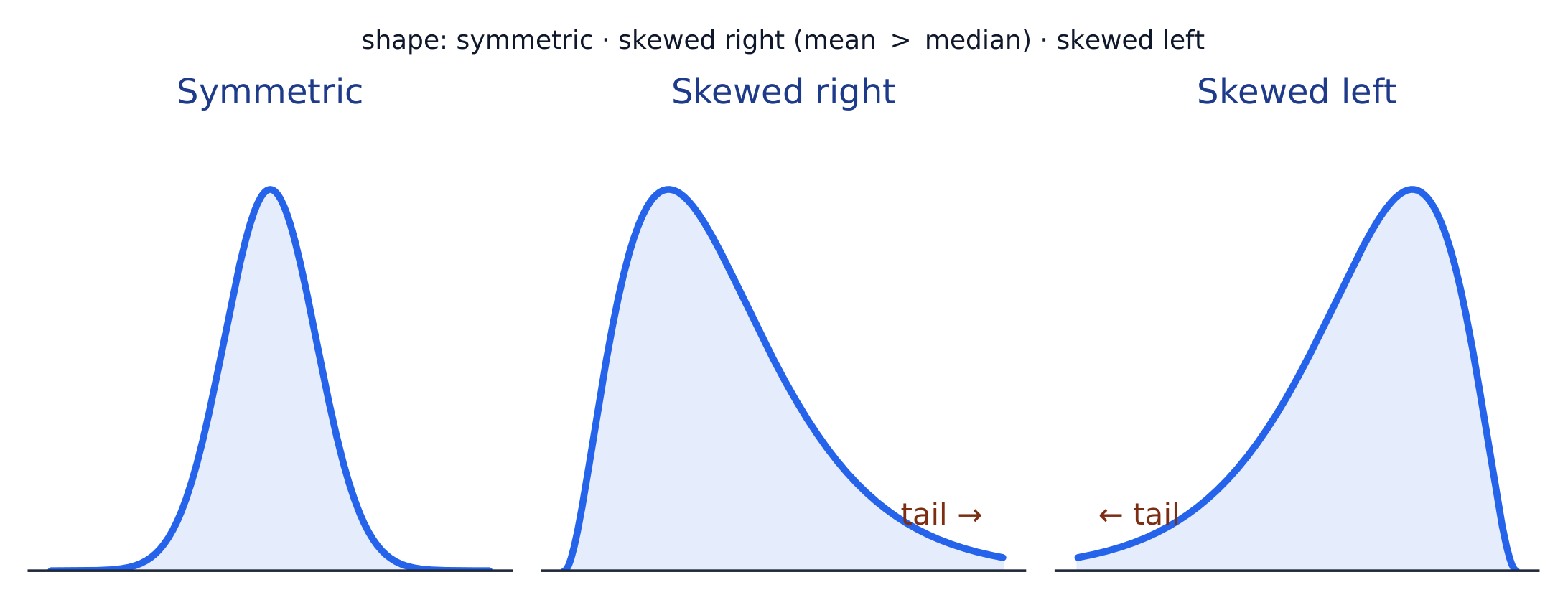
  • Shape 形状: symmetric, or skewed 偏斜 left/right (a long tail on that side), and how many peaks - one main peak is unimodal 单峰, two prominent peaks bimodal 双峰, and roughly equal bars uniform 均匀.
  • Outliers 离群值: unusual values far from the rest.
  • Center: a typical value (mean or median).
  • Spread: how much the values vary (range, IQR, standard deviation).

Always describe shape/center/spread in context, with units.

ไทย

อธิบายสี่อย่าง (จำ SOCS):

  • Shape: สมมาตร, หรือ skewed ซ้าย/ขวา (หางยาวด้านนั้น), และมียอดกี่จุด – ยอดหลักหนึ่งคือ unimodal, สองยอดเด่นคือ bimodal, และแท่งเท่าๆ กันคือ uniform
  • Outliers: ค่าผิดปกติห่างจาก其余值มาก
  • Center: ค่าทั่วไป (mean หรือ median)
  • การกระจายตัว: ความแตกต่างของค่าต่างๆ (ช่วง, IQR, ส่วนเบี่ยงเบนมาตรฐาน).

ควรอธิบายรูปร่าง/จุดกึ่งกลาง/การกระจายตัว ในบริบท พร้อมระบุหน่วยเสมอ.

รูปร่างของการแจกแจง: สมมาตร, บิดเบี้ยวไปทางขวา (หางยาวทางขวา), หรือบิดเบี้ยวไปทางซ้าย
Vocabulary · ⁨คำศัพท์⁩ Train · ⁨ฝึกฝน⁩
English ไทย
Shape/ʃeɪp/ รูปร่าง (Shape)
skewed/skjuːd/ เบี่ยงขวา/ซ้าย
unimodal/ˌʌnɪˈmɒdl/ แบบโมเดลเดียว
bimodal/baɪˈmɒdl/ แบบสองยอด
uniform/ˈjuːnɪfɔːm/ สม่ำเสมอ
Outliers/ˈaʊtlaɪəz/ ค่าผิดปกติ
mean/miːn/ ค่าเฉลี่ย
median/ˈmiːdiːən/ มัธยฐาน
interquartile range/ˌɪntəˈkwɔːtaɪl reɪndʒ/ ช่วงระหว่างควอไทล์
1.7

Summary Statistics for a Quantitative Variable · ⁨สรุปสถิติสำหรับตัวแปรเชิงปริมาณ⁩

Syllabus · ⁨หลักสูตร⁩
English
Enduring UnderstandingLearning ObjectiveEssential Knowledge

UNC-1
Graphical representations and statistics allow us to identify and represent key features of data.

UNC-1.I
Calculate measures of center and position for quantitative data. [Skill 2.C]

  • UNC-1.I.1 A statistic is a numerical summary of sample data.
  • UNC-1.I.2 The mean is the sum of all the data values divided by the number of values. For a sample, the mean is denoted by $x$-bar: $\bar{x} = \dfrac{1}{n}\sum_{i=1}^{n} x_i$, where $x_i$ represents the $i^{\text{th}}$ data point in the sample and $n$ represents the number of data values in the sample.
  • UNC-1.I.3 The median of a data set is the middle value when data are ordered. When the number of data points is even, the median can take on any value between the two middle values. In AP Statistics, the most commonly used value for the median of a data set with an even number of values is the average of the two middle values.
  • UNC-1.I.4 The first quartile, Q1, is the median of the half of the ordered data set from the minimum to the position of the median. The third quartile, Q3, is the median of the half of the ordered data set from the position of the median to the maximum. Q1 and Q3 form the boundaries for the middle 50% of values in an ordered data set.
  • UNC-1.I.5 The $p^{\text{th}}$ percentile is interpreted as the value that has $p\%$ of the data less than or equal to it.

UNC-1.J
Calculate measures of variability for quantitative data. [Skill 2.C]

  • UNC-1.J.1 Three commonly used measures of variability (or spread) in a distribution are the range, interquartile range, and standard deviation.
  • UNC-1.J.2 The range is defined as the difference between the maximum data value and the minimum data value. The interquartile range (IQR) is defined as the difference between the third and first quartiles: $Q3 - Q1$. Both the range and the interquartile range are possible ways of measuring variability of the distribution of a quantitative variable.
  • UNC-1.J.3 Standard deviation is a way to measure variability of the distribution of a quantitative variable. For a sample, the standard deviation is denoted by $s$: $s_x = \sqrt{\dfrac{1}{n-1}\sum(x_i - \bar{x})^2}$. The square of the sample standard deviation, $s^2$, is called the sample variance.
  • UNC-1.J.4 Changing units of measurement affects the values of the calculated statistics.

UNC-1.K
Explain the selection of a particular measure of center and/or variability for describing a set of quantitative data. [Skill 4.B]

  • UNC-1.K.1 There are many methods for determining outliers. Two methods frequently used in this course are:
    • UNC-1.K.1.i An outlier is a value greater than $1.5 \times \text{IQR}$ above the third quartile or more than $1.5 \times \text{IQR}$ below the first quartile.
    • UNC-1.K.1.ii An outlier is a value located 2 or more standard deviations above, or below, the mean.
  • UNC-1.K.2 The mean, standard deviation, and range are considered nonresistant (or non-robust) because they are influenced by outliers. The median and IQR are considered resistant (or robust), because outliers do not greatly (if at all) affect their value.
ไทย

ความเข้าใจที่ยั่งยืน (UNC-1): กราฟและสถิติช่วยให้เราระบุและแสดงคุณลักษณะสำคัญของข้อมูลได้ วัตถุประสงค์การเรียนรู้ UNC-1.I: คำนวณขนาดวัดจุดศูนย์กลางและตำแหน่งสำหรับข้อมูลเชิงปริมาณ [ทักษะ 2.C]

  • UNC-1.I.1 สถิติคือสรุปผลตัวเลขของข้อมูลตัวอย่าง
  • UNC-1.I.2 ค่าเฉลี่ย (mean) คือผลรวมของข้อมูลทั้งหมดหารด้วยจำนวนข้อมูล สำหรับตัวอย่าง ค่าเฉลี่ยแสดงด้วย $x$-บาร์: $\bar{x} = \dfrac{1}{n}\sum_{i=1}^{n} x_i$ โดยที่ $x_i$ แทน $i^{\text{th}}$ จุดข้อมูลในตัวอย่าง และ $n$ แทนจำนวนค่าข้อมูลในตัวอย่าง
  • UNC-1.I.3 ค่ามัธยฐาน (median) ของชุดข้อมูลคือค่าที่อยู่ตรงกลางเมื่อเรียงลำดับข้อมูล เมื่อจำนวนจุดข้อมูลเป็นเลขคู่ ค่ามัธยฐานอาจมีค่าใดก็ได้ระหว่างสองค่าตรงกลาง ใน AP Statistics ค่าที่ใช้บ่อยที่สุดสำหรับค่ามัธยฐานของชุดข้อมูลที่มีจำนวนค่าเป็นเลขคู่คือค่าเฉลี่ยของสองค่าตรงกลาง
  • UNC-1.I.4 ควอไทล์แรก, Q1, คือค่ามัธยฐานของครึ่งหนึ่งของชุดข้อมูลที่เรียงลำดับตั้งแต่ค่าต่ำสุดไปจนถึงตำแหน่งของค่ามัธยฐาน ควอไทล์ที่สาม, Q3, คือค่ามัธยฐานของครึ่งหนึ่งของชุดข้อมูลที่เรียงลำดับจากตำแหน่งของค่ามัธยฐานไปถึงค่าสูงสุด Q1 และ Q3 เป็นขอบเขตสำหรับ 50% ของค่าตรงกลางในชุดข้อมูลที่เรียงลำดับ
  • UNC-1.I.5 $p^{\text{th}}$ เปอร์เซ็นต์ไทล์ interpreted ว่ามีค่าซึ่งมี $p\%$ ของข้อมูลน้อยกว่าหรือเท่ากับค่านั้น
Learning ObjectiveEssential Knowledge

UNC-1.J
คำนวณ Measures of variability สำหรับข้อมูลเชิงปริมาณ [Skill 2.C]

  • UNC-1.J.1 Three measures of variability (or spread) ที่ใช้กันทั่วไปในการกระจายคือ range, interquartile range และ standard deviation
  • UNC-1.J.2 Range นิยามว่าเป็นผลต่างระหว่างค่าข้อมูลสูงสุดและค่าข้อมูลต่ำสุด Interquartile range (IQR) นิยามว่าเป็นผลต่างระหว่างควอไทล์ที่สามและควอไทล์แรก: $Q3 - Q1$ ทั้ง range และ interquartile range เป็นวิธีการที่เป็นไปได้ในการวัดความแปรปรวนของการกระจายของตัวแปรเชิงปริมาณ
  • UNC-1.J.3 Standard deviation เป็นวิธีวัดความแปรปรวนของการกระจายของตัวแปรเชิงปริมาณ สำหรับตัวอย่าง standard deviation แสดงด้วย $s$: $s_x = \sqrt{\dfrac{1}{n-1}\sum(x_i - \bar{x})^2}$ สี่เหลี่ยมของ sample standard deviation, $s^2$, เรียกว่า sample variance
  • UNC-1.J.4 การเปลี่ยนหน่วยวัดมีผลต่อค่าของสถิติที่คำนวณได้

UNC-1.K
อธิบายการเลือก Measure of center และ/หรือ measure of variability เพื่ออธิบายชุดข้อมูลเชิงปริมาณ [Skill 4.B]

  • UNC-1.K.1 มีหลายวิธีในการระบุค่าผิดปกติ (outliers) Two methods ที่ใช้บ่อยในรายวิชานี้คือ:
    • UNC-1.K.1.i Outlier คือค่ามากกว่า $1.5 \times \text{IQR}$ เหนือควอไทล์ที่สามหรือน้อยกว่า $1.5 \times \text{IQR}$ ต่ำกว่าควอไทล์แรก
    • UNC-1.K.1.ii Outlier คือค่าที่อยู่ห่าง 2 หรือมากกว่า standard deviation เหนือหรือต่ำกว่า mean
  • UNC-1.K.2 Mean, standard deviation และ range被视为 nonresistant (หรือ non-robust) เพราะได้รับผลกระทบจาก outliers Median และ IQR被视为 resistant (หรือ robust), เพราะ outliers ไม่ส่งผลกระทบต่อค่าของพวกมันอย่างมีนัยสำคัญ (ถ้ามีเลย)

Source: College Board AP Course and Exam Description · ⁨แหล่งที่มา: คำอธิบายหลักสูตรและข้อสอบ College Board AP⁩

English
Standard deviation: spread about the mean
  • Center: the mean 均值 $\bar{x}=\dfrac{\sum x_i}{n}$ (average) and the median 中位数 (middle value). The median resists outliers; the mean is pulled toward a skew.
  • Spread: the range, the interquartile range 四分位距 $\text{IQR}=Q_3-Q_1$ (middle 50%), and the standard deviation 标准差 $s_x=\sqrt{\dfrac{\sum(x_i-\bar{x})^2}{n-1}}$ (typical distance from the mean; its square is the variance 方差).
  • The five-number summary 五数概括: min, $Q_1$, median, $Q_3$, max.

Use resistant measures (median, IQR) for skewed data; mean and standard deviation for roughly symmetric data.

The percentile 百分位数 of a value is the percent of the data at or below it – so the median is the 50th percentile and $Q_1$ the 25th. A cumulative relative frequency graph 累积相对频率图 makes percentiles easy to read: for each value it plots the proportion of the data at or below it, rising from 0 to 1. Go up from a value to the curve and across to its percentile, or reverse the steps to find the value at a given percentile (the same reading works from a cumulative-frequency table).

Worked example. For the data $4, 8, 6, 10, 7$: the mean is $\bar{x}=\dfrac{4+8+6+10+7}{5}=\dfrac{35}{5}=7$. Sorting to $4,6,7,8,10$, the median is the middle value, $7$. The mean and median agree here because the data are roughly symmetric.

ไทย
ส่วนเบี่ยงเบนมาตรฐาน: การกระจายรอบค่าเฉลี่ย
  • จุดกึ่งกลาง: ค่า เฉลี่ย $\bar{x}=\dfrac{\sum x_i}{n}$ (ค่าเฉลี่ย) และ ค่ามัธยฐาน (ค่าตรงกลาง) ค่ามัธยฐานทนต่อค่าผิดปกติ; แต่ค่าเฉลี่ยจะถูกดึงไปทางความเบ้.
  • การกระจายตัว: ช่วง, ช่วงระหว่างควอไทล์ $\text{IQR}=Q_3-Q_1$ (50% ตรงกลาง), และ ส่วนเบี่ยงเบนมาตรฐาน $s_x=\sqrt{\dfrac{\sum(x_i-\bar{x})^2}{n-1}}$ (ระยะห่างจากค่าเฉลี่ยโดยทั่วไป;กำลังสองของมันคือ ความแปรปรวน).
  • สรุปข้อมูลห้าจำนวน: ค่าน้อยสุด, $Q_1$, ค่ามัธยฐาน, $Q_3$, ค่ามากสุด.

ใช้ ค่าที่ทนทาน (ค่ามัธยฐาน, IQR) สำหรับข้อมูลที่มีเบ้; ใช้ค่าเฉลี่ยและส่วนเบี่ยงเบนมาตรฐานสำหรับข้อมูลที่ประมาณได้ว่าเป็นสมมาตร.

เปอร์เซ็นต์ิล ของค่าหนึ่ง คือเปอร์เซ็นต์ของข้อมูลที่น้อยกว่าหรือเท่ากับค่านั้น – ดังนั้นค่ามัธยฐานจึงเป็นเปอร์เซ็นต์ิลที่ 50 และ $Q_1$ เป็นเปอร์เซ็นต์ิลที่ 25. กราฟความถี่สะสมสัมพัทธ์ ทำให้การอ่านค่าเปอร์เซ็นต์ิลได้ง่าย: สำหรับแต่ละค่าจะพล็อตสัดส่วนของข้อมูล ที่น้อยกว่าหรือเท่ากับ ค่านั้น ซึ่งเพิ่มขึ้นจาก 0 ถึง 1. ลากเส้นขึ้นจากค่าไปยังกราฟ แล้วลากข้ามไปหาเปอร์เซ็นต์ิล, หรือทำขั้นตอนย้อนกลับเพื่อหาค่าที่เปอร์เซ็นต์ิลที่กำหนด (การอ่านแบบเดียวกันใช้ได้กับตารางความถี่สะสมด้วย).

ตัวอย่างวิธีทำ. สำหรับข้อมูล $4, 8, 6, 10, 7$: ค่าเฉลี่ยคือ $\bar{x}=\dfrac{4+8+6+10+7}{5}=\dfrac{35}{5}=7$. เมื่อเรียงลำดับเป็น $4,6,7,8,10$,Median คือค่าตรงกลาง, $7$. ค่าเฉลี่ยและ Median ตรงกันในที่นี้เพราะข้อมูลมีความสมมาตรโดยประมาณ

Vocabulary · ⁨คำศัพท์⁩ Train · ⁨ฝึกฝน⁩
English ไทย
standard deviation/ˈstændəd ˌdiːvɪˈeɪʃn/ ส่วนเบี่ยงเบนมาตรฐาน
variance/ˈveərɪəns/ ความแปรปรวน
five-number summary/faɪv ˈnʌmbə ˈsʌməri/ five-number summary
percentile/pəˈsentaɪl/ เปอร์ไทล์
cumulative relative frequency graph/ˈkjuːmjʊlətɪv ˈrelətɪv ˈfriːkwənsi ɡræf/ กราฟความถี่สะสมสัมพัทธ์
1.8

Graphical Representations of Summary Statistics · ⁨การแสดงภาพสรุปสถิติ⁩

Syllabus · ⁨หลักสูตร⁩
English
Enduring UnderstandingLearning ObjectiveEssential Knowledge

UNC-1
Graphical representations and statistics allow us to identify and represent key features of data.

UNC-1.L
Represent summary statistics for quantitative data graphically. [Skill 2.B]

  • UNC-1.L.1 Taken together, the minimum data value, the first quartile (Q1), the median, the third quartile (Q3), and the maximum data value make up the five-number summary.
  • UNC-1.L.2 A boxplot is a graphical representation of the five-number summary (minimum, first quartile, median, third quartile, maximum). The box represents the middle 50% of data, with a line at the median and the ends of the box corresponding to the quartiles. Lines ("whiskers") extend from the quartiles to the most extreme point that is not an outlier, and outliers are indicated by their own symbol beyond this.

UNC-1.M
Describe summary statistics of quantitative data represented graphically. [Skill 2.A]

  • UNC-1.M.1 Summary statistics of quantitative data, or of sets of quantitative data, can be used to justify claims about the data in context.
  • UNC-1.M.2 If a distribution is relatively symmetric, then the mean and median are relatively close to one another. If a distribution is skewed right, then the mean is usually to the right of the median. If the distribution is skewed left, then the mean is usually to the left of the median.
ไทย

ความเข้าใจที่ยั่งยืน (UNC-1): กราฟและสถิติช่วยให้เราระบุและแสดงคุณลักษณะสำคัญของข้อมูลได้

Learning ObjectiveEssential Knowledge

UNC-1.L
แสดง Summary statistics ของข้อมูลเชิงปริมาณแบบกราฟิก [Skill 2.B]

  • UNC-1.L.1 รวมกันแล้ว ค่าข้อมูลต่ำสุด, ควอไทล์แรก (Q1), ค่ามัธยฐาน, ควอไทล์ที่สาม (Q3), และค่าข้อมูลสูงสุด构成了 Five-number summary
  • UNC-1.L.2 Boxplot คือการแสดง Summary statistics แบบกราฟิกของ five-number summary (minimum, first quartile, median, third quartile, maximum) กล่องแทน 50% ตรงกลางของข้อมูล โดยมีเส้นที่ค่ามัธยฐานและปลายกล่องสอดคล้องกับควอไทล์ เส้น ("whiskers") ขยายจากควอไทล์ไปยังจุดที่รุนแรงที่สุดที่ไม่ใช่ outlier และ outliers จะถูกแสดงด้วยสัญลักษณ์ของตนเองเกินกว่านี้

UNC-1.M
อธิบาย Summary statistics ของข้อมูลเชิงปริมาณที่แสดงแบบกราฟิก [Skill 2.A]

  • UNC-1.M.1 Summary statistics ของข้อมูลเชิงปริมาณ, หรือของชุดข้อมูลเชิงปริมาณ, สามารถใช้เพื่อสนับสนุนข้ออ้างเกี่ยวกับข้อมูลในบริบทได้
  • UNC-1.M.2 หากการกระจายมีความสมมาตรอย่าง نسبی, แล้ว mean และ median จะอยู่ใกล้กันอย่าง نسبی หากการกระจายเบี่ยงไปทางขวา, แล้ว mean มักจะอยู่ทางขวาของค่ามัธยฐาน หากการกระจายเบี่ยงไปทางซ้าย, แล้ว mean มักจะอยู่ทางซ้ายของค่ามัธยฐาน

Source: College Board AP Course and Exam Description · ⁨แหล่งที่มา: คำอธิบายหลักสูตรและข้อสอบ College Board AP⁩

English

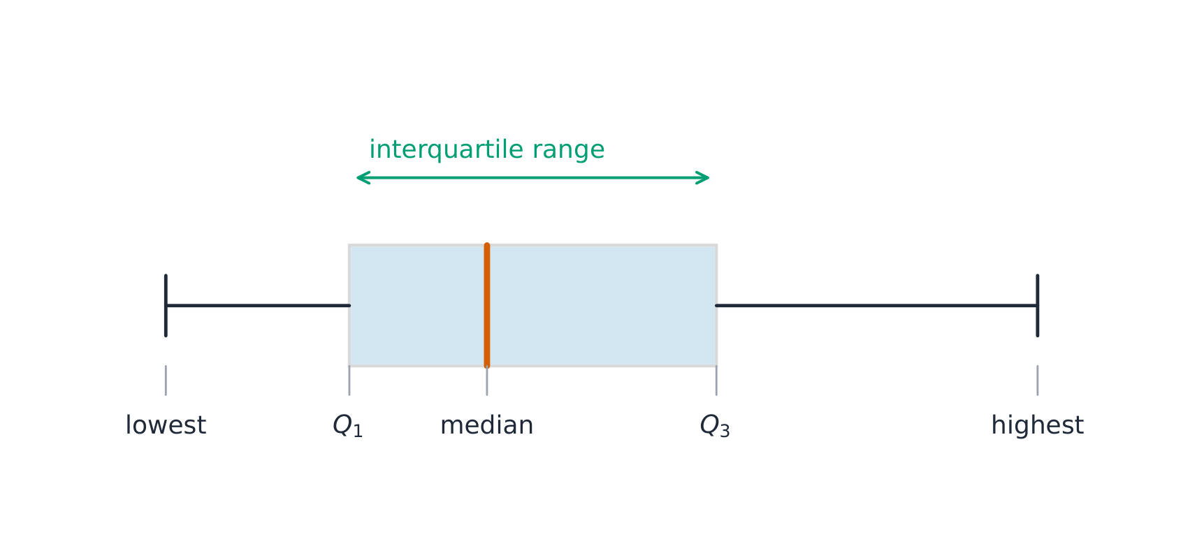
A boxplot 箱线图 draws the five-number summary: a box from $Q_1$ to $Q_3$ with the median inside, and whiskers to the most extreme non-outlier values. A point is an outlier if it lies more than $1.5\times\text{IQR}$ beyond a quartile – a rule you may be asked to apply. Boxplots are ideal for comparing several groups side by side.

Worked example. A dataset has $Q_1=20$ and $Q_3=32$, so $\text{IQR}=12$. The outlier fences are $Q_1-1.5(12)=2$ and $Q_3+1.5(12)=50$. Any value below $2$ or above $50$ is flagged as an outlier.

ไทย

แผนภาพกล่อง แสดงสรุปข้อมูลห้าจำนวน: กล่องจาก $Q_1$ ถึง $Q_3$ โดยมีค่ามัธยฐานอยู่ภายใน, และหนวดไปยังค่าที่รุนแรงที่สุดที่ไม่ใช่ค่าผิดปกติ. จุดหนึ่งถือเป็น ค่าผิดปกติ หากอยู่ไกลกว่า $1.5\times\text{IQR}$ จากควอไทล์ – ซึ่งเป็นกฎที่คุณอาจถูกขอให้นำไปใช้. แผนภาพกล่องเหมาะสำหรับการเปรียบเทียบหลายกลุ่มข้างเคียง.

**ตัวอย่างคำนวณ.**的一组ข้อมูลมี $Q_1=20$ และ $Q_3=32$, ดังนั้น $\text{IQR}=12$. ขอบเขตค่าผิดปกติคือ $Q_1-1.5(12)=2$ และ $Q_3+1.5(12)=50$. ค่าใดต่ำกว่า $2$ หรือสูงกว่า $50$ จะถูก标记เป็นค่าผิดปกติ.

แผนภาพกล่องและหนวดแสดงควอไทล์และช่วง
แผนภาพกล่องแสดงสรุปข้อมูลห้าจำนวน; กล่องครอบคลุมช่วงระหว่างควอไทล์
Explore · ⁨สำรวจ⁩

Explore the five-number summary as a boxplot · ⁨สำรวจสรุปห้าจำนวนในฐานะกราฟกล่อง⁩

Drag $Q_1$, the median, and $Q_3$ to see the box (its length is the IQR) and how the median's position inside the box reveals skew — a median close to $Q_1$ signals a right-skewed distribution. · ⁨ลาก $Q_1$, ค่ามัธยฐาน, และ $Q_3$ เพื่อดูกล่อง (ความยาวคือ IQR) และตำแหน่งของค่ามัธยฐานภายในกล่องเผยให้เห็น ความเบ้ — ค่ามัธยฐานใกล้กับ $Q_1$ บ่งชี้ถึงการกระจายตัวแบบเบ้ขวา⁩

Vocabulary · ⁨คำศัพท์⁩ Train · ⁨ฝึกฝน⁩
English ไทย
boxplot/ˈbɒksplɒt/ boxplot
normal distribution/ˈnɔːml ˌdɪstrɪˈbjuːʃn/ การแจกแจงปกติ
1.9

Comparing Distributions of a Quantitative Variable · ⁨เปรียบเทียบการแจกแจงของตัวแปรเชิงปริมาณ⁩

Syllabus · ⁨หลักสูตร⁩
English
Enduring UnderstandingLearning ObjectiveEssential Knowledge

UNC-1
Graphical representations and statistics allow us to identify and represent key features of data.

UNC-1.N
Compare graphical representations for multiple sets of quantitative data. [Skill 2.D]

  • UNC-1.N.1 Any of the graphical representations, e.g., histograms, side-by-side boxplots, etc., can be used to compare two or more independent samples on center, variability, clusters, gaps, outliers, and other features.

UNC-1.O
Compare summary statistics for multiple sets of quantitative data. [Skill 2.D]

  • UNC-1.O.1 Any of the numerical summaries (e.g., mean, standard deviation, relative frequency, etc.) can be used to compare two or more independent samples.
ไทย

ความเข้าใจที่ยั่งยืน (UNC-1): กราฟและสถิติช่วยให้เราระบุและแสดงคุณลักษณะสำคัญของข้อมูลได้

Learning ObjectiveEssential Knowledge

UNC-1.N
เปรียบเทียบการแสดงแบบกราฟิกสำหรับหลายชุดข้อมูลเชิงปริมาณ [Skill 2.D]

  • UNC-1.N.1 Any graphical representations, e.g., histograms, side-by-side boxplots, etc., สามารถใช้ในการเปรียบเทียบสองหรือมากกว่า samples独立กัน regarding center, variability, clusters, gaps, outliers, และลักษณะอื่นๆ

UNC-1.O
เปรียบเทียบ Summary statistics สำหรับหลายชุดข้อมูลเชิงปริมาณ [Skill 2.D]

  • UNC-1.O.1 Any numerical summaries (e.g., mean, standard deviation, relative frequency, etc.) สามารถใช้ในการเปรียบเทียบสองหรือมากกว่า samples独立กัน

Source: College Board AP Course and Exam Description · ⁨แหล่งที่มา: คำอธิบายหลักสูตรและข้อสอบ College Board AP⁩

English

To compare two or more groups, compare shape, center, and spread, and mention outliers – always with comparative words ("Group A has a higher median than Group B") and in context. Do not just describe each group separately; make the comparison explicit.

ไทย

ในการเปรียบเทียบสองกลุ่มขึ้นไป ให้เปรียบเทียบ รูปร่าง, จุดกึ่งกลาง, และการกระจายตัว, และกล่าวถึงค่าผิดปกติ – ด้วยคำเปรียบเทียบเสมอ (“กลุ่ม A มีค่ามัธยฐาน สูงกว่า กลุ่ม B”) และในบริบท. อย่าแค่อธิบายแต่ละกลุ่มแยกกัน; ให้มีการเปรียบเทียบอย่างชัดเจน.

Explore · ⁨สำรวจ⁩

Compare distributions with box plots · ⁨เปรียบเทียบการกระจายด้วยกราฟกล่อง⁩

A box plot draws the five-number summary. Placing two box plots on the same scale compares their centre (median), spread (IQR = box width) and skew at a glance — the fair way to compare groups. · ⁨กราฟกล่อง วาดสรุปห้าจำนวน การวางกราฟกล่องสองอันบนสเกลเดียวกันเปรียบเทียบ จุดกึ่งกลาง (ค่ามัธยฐาน), การกระจาย (IQR = ความกว้างของกล่อง) และ ความเบ้ ได้ทันที — วิธีที่ยุติธรรมในการเปรียบเทียบกลุ่ม⁩

1.10

The Normal Distribution · ⁨การแจกแจงปกติ⁩

Syllabus · ⁨หลักสูตร⁩
English

Enduring Understanding (VAR-2): The normal distribution can be used to represent some population distributions.

Learning Objective VAR-2.A: Compare a data distribution to the normal distribution model. [Skill 2.D]

  • VAR-2.A.1 A parameter is a numerical summary of a population.
  • VAR-2.A.2 Some sets of data may be described as approximately normally distributed. A normal curve is mound-shaped and symmetric. The parameters of a normal distribution are the population mean, $\mu$, and the population standard deviation, $\sigma$.
  • VAR-2.A.3 For a normal distribution, approximately 68% of the observations are within 1 standard deviation of the mean, approximately 95% of observations are within 2 standard deviations of the mean, and approximately 99.7% of observations are within 3 standard deviations of the mean. This is called the empirical rule.
  • VAR-2.A.4 Many variables can be modeled by a normal distribution.
    • Illustrative examples for VAR-2.A:
      • Variables that can be modeled by a normal distribution:
        • Body temperature
        • Weight of a loaf of bread

Learning Objective VAR-2.B: Determine proportions and percentiles from a normal distribution. [Skill 3.A]

  • VAR-2.B.1 A standardized score for a particular data value is calculated as (data value − mean)/(standard deviation), and measures the number of standard deviations a data value falls above or below the mean.
  • VAR-2.B.2 One example of a standardized score is a $z$-score, which is calculated as $z\text{-score} = \left(\dfrac{x_i - \mu}{\sigma}\right)$. A $z$-score measures how many standard deviations a data value is from the mean.
  • VAR-2.B.3 Technology, such as a calculator, a standard normal table, or computer-generated output, can be used to find the proportion of data values located on a given interval of a normally distributed random variable.
  • VAR-2.B.4 Given the area of a region under the graph of the normal distribution curve, it is possible to use technology, such as a calculator, a standard normal table, or computer-generated output, to estimate parameters for some populations.

Learning Objective VAR-2.C: Compare measures of relative position in data sets. [Skill 2.D]

  • VAR-2.C.1 Percentiles and $z$-scores may be used to compare relative positions of points within a data set or between data sets.
ไทย

ความเข้าใจที่ยั่งยืน (VAR-2): การแจกแจงปกติสามารถใช้เพื่อแสดงการแจกแจงของประชากรบางประเภท

จุดประสงค์การเรียนรู้ VAR-2.A: เปรียบเทียบการแจกแจงข้อมูลกับโมเดลการแจกแจงปกติ [ทักษะ 2.D]

  • VAR-2.A.1 พารามิเตอร์คือสรุปรายละเอียดเชิงตัวเลขของประชากร
  • VAR-2.A.2 ชุดข้อมูลบางชุดอาจถูกอธิบายว่าเป็นการแจกแจงแบบปกติโดยประมาณ กราฟ normal curve มีรูปร่างคล้ายยอดเขาและสมมาตร พารามิเตอร์ของการแจกแจงปกติคือค่าเฉลี่ยของประชากร, $\mu$, และความเบี่ยงเบนมาตรฐานของประชากร, $\sigma$.
  • VAR-2.A.3 สำหรับการแจกแจงปกติ ประมาณ 68% ของการสังเกตจะอยู่ภายใน 1 ความเบี่ยงเบนมาตรฐานจากค่าเฉลี่ย ประมาณ 95% ของการสังเกตจะอยู่ภายใน 2 ความเบี่ยงเบนมาตรฐานจากค่าเฉลี่ย และประมาณ 99.7% ของการสังเกตจะอยู่ภายใน 3 ความเบี่ยงเบนมาตรฐานจากค่าเฉลี่ย สิ่งนี้เรียกว่ากฎเชิงประจักษ์
  • VAR-2.A.4 ตัวแปรจำนวนมากสามารถจำลองได้ด้วยการแจกแจงปกติ
    • ตัวอย่างประกอบสำหรับ VAR-2.A:
      • ตัวแปรที่สามารถจำลองได้ด้วยการแจกแจงปกติ:
        • อุณหภูมิร่างกาย
        • น้ำหนักของขนมปัง

จุดประสงค์การเรียนรู้ VAR-2.B: คำนวณสัดส่วนและpercentile จาก distribution แบบปกติ [ทักษะ 3.A]

  • VAR-2.B.1 คะแนนมาตรฐานสำหรับค่าข้อมูลเฉพาะคำนวณได้จาก (ค่าข้อมูล − ค่าเฉลี่ย)/(ความเบี่ยงเบนมาตรฐาน) และวัดจำนวนความเบี่ยงเบนมาตรฐานที่ค่าข้อมูลนั้นห่างจากค่าเฉลี่ยไปทางด้านบนหรือด้านล่าง
  • VAR-2.B.2 ตัวอย่างหนึ่งของคะแนนมาตรฐานคือ $z$-score, ซึ่งคำนวณได้จาก $z\text{-score} = \left(\dfrac{x_i - \mu}{\sigma}\right)$. A $z$-score วัดว่าค่าข้อมูลห่างจากค่าเฉลี่ยกี่ความเบี่ยงเบนมาตรฐาน
  • VAR-2.B.3 เทคโนโลยี เช่น เครื่องคิดเลข ตารางnormal standard หรือผลลัพธ์ที่ผลิตโดยคอมพิวเตอร์ สามารถใช้ในการหาสัดส่วนของค่าข้อมูลที่อยู่ภายในช่วงที่กำหนดของตัวแปรสุ่มที่แจกแจงแบบปกติ
  • VAR-2.B.4 เมื่อทราบพื้นที่ของภูมิภาคใต้กราฟ of the normal distribution curve เป็นไปได้ที่จะใช้เทคโนโลยี เช่น เครื่องคิดเลข ตารางnormal standard หรือผลลัพธ์ที่ผลิตโดยคอมพิวเตอร์ เพื่อประมาณค่าพารามิเตอร์สำหรับบางประชากร

จุดประสงค์การเรียนรู้ VAR-2.C: เปรียบเทียบมาตรการของตำแหน่งสัมพัทธ์ในชุดข้อมูล [ทักษะ 2.D]

  • VAR-2.C.1 Percentiles และ $z$-scores อาจใช้เพื่อเปรียบเทียบตำแหน่งสัมพัทธ์ของจุดภายในชุดข้อมูลหรือระหว่างชุดข้อมูล

Source: College Board AP Course and Exam Description · ⁨แหล่งที่มา: คำอธิบายหลักสูตรและข้อสอบ College Board AP⁩

English

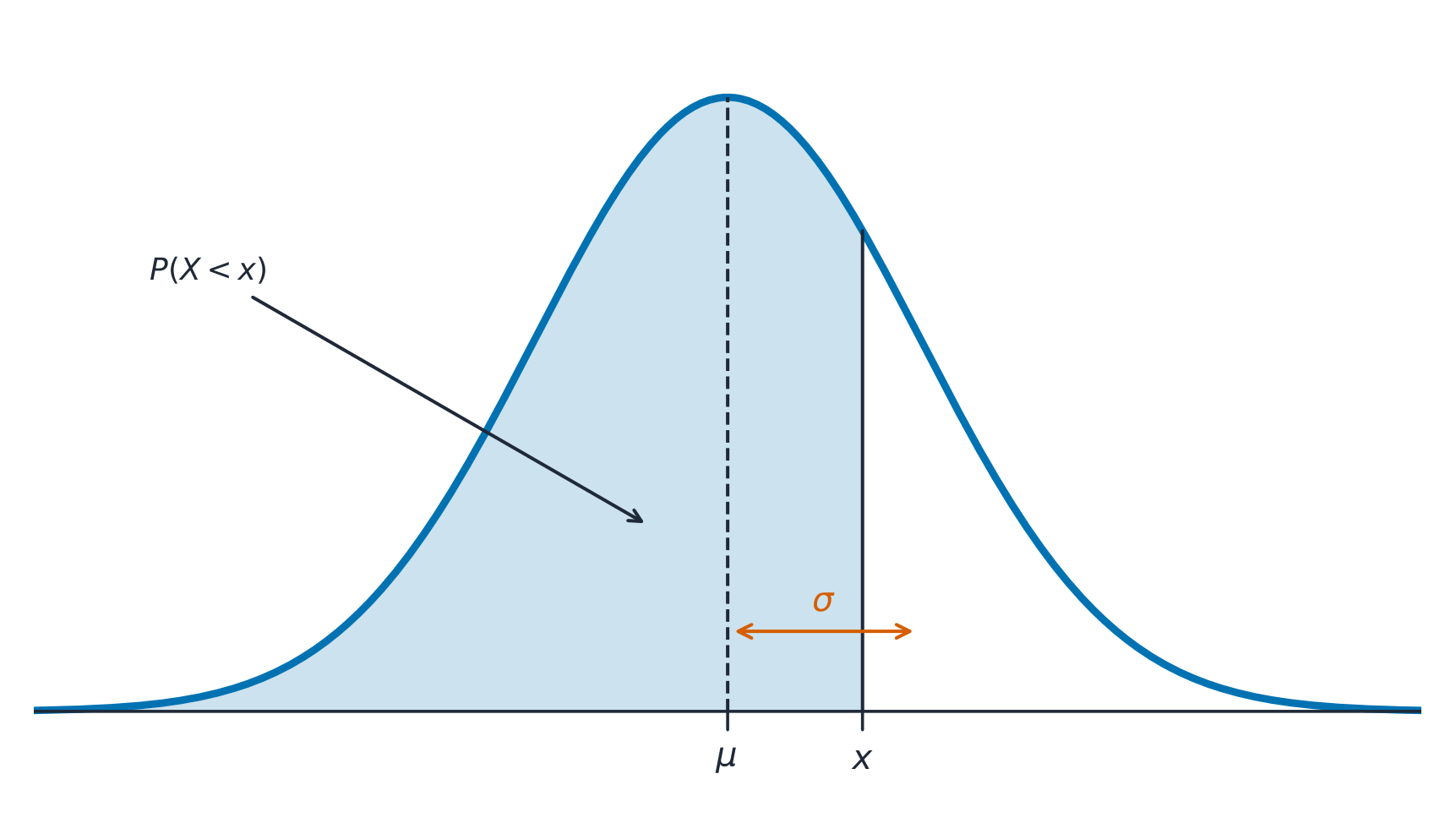
A normal distribution 正态分布 is a symmetric, bell-shaped model described by its mean $\mu$ and standard deviation $\sigma$. The empirical rule 经验法则 (68–95–99.7): about 68% of values lie within $1\sigma$ of the mean, 95% within $2\sigma$, and 99.7% within $3\sigma$.

A $z$-score 标准分数 measures how many standard deviations a value is from the mean:

$$z=\frac{x-\mu}{\sigma}.$$
Convert to a $z$-score, then use the normal table or technology to find the proportion (area) below, above, or between values – and reverse the process to find a value from a given percentile.

Worked example. Test scores are normal with $\mu=500$ and $\sigma=100$. A score of $700$ has $z=\dfrac{700-500}{100}=2$. By the empirical rule, $95\%$ of scores lie within $2\sigma$, so $2.5\%$ lie above $700$ – meaning a $700$ is at about the $97.5$th percentile.

ไทย

การแจกแจงปกติ เป็นโมเดลสมมาตรรูปกระดิ่งที่อธิบายด้วยค่าเฉลี่ย $\mu$ และส่วนเบี่ยงเบนมาตรฐาน $\sigma$. กฎทฤษฎีบทจริง (68–95–99.7): ประมาณ 68% ของค่าอยู่ในระยะ $1\sigma$ จากค่าเฉลี่ย, 95% Within $2\sigma$, และ 99.7% Within $3\sigma$.

โค้งปกติ: ความน่าจะเป็นคือพื้นที่ใต้โค้ง ซึ่งศูนย์กลางอยู่ที่ค่าเฉลี่ย

ค่า $z$-score วัดว่าค่าหนึ่งห่างจากค่าเฉลี่ยกี่ส่วนเบี่ยงเบนมาตรฐาน:

$$z=\frac{x-\mu}{\sigma}.$$
แปลงเป็น $z$-score, จากนั้นใช้ตารางการแจกแจงปกติหรือเทคโนโลยีเพื่อหา สัดส่วน (พื้นที่) ด้านล่าง, ด้านบน, หรือระหว่างค่า – และทำขั้นตอนย้อนกลับเพื่อหาค่าจากเปอร์เซ็นต์ิลที่กำหนด.

ตัวอย่างวิธีทำ. คะแนนทดสอบมีการแจกแจงปกติด้วย $\mu=500$ และ $\sigma=100$. คะแนน $700$ มี $z=\dfrac{700-500}{100}=2$. ตามกฎเชิงประจักษ์, $95\%$ ของคะแนนอยู่ภายใน $2\sigma$, ดังนั้น $2.5\%$ อยู่เหนือ $700$ – ซึ่งหมายความว่า $700$ อยู่ที่เปอร์เซ็นต์ิลที่ประมาณ $97.5$

เส้นโค้งปกติและกฎทฤษฎีบทจริง 68-95-99.7
Explore · ⁨สำรวจ⁩

Explore area under the normal curve · ⁨สำรวจพื้นที่ใต้เส้นโค้งปกติ⁩

The proportion of data below a value equals the area under the curve to its left. Shade a tail or a central band to see the 68–95–99.7 empirical rule and read a $z$-score as an area. · ⁨สัดส่วน ของข้อมูลต่ำกว่าค่าหนึ่งเท่ากับ พื้นที่ใต้เส้นโค้งทางซ้ายของมัน ทาเงาส่วนหางหรือแถบตรงกลางเพื่อดูกฎเชิงประจักษ์ 68–95–99.7 และอ่านค่า $z$ เป็นพื้นที่⁩

Vocabulary · ⁨คำศัพท์⁩ Train · ⁨ฝึกฝน⁩
English ไทย
empirical rule/emˈpɪrɪkl ruːl/ กฎเชิงประจักษ์ (empirical rule)
$z$-score/ˈzed skɔː/ $z$-สโคร์
1.10

Exam tips · ⁨ข้อแนะนำสำหรับการสอบ⁩

English
  • Describe a distribution by shape, center, spread, and outliers (SOCS) — always in context.
  • The mean is pulled by outliers; the median resists them, so prefer the median for skewed data.
  • For a normal distribution use the 68–95–99.7 rule and z-scores $z=\tfrac{x-\mu}{\sigma}$.
  • Compare distributions with side-by-side boxplots and comment on center, spread, and shape.
  • Standard deviation measures a typical distance from the mean; the IQR pairs with the median.
ไทย
  • อธิบายการแจกแจงด้วย รูปร่าง, จุดกึ่งกลาง, การกระจายตัว, และค่าผิดปกติ (SOCS) – เสมอในบริบท.
  • ค่าเฉลี่ย ถูกดึงโดยค่าผิดปกติ; ค่ามัธยฐาน ทนต่อมันได้ ดังนั้นควรเลือกค่ามัธยฐานสำหรับข้อมูลที่มีเบ้.
  • สำหรับการแจกแจง ปกติ ใช้กฎ 68–95–99.7 และ z-scores $z=\tfrac{x-\mu}{\sigma}$.
  • เปรียบเทียบการแจกแจงด้วยแผนภาพกล่องข้างเคียงและคอมเมนต์เรื่องจุดกึ่งกลาง, การกระจายตัว, และรูปร่าง.
  • ส่วนเบี่ยงเบนมาตรฐานวัดระยะห่างจากค่าเฉลี่ยโดยทั่วไป; IQR คู่กับค่ามัธยฐาน.

Interactive lessons on this topic · ⁨บทเรียนเชิงโต้ตอบสำหรับหัวข้อนี้⁩

Work through it step by step, with instant-check exercises. · ⁨ทำทีละขั้นตอน พร้อมแบบฝึกหัดตรวจสอบผลทันที⁩

Past Papers · ⁨ข้อสอบย้อนหลัง⁩

More topics in AP Statistics · ⁨หัวข้อเพิ่มเติมใน AP Statistics⁩

Log in or create account · ⁨เข้าสู่ระบบหรือสร้างบัญชี⁩

IGCSE, A-Level & AP