Skip to content · ⁨الانتقال إلى المحتوى⁩

Exploring One-Variable Data · ⁨استكشاف بيانات متغير واحد⁩

AP Statistics · ⁨AP الإحصاء⁩ · Topic 1 · ⁨الموضوع 1⁩

Video lesson for this topic · ⁨درس فيديو لهذا الموضوع⁩ Open the video page · ⁨افتح صفحة الفيديو⁩
9:03

استكشاف بيانات متغير واحد

قِس نفس الشيء عشرين مرة ولن تحصل على نفس الجواب عشرين مرة. ع열ون طالباً يقيسون نفس الطاولة. تتفاوت القيم. هذا ليس…

English narration · English + 中文 subtitles burned in · ⁨سرد باللغة الإنجليزية · ترجمة مدمجة بالإنجليزية + الصينية⁩

1.1

Introducing Statistics: What Can We Learn from Data? · ⁨مقدمة الإحصاء: ماذا يمكننا تعلمه من البيانات؟⁩

Syllabus · ⁨المنهج⁩
English

Enduring Understanding (VAR-1): Given that variation may be random or not, conclusions are uncertain.

Learning Objective VAR-1.A: Identify questions to be answered, based on variation in one-variable data. [Skill 1.A]

  • VAR-1.A.1 Numbers may convey meaningful information, when placed in context.
العربية

الفهم الدائم (VAR-1): بما أن التباين قد يكون عشوائياً أو غير ذلك، فإن الاستنتاجات تكون غير مؤكدة.

هدف التعلم VAR-1.A: تحديد الأسئلة المراد الإجابة عليها، بناءً على تباين بيانات متغير واحد. [مهارة 1.A]

  • VAR-1.A.1 قد تحمل الأرقام معلومات ذات معنى، عند وضعها في سياق.
Source: College Board AP Course and Exam Description · ⁨المصدر: وصف دورة وامتحان College Board AP⁩

English

Statistics 统计学 is the science of learning from data 数据 – numbers or labels collected from the real world. Data vary, so we describe patterns and account for the variation 变异 rather than expecting every value to match. A statistical question anticipates an answer based on data that vary.

Two distinctions run through the whole course. A parameter 参数 is a numerical summary of a whole population; a statistic 统计量 is a numerical summary of a sample - we use the statistic to estimate the parameter we cannot measure directly. And descriptive statistics 描述统计 only summarise the data set in hand, while inferential statistics 推断统计 use a sample to make and test claims about the larger population.

العربية

الإحصاء هو علم التعلم من البيانات – الأرقام أو العلامات المجمعة من العالم الحقيقي. تتفاوت البيانات، لذا نصف الأنماط ونأخذ في الاعتبار التفاوت بدلاً من توقع مطابقة كل قيمة. السؤال الإحصائي يتوقع إجابة بناءً على بيانات متفاوتة.

يمر تمييزان عبر المقرر بأكمله. المعامل هو ملخص رقمي لـ مجتمع كامل؛ والإحصاء هو ملخص رقمي لـ عينة - نستخدم الإحصاء لتقدير المعامل الذي لا يمكننا قياسه مباشرة. والإحصاء الوصفي يلخص فقط مجموعة البيانات المتاحة، بينما الإحصاء الاستدلالي يستخدم العينة لإثبات واختبار ادعاءات حول المجتمع الأكبر.

1.2

The Language of Variation: Variables · ⁨لغة التفاوت: المتغيرات⁩

Syllabus · ⁨المنهج⁩
English

Enduring Understanding (VAR-1): Given that variation may be random or not, conclusions are uncertain.

Learning Objective VAR-1.B: Identify variables in a set of data. [Skill 2.A]

  • VAR-1.B.1 A variable is a characteristic that changes from one individual to another.

Learning Objective VAR-1.C: Classify types of variables. [Skill 2.A]

  • VAR-1.C.1 A categorical variable takes on values that are category names or group labels.
  • VAR-1.C.2 A quantitative variable is one that takes on numerical values for a measured or counted quantity.
    • Illustrative examples for VAR-1.C:
      • Categorical variables:
        • Dominant hand
        • Age group (young or old)
        • Highest degree earned
      • Quantitative variables:
        • Age of a structure
        • Height of a child
        • Concentration of a sample
العربية

الفهم الدائم (VAR-1): بما أن التباين قد يكون عشوائياً أو غير ذلك، فإن الاستنتاجات تكون غير مؤكدة.

هدف التعلم VAR-1.B: تحديد المتغيرات في مجموعة بيانات. [مهارة 2.A]

  • VAR-1.B.1 المتغير هو سمة تتغير من فرد إلى آخر.

هدف التعلم VAR-1.C: تصنيف أنواع المتغيرات. [مهارة 2.A]

  • VAR-1.C.1 المتغير التصنيفي يأخذ قيماً هي أسماء فئات أو تسميات مجموعات.
  • VAR-1.C.2 المتغير الكمي هو الذي يأخذ قيماً رقمية لكمية مقاسة أو معدودة.
    • أمثلة توضيحية لـ VAR-1.C:
      • المتغيرات التصنيفية:
        • اليد السائدة
        • فئة العمر (صغير أو كبير)
        • أعلى شهادة تم الحصول عليها
      • المتغيرات الكمية:
        • عمر بنية ما
        • طول طفل
        • تركيز عينة ما

Source: College Board AP Course and Exam Description · ⁨المصدر: وصف دورة وامتحان College Board AP⁩

English

A variable 变量 is a characteristic that can differ between individuals. Two kinds:

  • Categorical 分类 (qualitative): values are labels/groups (eye colour, brand).
  • Quantitative 定量: values are numbers you can do arithmetic on (height, age). Quantitative variables are discrete (countable) or continuous (measured).

Choosing the right graph and summary depends on which kind you have.

العربية

المتغير هو خاصية يمكن أن تختلف بين الأفراد. نوعان:

  • تصنيفي (نوعي): القيم هي علامات/مجموعات (لون العين، العلامة التجارية).
  • كمّي: القيم هي أرقام يمكنك إجراء عمليات حسابية عليها (الطول، العمر). المتغيرات الكمية منفصلة (قابلة للعد) أو متصلة (مقاسة).

يعتمد اختيار الرسم البياني والملخص المناسب على النوع الذي لديك.

Explore · ⁨استكشف⁩

Categorical or quantitative? · ⁨فئة أم كمي؟⁩

Every variable is either categorical (it labels each unit with a group) or quantitative (a measured number you can average). Which kind it is decides the graphs and summaries you are allowed to use. · ⁨كل متغير إما فئة (يُصنّف كل وحدة في مجموعة) أو كمّي (رقم مقاس يمكن حساب متوسطه). نوعه يحدد الرسوم البيانية والملخصات المسموح باستخدامها.⁩

1.3

Representing a Categorical Variable with Tables · ⁨تمثيل متغير تصنيفي بجداول⁩

Syllabus · ⁨المنهج⁩
English

Enduring Understanding (UNC-1): Graphical representations and statistics allow us to identify and represent key features of data.

Learning Objective UNC-1.A: Represent categorical data using frequency or relative frequency tables. [Skill 2.B]

  • UNC-1.A.1 A frequency table gives the number of cases falling into each category. A relative frequency table gives the proportion of cases falling into each category.

Learning Objective UNC-1.B: Describe categorical data represented in frequency or relative tables. [Skill 2.A]

  • UNC-1.B.1 Percentages, relative frequencies, and rates all provide the same information as proportions.
  • UNC-1.B.2 Counts and relative frequencies of categorical data reveal information that can be used to justify claims about the data in context.
العربية

الفهم الدائم (UNC-1): تُمكّننا التمثيلات البيانية والإحصاءات من تحديد وميزة الملامح الرئيسية للبيانات.

هدف التعلم UNC-1.A: تمثيل البيانات الفئوية باستخدام جداول التكرار أو التكرار النسبي. [مهارة 2.B]

  • UNC-1.A.1 تعطي جدول التكرار عدد الحالات التي تندرج تحت كل فئة. بينما يعطي جدول التكرار النسبي نسبة الحالات التي تندرج تحت كل فئة.

هدف التعلم UNC-1.B: وصف البيانات الفئوية الممثلة في جداول التكرار أو النسب. [مهارة 2.A]

  • UNC-1.B.1 تقدم النسب المئوية والتكرارات النسبية والمعدلات نفس المعلومات كالنسب.
  • UNC-1.B.2 تكشف أعداد وتكرارات النسب للبيانات الفئوية عن معلومات يمكن استخدامها لتبرير الادعاءات حول البيانات في سياقها.

Source: College Board AP Course and Exam Description · ⁨المصدر: وصف دورة وامتحان College Board AP⁩

English

A frequency table 频数表 lists each category's count (frequency); a relative frequency 相对频率 table lists each category's proportion 比例 (count ÷ total). Relative frequencies let you compare groups of different sizes fairly.

العربية

جدول التواتر يعدّ عدد (تردد) كل فئة؛ وجدول التواتر النسبي يعدّ نسبة (عدد ÷ إجمالي) كل فئة. تتيح التواترات النسبية مقارنة مجموعات ذات أحجام مختلفة بشكل عادل.

1.4

Representing a Categorical Variable with Graphs · ⁨تمثيل متغير تصنيفي برسومات بيانية⁩

Syllabus · ⁨المنهج⁩
English

Enduring Understanding (UNC-1): Graphical representations and statistics allow us to identify and represent key features of data.

Learning Objective UNC-1.C: Represent categorical data graphically. [Skill 2.B]

  • UNC-1.C.1 Bar charts (or bar graphs) are used to display frequencies (counts) or relative frequencies (proportions) for categorical data.
  • UNC-1.C.2 The height or length of each bar in a bar graph corresponds to either the number or proportion of observations falling within each category.
  • UNC-1.C.3 There are many additional ways to represent frequencies (counts) or relative frequencies (proportions) for categorical data.

Learning Objective UNC-1.D: Describe categorical data represented graphically. [Skill 2.A]

  • UNC-1.D.1 Graphical representations of a categorical variable reveal information that can be used to justify claims about the data in context.

Learning Objective UNC-1.E: Compare multiple sets of categorical data. [Skill 2.D]

  • UNC-1.E.1 Frequency tables, bar graphs, or other representations can be used to compare two or more data sets in terms of the same categorical variable.
العربية

الفهم الدائم (UNC-1): تُمكّننا التمثيلات البيانية والإحصاءات من تحديد وميزة الملامح الرئيسية للبيانات.

هدف التعلم UNC-1.C: تمثيل البيانات الفئوية بيانياً. [مهارة 2.B]

  • UNC-1.C.1 تُستخدم الرسوم البيانية الشريطية (أو مخططات الأشرطة) لعرض التكرارات (الأعداد) أو التكرارات النسبية (النسب) للبيانات الفئوية.
  • UNC-1.C.2 يتوافق ارتفاع أو طول كل شريط في الرسم البياني الشريطي إما مع عدد أو نسبة الملاحظات التي تندرج ضمن كل فئة.
  • UNC-1.C.3 توجد طرق إضافية عديدة لتمثيل التكرارات (الأعداد) أو التكرارات النسبية (النسب) للبيانات الفئوية.

هدف التعلم UNC-1.D: وصف البيانات الفئوية الممثلة بيانياً. [مهارة 2.A]

  • UNC-1.D.1 تكشف التمثيلات البيانية للمتغير الفئي عن معلومات يمكن استخدامها لتبرير الادعاءات حول البيانات في سياقها.

هدف التعلم UNC-1.E: مقارنة مجموعات متعددة من البيانات الفئوية. [مهارة 2.D]

  • UNC-1.E.1 يمكن استخدام جداول التكرار أو الرسوم البيانية الشريطية أو غيرها من التمثيلات لمقارنة مجموعتين أو أكثر من مجموعات البيانات من حيث نفس المتغير الفئي.

Source: College Board AP Course and Exam Description · ⁨المصدر: وصف دورة وامتحان College Board AP⁩

English

Bar charts 条形图 show the count or proportion of each category as separated bars; a pie chart shows each category's share of the whole. The bar heights (or slices) let you compare categories at a glance. Bars may be ordered by size or by a natural category order.

العربية

المخططات الشريطية تُظهر عدد أو نسبة كل فئة كأشرطة منفصلة؛ والمخطط الدائري يُظهر حصة كل فئة من الكل. تسمح ارتفاعات الأشرطة (أو المقاطع) بمقارنة الفئات بنظرة سريعة. قد تكون الأشرطة مرتبة حسب الحجم أو حسب ترتيب فئوي طبيعي.

Explore · ⁨استكشف⁩

Show a categorical variable as a pie chart · ⁨اعرض متغيراً فئياً كمخطط دائري⁩

A pie chart turns each category's share of the whole into a slice: a bigger share is a bigger slice, and every slice together makes 100%. It is a picture of a relative-frequency table. · ⁨المخطط الدائري يحول نسبة كل فئة من الكل إلى قطعة: النسبة الأكبر تعني قطعة أكبر، وكل القطع معاً تشكل 100%. إنه صورة لجدول تردد نسبي.⁩

1.5

Representing a Quantitative Variable with Graphs · ⁨تمثيل متغير كمّي برسومات بيانية⁩

Syllabus · ⁨المنهج⁩
English

Enduring Understanding (UNC-1): Graphical representations and statistics allow us to identify and represent key features of data.

Learning Objective UNC-1.F: Classify types of quantitative variables. [Skill 2.A]

  • UNC-1.F.1 A discrete variable can take on a countable number of values. The number of values may be finite or countably infinite, as with the counting numbers.
  • UNC-1.F.2 A continuous variable can take on infinitely many values, but those values cannot be counted. No matter how small the interval between two values of a continuous variable, it is always possible to determine another value between them.
    • Illustrative examples for UNC-1.F:
      • A discrete variable:
        • Number of students in a class
      • A continuous variable:
        • Height of a child

Learning Objective UNC-1.G: Represent quantitative data graphically. [Skill 2.B]

  • UNC-1.G.1 In a histogram, the height of each bar shows the number or proportion of observations that fall within the interval corresponding to that bar. Altering the interval widths can change the appearance of the histogram.
  • UNC-1.G.2 In a stem and leaf plot, each data value is split into a "stem" (the first digit or digits) and a "leaf" (usually the last digit).
  • UNC-1.G.3 A dotplot represents each observation by a dot, with the position on the horizontal axis corresponding to the data value of that observation, with nearly identical values stacked on top of each other.
  • UNC-1.G.4 A cumulative graph represents the number or proportion of a data set less than or equal to a given number.
  • UNC-1.G.5 There are many additional ways to graphically represent distributions of quantitative data.
العربية

الفهم الدائم (UNC-1): تُمكّننا التمثيلات البيانية والإحصاءات من تحديد وميزة الملامح الرئيسية للبيانات.

هدف التعلم UNC-1.F: تصنيف أنواع المتغيرات الكمية. [مهارة 2.A]

  • UNC-1.F.1 يمكن للمتغير المنفصل أن يأخذ عدداً قابلاً للعد من القيم. قد يكون عدد القيم محدوداً أو لا نهائياً قابلاً للعد، كما هو الحال مع أعداد العد.
  • UNC-1.F.2 يمكن للمتغير المستمر أن يأخذ عدداً لا نهائياً من القيم، ولكن لا يمكن عد تلك القيم. بغض النظر عن مدى صغر الفترة الزمنية بين قيمتين لمتغير مستمر، يكون دائماً من الممكن تحديد قيمة أخرى بينهما.
    • أمثلة توضيحية لـ UNC-1.F:
      • متغير منفصل:
        • عدد الطلاب في فصل دراسي
      • متغير مستمر:
        • طول طفل

هدف التعلم UNC-1.G: تمثيل البيانات الكمية بيانياً. [مهارة 2.B]

  • UNC-1.G.1 في المدرج التكراري، يُظهر ارتفاع كل شريط عدد أو نسبة الملاحظات التي تندرج ضمن الفترة المقابلة لذلك الشريط. تغيير عرض الفترات يمكن أن يغير مظهر المدرج التكراري.
  • UNC-1.G.2 في مخطط الجذع والأوراق، يتم تقسيم كل قيمة بيانات إلى "جذع" (الرقم الأول أو الأرقام الأولى) و"ورقة" (عادة الرقم الأخير).
  • UNC-1.G.3 يمثل المخطط النقطي كل ملاحظة بنقطة، حيث تتوافق الموقع على المحور الأفقي مع قيمة البيانات الخاصة بتلك الملاحظة، مع تراكم القيم المتطابقة تقريباً فوق بعضها البعض.
  • UNC-1.G.4 يمثل الرسم التراكمي عدد أو نسبة مجموعة البيانات الأقل من أو يساوي رقماً معيناً.
  • UNC-1.G.5 توجد طرق إضافية عديدة لتمثيل التوزيعات للبيانات الكمية بيانياً.

Source: College Board AP Course and Exam Description · ⁨المصدر: وصف دورة وامتحان College Board AP⁩

English

For numbers, use a dotplot 点图, stem-and-leaf plot 茎叶图, or histogram 直方图 (bars over value intervals called bins). These show the distribution 分布 – how the values spread out. A histogram's bin width changes the picture, so choose it to reveal the shape.

العربية

للأرقام، استخدم المخطط النقطي، أو مخطط الساق والورقة، أو المخطط التكراري (أشرطة فوق فترات قيمة تسمى صناديق). تُظهر هذه الـتوزيع – كيف تنتشر القيم. يغير عرض صندوق المخطط التكراري الصورة، لذا اختره لكشف الشكل.

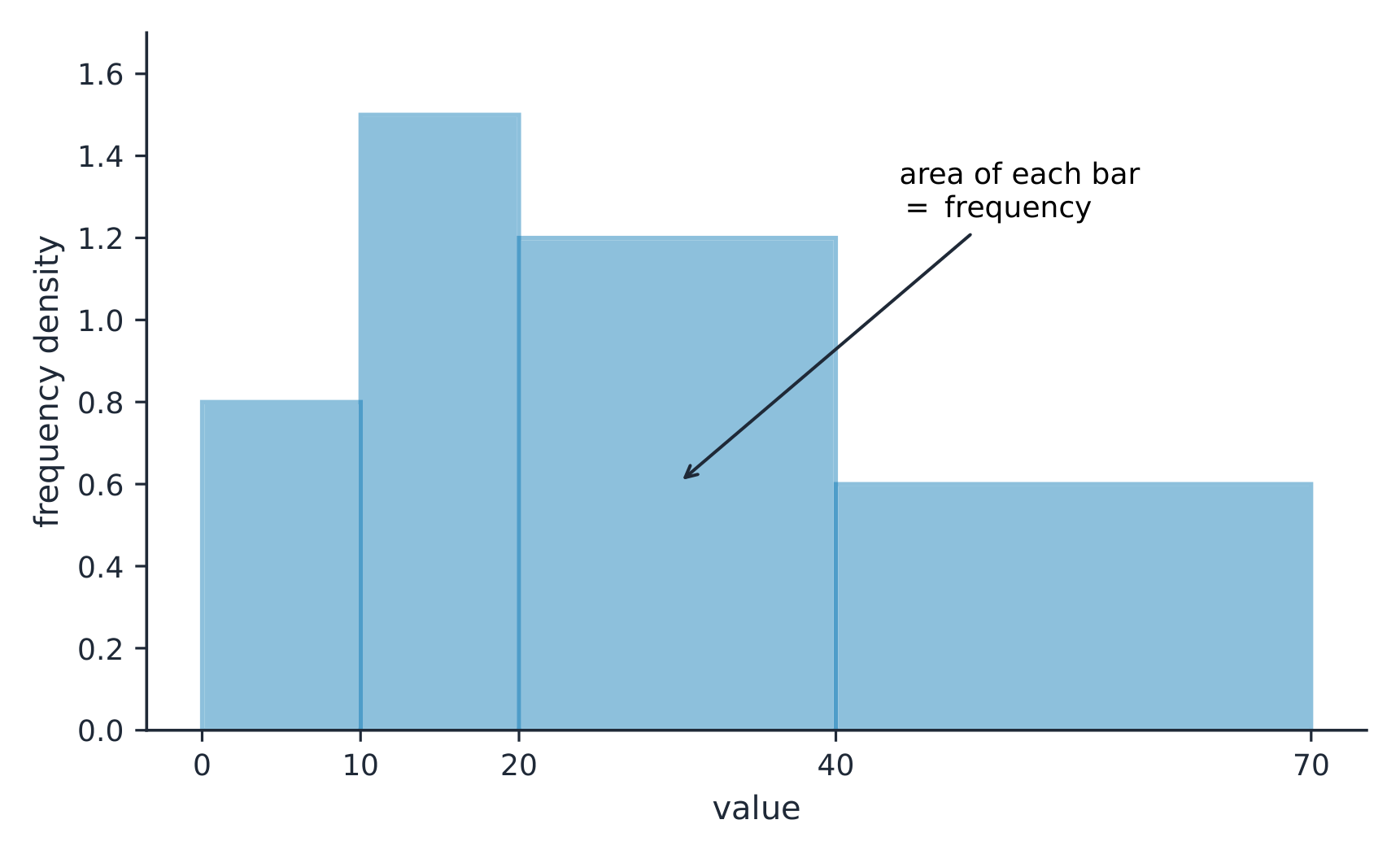
على المخطط التكراري ذو العرض غير المتساوٍ للفئات، مساحة الشريط هي التواتر
Explore · ⁨استكشف⁩

Explore how bin width shapes a histogram · ⁨استكشف كيف يؤثر عرض الشريط على شكل المدرجة التكرارية⁩

A histogram groups data into equal-width bins and draws a bar over each. Change the bins and notice how the same data can look jagged (too narrow) or smooth (too wide) — the shape is a choice. · ⁨المدرجة التكرارية تجمع البيانات في شرائط متساوية العرض وترسم عموداً فوق كل شريط. غيّر الشرائط ولاحظ كيف يمكن أن تبدو نفس البيانات متعرجة (ضيقة جداً) أو سلسة (واسعة جداً) — الشكل اختيار.⁩

Vocabulary · ⁨مفردات⁩ Train · ⁨تدريب⁩
English العربية
Statistics/stəˈtɪstɪks/ الإحصاء
data/ˈdeɪtə/ البيانات
variation/ˌveərɪˈeɪʃn/ التنوع
parameter/pəˈræmɪtə/ معامل
statistic/stəˈtɪstɪk/ إحصاء
descriptive statistics/dɪˈskrɪptɪv stəˈtɪstɪks/ الإحصاء الوصفي
inferential statistics/ɪnfəˈrenʃl stəˈtɪstɪks/ الإحصاء الاستنتاجي
variable/ˈveərɪəbl/ حدث
Categorical/ˌkætɪˈɡɒrɪkl/ فئة
Quantitative/ˈkwɒntɪteɪtɪv/ كمّي
frequency table/ˈfriːkwənsi ˈteɪbl/ جدول التواتر
relative frequency/ˈrelətɪv ˈfriːkwənsi/ التكرار النسبي
proportion/prəˈpɔːʃn/ نسبة
Bar charts/bɑː tʃɑːts/ المخططات الشريطية
dotplot/ˈdɒtplɒt/ المخطط النقطي
stem-and-leaf plot/stem ænd liːf plɒt/ المخطط الجذري-الورقي
histogram/ˈhɪstəɡræm/ مخطط مستند
1.6

Describing the Distribution of a Quantitative Variable · ⁨وصف توزيع متغير كمّي⁩

Syllabus · ⁨المنهج⁩
English

Enduring Understanding (UNC-1): Graphical representations and statistics allow us to identify and represent key features of data.

Learning Objective UNC-1.H: Describe the characteristics of quantitative data distributions. [Skill 2.A]

  • UNC-1.H.1 Descriptions of the distribution of quantitative data include shape, center, and variability (spread), as well as any unusual features such as outliers, gaps, clusters, or multiple peaks.
  • UNC-1.H.2 Outliers for one-variable data are data points that are unusually small or large relative to the rest of the data.
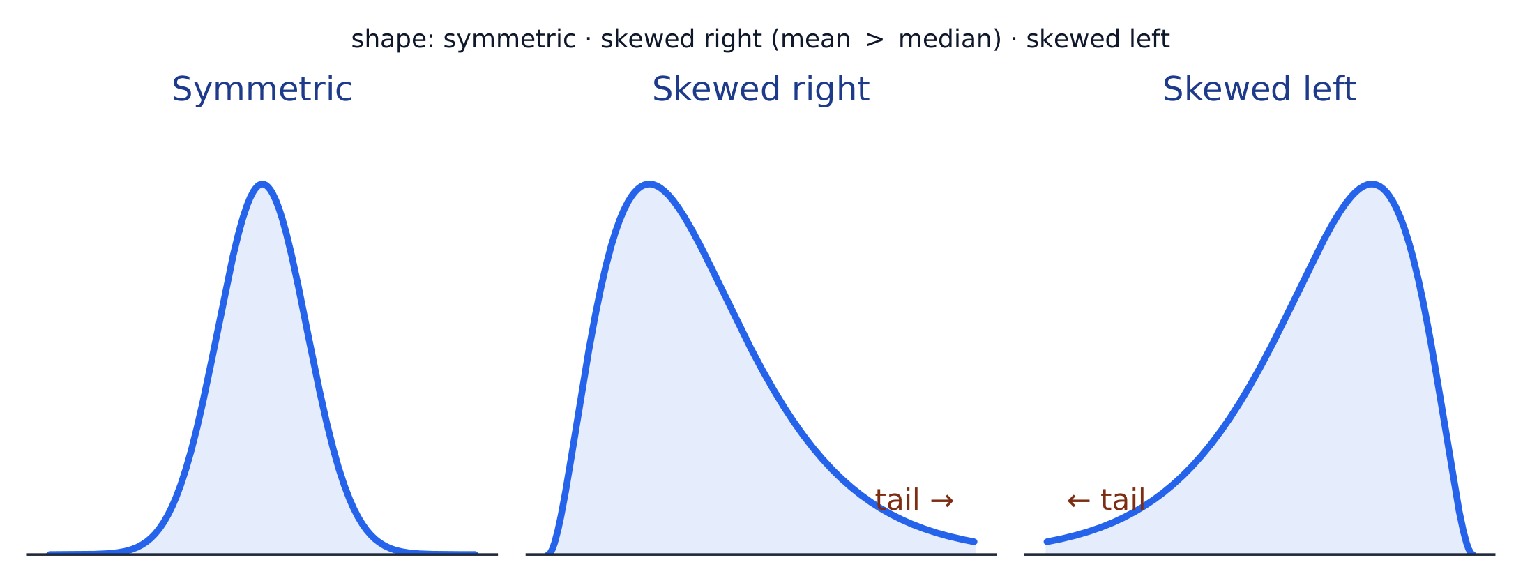
  • UNC-1.H.3 A distribution is skewed to the right (positive skew) if the right tail is longer than the left. A distribution is skewed to the left (negative skew) if the left tail is longer than the right. A distribution is symmetric if the left half is the mirror image of the right half.
  • UNC-1.H.4 Univariate graphs with one main peak are known as unimodal. Graphs with two prominent peaks are bimodal. A graph where each bar height is approximately the same (no prominent peaks) is approximately uniform.
  • UNC-1.H.5 A gap is a region of a distribution between two data values where there are no observed data.
  • UNC-1.H.6 Clusters are concentrations of data usually separated by gaps.
  • UNC-1.H.7 Descriptive statistics does not attribute properties of a data set to a larger population, but may provide the basis for conjectures for subsequent testing.
العربية

الفهم الدائم (UNC-1): تُمكّننا التمثيلات البيانية والإحصاءات من تحديد وميزة الملامح الرئيسية للبيانات.

هدف التعلم UNC-1.H: وصف خصائص توزيعات البيانات الكمية. [مهارة 2.A]

  • UNC-1.H.1 تشمل وصفات توزيع البيانات الكمية الشكل، والمركز، والتباين (التوزع)، بالإضافة إلى أي ملامح غير معتادة مثل القيم الشاذة، والفجوات، والتجمعات، أو القمم المتعددة.
  • UNC-1.H.2 القيم الشاذة لبيانات متغير واحد هي نقاط بيانات تكون صغيرة جداً أو كبيرة جداً بشكل غير معتاد مقارنة بباقي البيانات.
  • UNC-1.H.3 يكون التوزيع منحرفاً إلى اليمين (انحراف موجب) إذا كان الذيل الأيمن أطول من الأيسر. ويكون التوزيع منحرفاً إلى اليسار (انحراف سالب) إذا كان الذيل الأيسر أطول من اليمين. ويكون التوزيع متماثلاً إذا كانت النصف الأيسر مرآة للنصف الأيمن.
  • UNC-1.H.4 تُعرف الرسوم البيانية أحادية المتغير ذات قمة واحدة رئيسية بأنها أحادية القمة. والرسوم البيانية ذات قممتين بارزتين ثنائية القمة. والرسم البياني الذي يكون فيه ارتفاع كل شريط مقارباً للثابت (بدون قمم بارزة) مقارباً للتجانس.
  • UNC-1.H.5 الفجوة هي منطقة في التوزيع بين قيمتين بيانات حيث لا توجد بيانات مرصودة.
  • UNC-1.H.6 التجمعات هي تراكبات للبيانات عادة ما تكون مفصولة بفجوات.
  • UNC-1.H.7 لا ينسب الإحصاء الوصفي خصائص مجموعة بيانات إلى مجتمع أكبر، ولكنه قد يوفر الأساس لتخمينات للاختبار اللاحق.

Source: College Board AP Course and Exam Description · ⁨المصدر: وصف دورة وامتحان College Board AP⁩

English

Describe four things (remember SOCS):

  • Shape 形状: symmetric, or skewed 偏斜 left/right (a long tail on that side), and how many peaks - one main peak is unimodal 单峰, two prominent peaks bimodal 双峰, and roughly equal bars uniform 均匀.
  • Outliers 离群值: unusual values far from the rest.
  • Center: a typical value (mean or median).
  • Spread: how much the values vary (range, IQR, standard deviation).

Always describe shape/center/spread in context, with units.

العربية

صف أربعة أشياء (تذكر SOCS):

  • الشكل: متماثل، أو ملتوٍ يمينًا/يسارًا (ذيل طويل على تلك الجهة)، وعدد القمم - قمة رئيسية واحدة هي ذروة واحدة، وقمتان بارزتان هما ذروتان، وأشرطة متساوية تقريبًا هي منتظمة.
  • القيم الشاذة: قيم غير معتادة بعيدة عن الباقي.
  • الوسط: قيمة نموذجية (متوسط أو وسطي).
  • التشتت: مدى تفاوت القيم (المدى، المدى الربيعي، الانحراف المعياري).

صف دائماً الشكل/المركز/التشتت في السياق، مع الوحدات.

شكل التوزيع: متماثل، مائل لليمين (ذيل أيمن طويل)، أو مائل لليسار
Vocabulary · ⁨مفردات⁩ Train · ⁨تدريب⁩
English العربية
distribution/ˌdɪstrɪˈbjuːʃn/ التوزيع
Shape/ʃeɪp/ الشكل
skewed/skjuːd/ ملتوياً
unimodal/ˌʌnɪˈmɒdl/ ذو شكل واحد
bimodal/baɪˈmɒdl/ ذو شكلين
uniform/ˈjuːnɪfɔːm/ موحد
Outliers/ˈaʊtlaɪəz/ القيم المتطرفة
mean/miːn/ متوسط
median/ˈmiːdiːən/ الوسيط
interquartile range/ˌɪntəˈkwɔːtaɪl reɪndʒ/ المدى الربيعي
1.7

Summary Statistics for a Quantitative Variable · ⁨إحصائيات ملخصة للمتغير الكمي⁩

Syllabus · ⁨المنهج⁩
English

Enduring Understanding (UNC-1): Graphical representations and statistics allow us to identify and represent key features of data.

Learning Objective UNC-1.I: Calculate measures of center and position for quantitative data. [Skill 2.C]

  • UNC-1.I.1 A statistic is a numerical summary of sample data.
  • UNC-1.I.2 The mean is the sum of all the data values divided by the number of values. For a sample, the mean is denoted by $x$-bar: $\bar{x} = \dfrac{1}{n}\sum_{i=1}^{n} x_i$, where $x_i$ represents the $i^{\text{th}}$ data point in the sample and $n$ represents the number of data values in the sample.
  • UNC-1.I.3 The median of a data set is the middle value when data are ordered. When the number of data points is even, the median can take on any value between the two middle values. In AP Statistics, the most commonly used value for the median of a data set with an even number of values is the average of the two middle values.
  • UNC-1.I.4 The first quartile, Q1, is the median of the half of the ordered data set from the minimum to the position of the median. The third quartile, Q3, is the median of the half of the ordered data set from the position of the median to the maximum. Q1 and Q3 form the boundaries for the middle 50% of values in an ordered data set.
  • UNC-1.I.5 The $p^{\text{th}}$ percentile is interpreted as the value that has $p\%$ of the data less than or equal to it.

Learning Objective UNC-1.J: Calculate measures of variability for quantitative data. [Skill 2.C]

  • UNC-1.J.1 Three commonly used measures of variability (or spread) in a distribution are the range, interquartile range, and standard deviation.
  • UNC-1.J.2 The range is defined as the difference between the maximum data value and the minimum data value. The interquartile range (IQR) is defined as the difference between the third and first quartiles: $Q3 - Q1$. Both the range and the interquartile range are possible ways of measuring variability of the distribution of a quantitative variable.
  • UNC-1.J.3 Standard deviation is a way to measure variability of the distribution of a quantitative variable. For a sample, the standard deviation is denoted by $s$: $s_x = \sqrt{\dfrac{1}{n-1}\sum(x_i - \bar{x})^2}$. The square of the sample standard deviation, $s^2$, is called the sample variance.
  • UNC-1.J.4 Changing units of measurement affects the values of the calculated statistics.

Learning Objective UNC-1.K: Explain the selection of a particular measure of center and/or variability for describing a set of quantitative data. [Skill 4.B]

  • UNC-1.K.1 There are many methods for determining outliers. Two methods frequently used in this course are:
    • UNC-1.K.1.i An outlier is a value greater than $1.5 \times \text{IQR}$ above the third quartile or more than $1.5 \times \text{IQR}$ below the first quartile.
    • UNC-1.K.1.ii An outlier is a value located 2 or more standard deviations above, or below, the mean.
  • UNC-1.K.2 The mean, standard deviation, and range are considered nonresistant (or non-robust) because they are influenced by outliers. The median and IQR are considered resistant (or robust), because outliers do not greatly (if at all) affect their value.
العربية

الفهم الدائم (UNC-1): تُمكّننا التمثيلات البيانية والإحصاءات من تحديد وميزة الملامح الرئيسية للبيانات.

هدف التعلم UNC-1.I: حساب مقاييس المركز والموضع للبيانات الكمية. [مهارة 2.C]

  • UNC-1.I.1 الإحصاء هو تلخيص رقمي لبيانات العينة.
  • UNC-1.I.2 المتوسط الحسابي هو مجموع جميع قيم البيانات مقسوماً على عددها. بالنسبة لعينة، يُرمز للمتوسط بـ $x$-بار: $\bar{x} = \dfrac{1}{n}\sum_{i=1}^{n} x_i$، حيث يُمثل $x_i$ نقطة البيانات $i^{\text{th}}$ في العينة ويمثل $n$ عدد قيم البيانات في العينة.
  • UNC-1.I.3 الوسيط لمجموعة بيانات هو القيمة الوسطى عند ترتيب البيانات. عندما يكون عدد نقاط البيانات زوجياً، يمكن أن يأخذ الوسيط أي قيمة بين القيمتين الوسطيتين. في إحصاء AP، القيمة الأكثر شيوعاً للوسيط لمجموعة بيانات ذات عدد زوجي من القيم هي متوسط القيمتين الوسطيتين.
  • UNC-1.I.4 الربيع الأول، Q1، هو وسطي نصف مجموعة البيانات المرتبة من الحد الأدنى إلى موقع الوسيط. الربيع الثالث، Q3، هو وسطي نصف مجموعة البيانات المرتبة من موقع الوسيط إلى الحد الأقصى. يشكلان Q1 وQ3 الحدود لـ 50% من القيم في مجموعة بيانات مرتبة.
  • UNC-1.I.5 تُفسَّر $p^{\text{th}}$ المئوي على أنه القيمة التي تكون أقل منها أو تساويها $p\%$ من البيانات.

هدف التعلم UNC-1.J: حساب مقاييس التشتت للبيانات الكمية. [مهارة 2.C]

  • UNC-1.J.1 ثلاثة مقاييس شائعة للتشتت (أو الانتشار) في التوزيع هي المدى، والمدى الربيعي، والانحراف المعياري.
  • UNC-1.J.2 يُعرّف المدى بأنه الفرق بين أكبر قيمة للبيانات وأصغرها. يُعرّف المدى الربيعي (IQR) بأنه الفرق بين الربيع الثالث والأول: $Q3 - Q1$. كل من المدى والمدى الربيعي طرق محتملة لقياس تشتت توزيع متغير كمي.
  • UNC-1.J.3 الانحراف المعياري هو طريقة لقياس تشتت توزيع متغير كمي. بالنسبة لعينة، يُرمز للانحراف المعياري بـ $s$: $s_x = \sqrt{\dfrac{1}{n-1}\sum(x_i - \bar{x})^2}$. مربع انحراف العينة المعياري، $s^2$، يسمى تباين العينة.
  • UNC-1.J.4 تغيير وحدات القياس يؤثر على قيم الإحصاءات المحسوبة.

هدف التعلم UNC-1.K: شرح اختيار مقياس معين للمركز و/أو التشتت لوصف مجموعة من البيانات الكمية. [مهارة 4.B]

  • UNC-1.K.1 توجد العديد من الطرق لتحديد القيم الشاذة. طريقتان مستخدمتان بشكل متكرر في هذا المقرر هما:
    • UNC-1.K.1.i القيمة الشاذة هي قيمة تزيد عن $1.5 \times \text{IQR}$ فوق الربيع الثالث أو تقل عن $1.5 \times \text{IQR}$ تحت الربيع الأول.
    • UNC-1.K.1.ii القيمة الشاذة هي قيمة تقع على بعد 2 أو أكثر من الانحرافات المعيارية فوق أو تحت المتوسط.
  • UNC-1.K.2 يُعتبر المتوسط والانحراف المعياري والمدى غير مقاوم (أو غير قوي) لأنها تتأثر بالقيم الشاذة. يُعتبر الوسيط والمدى الربيعي مقاوم (أو قوي)، لأن القيم الشاذة لا تؤثر بشكل كبير (إن أثرت أصلاً) على قيمتها.

Source: College Board AP Course and Exam Description · ⁨المصدر: وصف دورة وامتحان College Board AP⁩

English
Standard deviation: spread about the mean
  • Center: the mean 均值 $\bar{x}=\dfrac{\sum x_i}{n}$ (average) and the median 中位数 (middle value). The median resists outliers; the mean is pulled toward a skew.
  • Spread: the range, the interquartile range 四分位距 $\text{IQR}=Q_3-Q_1$ (middle 50%), and the standard deviation 标准差 $s_x=\sqrt{\dfrac{\sum(x_i-\bar{x})^2}{n-1}}$ (typical distance from the mean; its square is the variance 方差).
  • The five-number summary 五数概括: min, $Q_1$, median, $Q_3$, max.

Use resistant measures (median, IQR) for skewed data; mean and standard deviation for roughly symmetric data.

The percentile 百分位数 of a value is the percent of the data at or below it – so the median is the 50th percentile and $Q_1$ the 25th. A cumulative relative frequency graph 累积相对频率图 makes percentiles easy to read: for each value it plots the proportion of the data at or below it, rising from 0 to 1. Go up from a value to the curve and across to its percentile, or reverse the steps to find the value at a given percentile (the same reading works from a cumulative-frequency table).

Worked example. For the data $4, 8, 6, 10, 7$: the mean is $\bar{x}=\dfrac{4+8+6+10+7}{5}=\dfrac{35}{5}=7$. Sorting to $4,6,7,8,10$, the median is the middle value, $7$. The mean and median agree here because the data are roughly symmetric.

العربية
الانحراف المعياري: التشتت حول المتوسط
  • المركز: المتوسط $\bar{x}=\dfrac{\sum x_i}{n}$ (الأوسط الحسابي) والوسيط (القيمة الوسطى). يرفض الوسيط القيم المتطرفة؛ بينما يُسحب المتوسط نحو الانحياز.
  • التشتت: المدى، المدى الربيعي $\text{IQR}=Q_3-Q_1$ (الـ 50% الوسطى)، والانحراف المعياري $s_x=\sqrt{\dfrac{\sum(x_i-\bar{x})^2}{n-1}}$ (المسافة النموذجية عن المتوسط؛ مربعه هو التباين).
  • ملخص الخمس أرقام: الحد الأدنى، $Q_1$، الوسيط، $Q_3$، الحد الأعلى.

استخدم مقاييس مقاومة (الوسيط، المدى الربيعي) للبيانات المنحازة؛ والمتوسط والانحراف المعياري للبيانات المتماثلة تقريباً.

المستوى المئوي للقيمة هو النسبة المئوية من البيانات التي تساويها أو تقع دونها – لذا الوسيط هو المستوى المئوي 50 و$Q_1$ هو المستوى المئوي 25. يجعل الرسم البياني للتكرار النسبي التراكمي قراءة المستويات المئوية سهلة: لكل قيمة يرسم نسبة البيانات المساوية لها أو أدنى منها، تصعد من 0 إلى 1. اذهب للأعلى من قيمة إلى المنحنى ثم أفقياً لمستواها المئوي، أو عكس الخطوات لإيجاد القيمة عند مستوى مئوي محدد (نفس القراءة تعمل من جدول التكرار التراكمي).

مثال محلل. للبيانات $4, 8, 6, 10, 7$: المتوسط هو $\bar{x}=\dfrac{4+8+6+10+7}{5}=\dfrac{35}{5}=7$. بالترتيب إلى $4,6,7,8,10$، الوسيط هو القيمة الوسطى، $7$. يتفق المتوسط والوسيط هنا لأن البيانات متماثلة تقريباً.

Vocabulary · ⁨مفردات⁩ Train · ⁨تدريب⁩
English العربية
standard deviation/ˈstændəd ˌdiːvɪˈeɪʃn/ الانحراف المعياري
variance/ˈveərɪəns/ التباين
five-number summary/faɪv ˈnʌmbə ˈsʌməri/ ملخص الخمس قيم
percentile/pəˈsentaɪl/ المئوي
cumulative relative frequency graph/ˈkjuːmjʊlətɪv ˈrelətɪv ˈfriːkwənsi ɡræf/ مخطط التواتر النسبي التراكمي
1.8

Graphical Representations of Summary Statistics · ⁨التمثيلات البيانية للإحصائيات الملخصة⁩

Syllabus · ⁨المنهج⁩
English

Enduring Understanding (UNC-1): Graphical representations and statistics allow us to identify and represent key features of data.

Learning Objective UNC-1.L: Represent summary statistics for quantitative data graphically. [Skill 2.B]

  • UNC-1.L.1 Taken together, the minimum data value, the first quartile (Q1), the median, the third quartile (Q3), and the maximum data value make up the five-number summary.
  • UNC-1.L.2 A boxplot is a graphical representation of the five-number summary (minimum, first quartile, median, third quartile, maximum). The box represents the middle 50% of data, with a line at the median and the ends of the box corresponding to the quartiles. Lines ("whiskers") extend from the quartiles to the most extreme point that is not an outlier, and outliers are indicated by their own symbol beyond this.

Learning Objective UNC-1.M: Describe summary statistics of quantitative data represented graphically. [Skill 2.A]

  • UNC-1.M.1 Summary statistics of quantitative data, or of sets of quantitative data, can be used to justify claims about the data in context.
  • UNC-1.M.2 If a distribution is relatively symmetric, then the mean and median are relatively close to one another. If a distribution is skewed right, then the mean is usually to the right of the median. If the distribution is skewed left, then the mean is usually to the left of the median.
العربية

الفهم الدائم (UNC-1): تُمكّننا التمثيلات البيانية والإحصاءات من تحديد وميزة الملامح الرئيسية للبيانات.

هدف التعلم UNC-1.L: تمثيل الإحصاءات الموجزة للبيانات الكمية بيانياً. [مهارة 2.B]

  • UNC-1.L.1 معاً، تشكل قيمة البيانات الدنيا، والربيع الأول (Q1)، والوسيط، والربيع الثالث (Q3)، وقيمة البيانات العليا ملخصاً من خمس قيم.
  • UNC-1.L.2 الرسم الصندوقي هو تمثيل بياني وملخص من خمس قيم (الحد الأدنى، الربيع الأول، الوسيط، الربيع الثالث، الحد الأعلى). يمثل الصندوق الـ 50% الوسطى من البيانات، مع خط عند الوسيط وأطراف الصندوق المقابلة للربيعات. تمتد الخطوط ("الشوارب") من الربيعات إلى النقطة الأكثر تطرفاً التي ليست قيمة شاذة، وتُشار إلى القيم الشاذة برموز خاصة beyond this.

هدف التعلم UNC-1.M: وصف الإحصاءات الموجزة للبيانات الكمية الممثلة بيانياً. [مهارة 2.A]

  • UNC-1.M.1 يمكن استخدام الإحصاءات الموجزة للبيانات الكمية، أو مجموعات البيانات الكمية، لتبرير الادعاءات حول البيانات في السياق.
  • UNC-1.M.2 إذا كان التوزيع متماثلاً نسبياً، فإن المتوسط والوسيط قريبان نسبياً من بعضهما البعض. إذا كان التوزيع منحازاً لليمين، فعادة ما يكون المتوسط إلى يمين الوسيط. إذا كان التوزيع منحازاً لليسار، فعادة ما يكون المتوسط إلى يسار الوسيط.

Source: College Board AP Course and Exam Description · ⁨المصدر: وصف دورة وامتحان College Board AP⁩

English

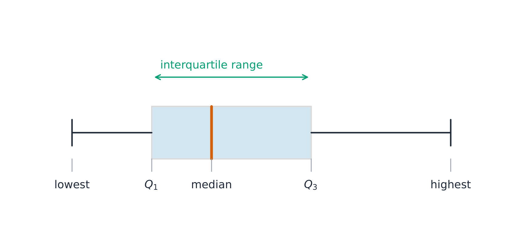
A boxplot 箱线图 draws the five-number summary: a box from $Q_1$ to $Q_3$ with the median inside, and whiskers to the most extreme non-outlier values. A point is an outlier if it lies more than $1.5\times\text{IQR}$ beyond a quartile – a rule you may be asked to apply. Boxplots are ideal for comparing several groups side by side.

Worked example. A dataset has $Q_1=20$ and $Q_3=32$, so $\text{IQR}=12$. The outlier fences are $Q_1-1.5(12)=2$ and $Q_3+1.5(12)=50$. Any value below $2$ or above $50$ is flagged as an outlier.

العربية

الرسم الصندوقي يرسم ملخص الخمس أرقام: صندوق من $Q_1$ إلى $Q_3$ مع الوسيط بداخله، وعيون للقيم المتطرفة الأكثر تطرفاً غير المتطرفة. النقطة تعتبر قيمة متطرفة إذا كانت تبعد أكثر من $1.5\times\text{IQR}$ عن أحد الربيعات – وهي قاعدة قد يُطلب منك تطبيقها. الرسم الصندوقي مثالي لمقارنة عدة مجموعات جنباً إلى جنب.

مثال محلل. مجموعة بيانات بها $Q_1=20$ و$Q_3=32$، إذن $\text{IQR}=12$. حدود القيم المتطرفة هي $Q_1-1.5(12)=2$ و$Q_3+1.5(12)=50$. أي قيمة أقل من $2$ أو أعلى من $50$ تُصنف كقيمة متطرفة.

مخطط الصندوق والذيل يظهر الربيعات والمدى
رسم صندوقي يظهر الربيعات والمدى
رسم الصندوق يرخص الملخص الخمسي; الامتداد يمثل IQR
رسم صندوقي يرسم ملخص الخمس أرقام؛ الصندوق يغطي المدى الربيعي
Explore · ⁨استكشف⁩

Explore the five-number summary as a boxplot · ⁨استكشف ملخص الخمس أرقام كمخطط صندوقي⁩

Drag $Q_1$, the median, and $Q_3$ to see the box (its length is the IQR) and how the median's position inside the box reveals skew — a median close to $Q_1$ signals a right-skewed distribution. · ⁨اسحب $Q_1$، الوسيط، و$Q_3$ لرؤية الصندوق (طول هو IQR) وكيف يكشف موقع الوسيط داخل الصندوق عن الانحراف — الوسيط القريب من $Q_1$ يشير إلى توزيع منحرف لليمين.⁩

Vocabulary · ⁨مفردات⁩ Train · ⁨تدريب⁩
English العربية
boxplot/ˈbɒksplɒt/ مخطط الصندوق
normal distribution/ˈnɔːml ˌdɪstrɪˈbjuːʃn/ التوزيع الطبيعي
1.9

Comparing Distributions of a Quantitative Variable · ⁨مقارنة توزيعات المتغير الكمي⁩

Syllabus · ⁨المنهج⁩
English

Enduring Understanding (UNC-1): Graphical representations and statistics allow us to identify and represent key features of data.

Learning Objective UNC-1.N: Compare graphical representations for multiple sets of quantitative data. [Skill 2.D]

  • UNC-1.N.1 Any of the graphical representations, e.g., histograms, side-by-side boxplots, etc., can be used to compare two or more independent samples on center, variability, clusters, gaps, outliers, and other features.

Learning Objective UNC-1.O: Compare summary statistics for multiple sets of quantitative data. [Skill 2.D]

  • UNC-1.O.1 Any of the numerical summaries (e.g., mean, standard deviation, relative frequency, etc.) can be used to compare two or more independent samples.
العربية

الفهم الدائم (UNC-1): تُمكّننا التمثيلات البيانية والإحصاءات من تحديد وميزة الملامح الرئيسية للبيانات.

هدف التعلم UNC-1.N: مقارنة التمثيلات البيانية لمجموعات متعددة من البيانات الكمية. [مهارة 2.D]

  • UNC-1.N.1 يمكن استخدام أي من التمثيلات البيانية، مثل المدرجات التكرارية، والرسومات الصندوقية جنباً إلى جنب، إلخ، لمقارنة عينتين مستقلتين أو أكثر من حيث المركز، والتشتت، والتكتلات، والفجوات، والقيم الشاذة، والميزات الأخرى.

هدف التعلم UNC-1.O: مقارنة الإحصاءات الموجزة لمجموعات متعددة من البيانات الكمية. [مهارة 2.D]

  • UNC-1.O.1 يمكن استخدام أي من الملخصات العددية (مثل المتوسط، والانحراف المعياري، والتردد النسبي، إلخ) لمقارنة عينتين مستقلتين أو أكثر.

Source: College Board AP Course and Exam Description · ⁨المصدر: وصف دورة وامتحان College Board AP⁩

English

To compare two or more groups, compare shape, center, and spread, and mention outliers – always with comparative words ("Group A has a higher median than Group B") and in context. Do not just describe each group separately; make the comparison explicit.

العربية

لمقارنة مجموعتين أو أكثر، قارن الشكل والمركز والتشتت، واذكر القيم المتطرفة – دائماً بكلمات مقارنة ("المجموعة أ لها وسيط أعلى من المجموعة ب") وفي السياق. لا تصف كل مجموعة على حدة فقط؛ اجعل المقارنة صريحة.

Explore · ⁨استكشف⁩

Compare distributions with box plots · ⁨قارن التوزيعات بمخططات الصناديق⁩

A box plot draws the five-number summary. Placing two box plots on the same scale compares their centre (median), spread (IQR = box width) and skew at a glance — the fair way to compare groups. · ⁨المخطط الصندوقي يرسم ملخص الخمس أرقام. وضع مخططين صندوقيين على نفس المقياس يقارن مركزهما (الوسيط)، انتشارهما (IQR = عرض الصندوق) وانحرافهما بنظرة واحدة — الطريقة العادلة لمقارنة المجموعات.⁩

1.10

The Normal Distribution · ⁨التوزيع الطبيعي⁩

Syllabus · ⁨المنهج⁩
Enduring UnderstandingLearning ObjectiveEssential Knowledge

VAR-2
The normal distribution can be used to represent some population distributions.

VAR-2.A
Compare a data distribution to the normal distribution model. [Skill 2.D]

  • VAR-2.A.1 A parameter is a numerical summary of a population.
  • VAR-2.A.2 Some sets of data may be described as approximately normally distributed. A normal curve is mound-shaped and symmetric. The parameters of a normal distribution are the population mean, $\mu$, and the population standard deviation, $\sigma$.
  • VAR-2.A.3 For a normal distribution, approximately 68% of the observations are within 1 standard deviation of the mean, approximately 95% of observations are within 2 standard deviations of the mean, and approximately 99.7% of observations are within 3 standard deviations of the mean. This is called the empirical rule.
  • VAR-2.A.4 Many variables can be modeled by a normal distribution.
    • Illustrative examples for VAR-2.A:
      • Variables that can be modeled by a normal distribution:
        • Body temperature
        • Weight of a loaf of bread

VAR-2.B
Determine proportions and percentiles from a normal distribution. [Skill 3.A]

  • VAR-2.B.1 A standardized score for a particular data value is calculated as (data value − mean)/(standard deviation), and measures the number of standard deviations a data value falls above or below the mean.
  • VAR-2.B.2 One example of a standardized score is a $z$-score, which is calculated as $z\text{-score} = \left(\dfrac{x_i - \mu}{\sigma}\right)$. A $z$-score measures how many standard deviations a data value is from the mean.
  • VAR-2.B.3 Technology, such as a calculator, a standard normal table, or computer-generated output, can be used to find the proportion of data values located on a given interval of a normally distributed random variable.
  • VAR-2.B.4 Given the area of a region under the graph of the normal distribution curve, it is possible to use technology, such as a calculator, a standard normal table, or computer-generated output, to estimate parameters for some populations.

VAR-2.C
Compare measures of relative position in data sets. [Skill 2.D]

  • VAR-2.C.1 Percentiles and $z$-scores may be used to compare relative positions of points within a data set or between data sets.

Source: College Board AP Course and Exam Description · ⁨المصدر: وصف دورة وامتحان College Board AP⁩

English

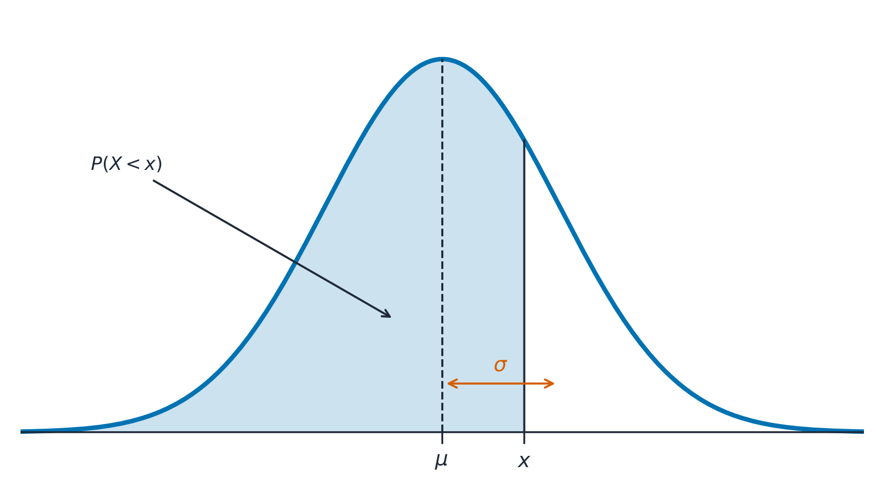
A normal distribution 正态分布 is a symmetric, bell-shaped model described by its mean $\mu$ and standard deviation $\sigma$. The empirical rule 经验法则 (68–95–99.7): about 68% of values lie within $1\sigma$ of the mean, 95% within $2\sigma$, and 99.7% within $3\sigma$.

A $z$-score 标准分数 measures how many standard deviations a value is from the mean:

$$z=\frac{x-\mu}{\sigma}.$$
Convert to a $z$-score, then use the normal table or technology to find the proportion (area) below, above, or between values – and reverse the process to find a value from a given percentile.

Worked example. Test scores are normal with $\mu=500$ and $\sigma=100$. A score of $700$ has $z=\dfrac{700-500}{100}=2$. By the empirical rule, $95\%$ of scores lie within $2\sigma$, so $2.5\%$ lie above $700$ – meaning a $700$ is at about the $97.5$th percentile.

العربية

التوزيع الطبيعي هو نموذج متماثل على شكل جرس توصف بمتوسطه $\mu$ وانحرافه المعياري $\sigma$. القاعدة التجريبية (68-95-99.7): حوالي 68% من القيم تقع ضمن $1\sigma$ من المتوسط، 95% ضمن $2\sigma$، و99.7% ضمن $3\sigma$.

المنحنى الطبيعي: الاحتمال هو المساحة تحته، متمركز حول المتوسط الحسابي

الدرجة المعيارية $z$ تقيس كم انحراف معياري تبعد القيمة عن المتوسط:

$$z=\frac{x-\mu}{\sigma}.$$
حوّل إلى درجة معيارية $z$، ثم استخدم الجدول الطبيعي أو التكنولوجيا لإيجاد النسبة (المساحة) تحت، فوق، أو بين القيم – وعكس العملية لإيجاد قيمة من مستوى مئوي محدد.

مثال محلل. درجات الاختبار تتبع توزيعاً طبيعياً بمتوسط $\mu=500$ وانحراف معياري $\sigma=100$. الدرجة $700$ لها درجة معيارية $z=\dfrac{700-500}{100}=2$. بالقاعدة التجريبية، يقع $95\%$ من الدرجات ضمن $2\sigma$، لذا تقع $2.5\%$ فوق $700$ – مما يعني أن الدرجة $700$ تقبع عند المستوى المئوي تقريباً $97.5$.

المنحنى الطبيعي وقاعدة التجريبية 68-95-99.7
المنحنى الطبيعي والقاعدة التجريبية 68-95-99.7
Explore · ⁨استكشف⁩

Explore area under the normal curve · ⁨استكشف المساحة تحت المنحنى الطبيعي⁩

The proportion of data below a value equals the area under the curve to its left. Shade a tail or a central band to see the 68–95–99.7 empirical rule and read a $z$-score as an area. · ⁨نسبة البيانات أقل من قيمة تساوي المساحة تحت المنحنى على يسارها. ظلل ذيلاً أو حزاماً مركزياً لرؤية قاعدة ⟦68–95–99.7⟧ التجريبية واقرأ درجة $z$ كمساحة.⁩

Vocabulary · ⁨مفردات⁩ Train · ⁨تدريب⁩
English العربية
empirical rule/emˈpɪrɪkl ruːl/ القاعدة التجريبية
$z$-score/ˈzed skɔː/ مقياس $z$
1.10

Exam tips · ⁨نصائح للامتحان⁩

English
  • Describe a distribution by shape, center, spread, and outliers (SOCS) — always in context.
  • The mean is pulled by outliers; the median resists them, so prefer the median for skewed data.
  • For a normal distribution use the 68–95–99.7 rule and z-scores $z=\tfrac{x-\mu}{\sigma}$.
  • Compare distributions with side-by-side boxplots and comment on center, spread, and shape.
  • Standard deviation measures a typical distance from the mean; the IQR pairs with the median.
العربية
  • صف التوزيع بـ الشكل والمركز والتشتت والقيم المتطرفة (SOCS) – دائماً في السياق.
  • المتوسط يُسحب بواسطة القيم المتطرفة؛ الوسيط يقاومها، لذا يفضل استخدام الوسيط للبيانات المنحازة.
  • للتوزيع الطبيعي استخدم قاعدة 68–95–99.7 والدرجات المعيارية $z=\tfrac{x-\mu}{\sigma}$.
  • قارن التوزيعات باستخدام الرسوم الصندوقية المتجاوبة وتعليقاً على المركز والتشتت والشكل.
  • يقيس الانحراف المعياري المسافة النموذجية عن المتوسط؛ يرتبط المدى الربيعي بالوسيط.

Interactive lessons on this topic · ⁨دروس تفاعلية حول هذا الموضوع⁩

Work through it step by step, with instant-check exercises. · ⁨ا-working عليه خطوة بخطوة، مع تمارين تحقق فوري.⁩

Past Papers · ⁨أوراق الامتحانات السابقة⁩

More topics in AP Statistics · ⁨AP الإحصاء⁩ · ⁨المزيد من المواضيع في AP Statistics · ⁨AP الإحصاء⁩⁩

Log in or create account · ⁨تسجيل الدخول أو إنشاء حساب⁩

IGCSE, A-Level & AP