Skip to content · ⁨コンテンツへスキップ⁩

Principles of Design · ⁨デザイン原理⁩

AP 2-D Art and Design · ⁨AP 2Dアート&デザイン⁩ · Topic 2 · ⁨トピック 2⁩

View Slides · ⁨查看幻灯片⁩ Train · ⁨練習する⁩
Video lesson for this topic · ⁨このトピックのビデオレッスン⁩ Open the video page · ⁨動画ページを開く⁩
7:20

デザイン原理

この絵を三秒間見てください。あなたの目は最初どこへ向きました吗?ほとんど所有人都看向同一个地方——中间的两张明亮的面孔。那是…

English narration · English + 中文 subtitles burned in · ⁨英語ナレーション・英語+中文字幕 burning-in⁩

2.1

Balance · ⁨バランス⁩

Syllabus · ⁨シラバス⁩
English

Focus: Balance is the visual distribution of weight in a composition so it feels stable.

  • Symmetrical (formal) balance mirrors both sides of a central axis — calm and orderly.
  • Asymmetrical (informal) balance uses different elements of equal visual weight — dynamic and lively.
  • Radial balance arranges elements around a central point.
  • Visual weight is affected by size, colour, value, texture, and position.
  • A large, dull shape can balance a small, bright one on the other side.
日本語

**焦点:**均衡是构图中视觉重量的分布,使其看起来稳定。

  • 对称(正式)均衡沿中心轴镜像两侧——显得平静有序。
  • 不对称(非正式)均衡使用不同但视觉重量相等的元素——显得动态活泼。
  • 辐射均衡围绕中心点排列元素。
  • 视觉重量受大小、颜色、明度、质感和位置影响。
  • 一侧的大面积暗色形状可以平衡另一侧的小面积亮色形状。

Source: College Board AP Course and Exam Description · ⁨出典: College Board AP コースおよび試験説明書⁩

English
Balance: symmetrical, asymmetrical, radial

The principles of design 设计原则 are the "rules" for arranging the elements of art. The first is balance 平衡 — the visual distribution of weight so a work feels stable.

  • Symmetrical (formal) balance 对称平衡 mirrors both sides of a central axis — calm and orderly.
  • Asymmetrical (informal) balance 非对称平衡 uses different elements of equal visual weight 视觉重量 — dynamic and lively.
  • Radial balance 辐射平衡 arranges elements around a central point.

Visual weight is affected by size, colour, value, and position: a small bright shape can balance a large dull one.

日本語
バランス:対称、非対称、放射状

デザイン原則とは、芸術の要素を配置するための「ルール」です。最初の原则はバランス——作品が安定して見えるように重みの視覚的な分布を行うことです。

3種類のバランス:対称、非対称、放射状
対称バランスは中央軸を鏡のように映し出します;非対称バランスは異なる要素の重みを調整します;放射状バランスは中心から外側へ放たれます
  • 対称(形式)バランスは中央軸の両側を鏡のように映し出し、落ち着きがあり整然としています。
  • 非対称(自由)バランスは等しい視覚的重みを持つ異なる要素を用い、ダイナミックで生き生きとしています。
  • 放射状バランス は、要素を中央の点の周りに配置します。

視覚的重みは大きさ、色、明度、位置に影響を受けます。小さな鮮やかな形状は、大きなくすんだ形状と釣り合うことができます。

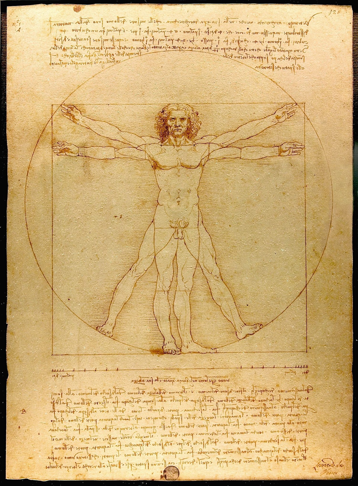
レオナルドの墨絵、腕と脚を広げた男性が円と正方形の両方に収められている
レオナルドの『ウィトルビウスの人』:人物は中央の垂直軸についてほぼ完全な対称性で描かれており、周囲の円が放射状のバランスも与えています
ピクチャープレーン全体に光、塊、興味の関心を均衡させた構図
Explore · ⁨探索⁩

Which kind of balance? · ⁨どのような種類のバランスか?⁩

Symmetrical balance mirrors a central axis; asymmetrical balance weighs different elements of equal visual weight; radial balance radiates from a centre. · ⁨対称的バランスは中央軸で鏡像する;非対称的バランスは視覚的な重みが等しい異なる要素で釣り合う;放射状バランスは中心から放射する。⁩

Vocabulary · ⁨語彙⁩ Train · ⁨練習する⁩
English 日本語
principles of design/ˈprɪnsɪplz ɒv dɪˈzaɪn/ デザインの原理
balance/ˈbæləns/ バランス
Symmetrical (formal) balance/sɪˈmetrɪkl ˈbæləns/ 対称的(形式の)バランス
Asymmetrical (informal) balance/ˌeɪsɪˈmetrɪkl ˈbæləns/ 非対称的( informal )バランス
visual weight/ˈvɪʒuːəl weɪt/ 視覚的重み
Radial balance/ˈreɪdɪəl ˈbæləns/ 放射状バランス
Emphasis/ˈemfəsɪs/ 強調
focal point/ˈfəʊkl pɔɪnt/ 焦点
Subordination/ˌsʌbɔːdɪˈneɪʃn/ 従属
Contrast/ˈkɒntræst/ コントラスト
visual hierarchy/ˈvɪʒuːəl ˈhaɪərɑːki/ 視覚的階層性
2.2

Emphasis and Focal Point · ⁨強調と焦点⁩

Syllabus · ⁨シラバス⁩
English

Focus: Emphasis makes one part of a work stand out as the centre of interest (the focal point).

  • A focal point is where the eye is drawn first; emphasis creates it.
  • Emphasis is built through contrast — of size, colour, value, isolation, or placement.
  • Convergence (lines that point) and the rule of thirds help locate a strong focal point.
  • Subordination keeps other areas quieter so the focal point leads.
  • A work may have one dominant focal point and smaller secondary accents.
日本語

**焦点:**强调使作品的某一部分突出成为兴趣中心(视觉中心)。

  • 视觉中心是视线最先被吸引的地方;强调作用由此产生。
  • 强调通过对比建立——包括大小、颜色、明度、孤立感或位置的对比。
  • 线条汇聚(指向线)和三分法有助于定位强有力的视觉中心。
  • 従属 は、他の部分を静かに保ち、焦点が主導権を握るようにします。
  • 作品可能有一个主导视觉中心和较小的次要强调点。

Source: College Board AP Course and Exam Description · ⁨出典: College Board AP コースおよび試験説明書⁩

English

Emphasis 强调 makes one part of a work stand out as the centre of interest — the focal point 视觉焦点, where the eye is drawn first.

  • Emphasis is created through contrast — of size, colour, value, isolation, or placement.
  • Leading lines and the rule of thirds help place a strong focal point.
  • Subordination 从属 keeps other areas quieter so the focal point leads.
日本語

強調とは、作品の一部を関心の中心である焦点として際立たせることで、最初に目が引きつけられる場所を作ることです。

  • 強調は、大きさ、色、明度、孤立、配置の対比を通じて作られます。
  • リーディングラインと三分割の法則は、強力な焦点を配置するのに役立ちます。
  • 従属 は、他の部分を静かに保ち、焦点が主導権を握るようにします。
2.3

Contrast · ⁨対比⁩

Syllabus · ⁨シラバス⁩
English

Focus: Contrast is the difference between elements — it creates energy, variety, and readability.

  • Contrast can be of value (light/dark), colour (complementary), shape, texture, or size.
  • Strong contrast attracts attention and defines a focal point.
  • Low contrast unifies a work and can feel calm, subtle, or moody.
  • Contrast in direction (horizontal vs diagonal) adds movement.
  • In graphic design, value and size contrast create clear visual hierarchy.
日本語

**焦点:**对比是元素之间的差异——它创造能量、变化和可读性。

  • 对比可以是明度(深浅)、色彩(互补)、形状、质感或大小。
  • 強いコントラストは注目を集め、焦点を定義します。
  • 低对比度统一画面,可能显得平静、微妙或多愁善感。
  • 方向对比(水平与对角线)增加动感。
  • 在平面设计中,明度和大小的对比能建立清晰的视觉层级。

Source: College Board AP Course and Exam Description · ⁨出典: College Board AP コースおよび試験説明書⁩

English

Contrast 对比 is the difference between elements — it creates energy, variety, and readability.

  • Contrast can be of value (light/dark), colour (complementary), shape, texture, or size.
  • Strong contrast attracts attention and defines a focal point; low contrast unifies and calms.
  • In design, value and size contrast create clear visual hierarchy 视觉层次.
日本語

対比とは要素間の違いであり、エネルギー、多様性、可読性を生み出します。

  • 対比は、明度(明・暗)、色(補色)、形状、質感、大きさのいずれでもあり得ます。
  • 強い対比は注目を集め、焦点を定義します;低い対比は統一感を与え、落ち着かせます。
  • デザインにおいて、価値観とサイズの対比は明確な視覚的階層を生み出す。
2.4

Movement and Rhythm · ⁨動きとリズム⁩

Syllabus · ⁨シラバス⁩
English

Focus: Movement leads the viewer's eye through a work; rhythm is the repetition that creates a visual beat.

  • Movement is the path the eye takes, guided by line, edges, colour, and placement.
  • Rhythm is created by repeating elements with regular or varied spacing.
  • Types of rhythm: regular (even), flowing (curving), progressive (gradual change), and random.
  • Directional forces (leading lines, gazes, gestures) create implied motion.
  • Repetition with variation keeps rhythm interesting rather than monotonous.
日本語

**焦点:**动势引导观众视线穿过作品;节奏是通过重复产生的视觉节拍。

  • 动势是视线的轨迹,由线条、边缘、颜色和位置引导。
  • 节奏通过有规律或不规律的间隔重复元素而产生。
  • 节奏类型:等距(均匀)、流动(弯曲)、渐变(逐渐变化)和随机。
  • 导向力(引导线、视线、手势)营造出暗示性的运动感。
  • 変化を伴う反復は、単調さを防ぎリズムを興味深いものにする。

Source: College Board AP Course and Exam Description · ⁨出典: College Board AP コースおよび試験説明書⁩

English

Movement 动感 leads the viewer's eye through a work; rhythm 节奏 is the repetition that creates a visual "beat".

  • Movement is the path the eye takes, guided by line, edges, colour, and placement.
  • Rhythm types: regular (even), flowing (curving), progressive 渐进 (gradual change), and random.
  • Repetition with variation keeps rhythm interesting rather than monotonous.
日本語

動きは鑑賞者の視線を作品内へ誘導し、リズムは視覚的な「ビート」を作る反復である。

  • 動きは線、輪郭、色、配置によって導かれる視線の経路である。
  • リズムの種類:規則的(均等)、流れるような(曲線的)、段階的(漸進的な変化)、ランダム。
  • 変化を伴う反復は、単調さを防ぎリズムを興味深いものにする。
暗い村の上を大きな渦巻きの光が広がり、星空を描いたヴァン・ゴッホの絵画
ヴァン・ゴッホ『星夜』:渦巻き状の筆致が空全体に視線を移動させ(動き)、繰り返されるカールが波打つリズムを与える
Vocabulary · ⁨語彙⁩ Train · ⁨練習する⁩
English 日本語
Movement/ˈmuːvmənt/ 動き
rhythm/ˈrɪðəm/ rhythm
progressive/prəˈɡresɪv/ 漸進的
2.5

Pattern and Repetition · ⁨パターンと反復⁩

Syllabus · ⁨シラバス⁩
English

Focus: Repetition reuses an element; pattern is the repeated element arranged in a predictable way.

  • Repetition of shape, colour, or line builds unity and rhythm.
  • A pattern is a repeated motif — regular (grid, tessellation) or irregular.
  • Patterns can fill a shape, define a texture, or become the subject itself.
  • Motif is the single unit that repeats; changing scale or colour varies the pattern.
  • Too much repetition can feel monotonous; variation keeps it engaging.
日本語

**焦点:**重复是复用某一元素;图案是按可预测方式排列的重复元素。

  • 重复形状、颜色或线条能建立统一感和节奏感。
  • 图案是重复的母题——可以是规则的(网格、镶嵌)或不规则的。
  • 图案可以填充形状、定义质感,或直接成为主题本身。
  • モチーフは繰り返される単一の単位であり、スケールや色を変えることでパターンが変化します。
  • 繰り返しが多すぎると単調に感じる場合があります;バリエーションがあることで興味を維持できます。

Source: College Board AP Course and Exam Description · ⁨出典: College Board AP コースおよび試験説明書⁩

English

Repetition 重复 reuses an element; a pattern 图案 is the repeated element arranged in a predictable way.

  • Repetition of shape, colour, or line builds unity and rhythm.
  • A pattern is a repeated motif 母题 — regular (a grid or tessellation) or irregular.
  • Too much repetition feels monotonous; changing scale or colour adds variety.
日本語

反復は要素を再利用すること、パターンは反復した要素が予測可能な形で配置されたものである。

  • 形状、色、線の反復は統一感とリズムを生む。
  • パターンとは反復するモチーフであり、規則的(グリッドやテッセレーション)または不規則である。
  • 反復が多すぎると単調になるため、スケールや色を変えることで多様性を加える。
赤いイチゴと緑の葉の間を青い鳥が通り、同じモチーフが布全体に繰り返される模様の布地
ウィリアム・モリス『ストロベリースナイパー』:イチゴの間の鳥という一つのモチーフが、布全体に規則的なパターンで繰り返されている
Vocabulary · ⁨語彙⁩ Train · ⁨練習する⁩
English 日本語
Repetition/ˌrepəˈtɪʃn/ 反復
pattern/ˈpætn/ 模様
motif/məʊˈtiːf/ モチーフ
Proportion/prəˈpɔːʃn/ 比
scale/skeɪl/ スケール
Hierarchical scale/haɪəˈrɑːkɪkl skeɪl/ 階層的スケール
golden ratio/ˈɡəʊldn ˈreɪʃɪəʊ/ 黄金比
Unity/ˈjuːnɪti/ 統一性
variety/vəˈraɪəti/ 多様性
proximity/prɒkˈsɪmɪti/ 近接
continuity/kɒntɪˈnjuːɪti/ 継続
Harmony/ˈhɑːməni/ 調和
2.6

Proportion and Scale · ⁨比率とスケール⁩

Syllabus · ⁨シラバス⁩
English

Focus: Proportion is the size relationship between parts; scale is the size of the work or an element relative to something else.

  • Proportion compares the sizes of parts within a work (e.g. head to body).
  • Scale compares an element to the whole, to the human body, or to the real world.
  • Hierarchical scale makes the most important element largest.
  • Exaggerated or distorted proportion can express emotion or draw attention.
  • The golden ratio and canon of proportions are historic guides to pleasing relationships.
日本語

焦点: 比率とは構成要素間の大きさの関係であり、スケールとは作品全体や要素の大きさが他者に対する相対的な大きさを指します。

  • 比率は、作品内の部分同士の大きさの比較を行います(例:頭部と体)。
  • スケールは、ある要素が全体、人体、あるいは現実世界に対してどの程度大きい・小さいかを比較します。
  • 階層的スケールは、最も重要な要素を最大にする手法です。
  • 誇張されたまたは歪曲したプロポーションは、感情を表現したり、注目を集めたりするために用いられます。
  • 黄金比や比率の正統な体系は、心地よい関係性を導くための歴史的な指針となります。

Source: College Board AP Course and Exam Description · ⁨出典: College Board AP コースおよび試験説明書⁩

English

Proportion 比例 is the size relationship between parts; scale 尺度 is the size of an element relative to something else.

  • Proportion compares the sizes of parts within a work (head to body).
  • Hierarchical scale 等级比例 makes the most important element the largest.
  • Exaggerated or distorted proportion can express emotion or draw attention. The golden ratio 黄金比例 is a historic guide to pleasing proportions.
日本語

比率は部分同士の大きさの関係、スケールは他物に対する要素の大きさを指す。

構成ツール:三分割法と階層的スケール
三分割法は重要な要素を三分の一分け線上に配置し、階層的スケールでは重要な要素を最も大きくする
  • 比率は作品内の部分同士の大きさの比較である(頭から体など)。
  • 階層的スケールとは、最も重要な要素を最も大きく描く手法です。
  • 誇張や歪んだ比率は感情を表現したり注目を集めたりする。黄金比は、快楽的な比率のための歴史的なガイドラインである。
Vocabulary · ⁨語彙⁩ Train · ⁨練習する⁩
English 日本語
Composition/ˌkɒmpəˈzɪʃn/ 構成
picture plane/ˈpɪktʃə pleɪn/ 絵画面
format/ˈfɔːmæt/ フォーマット
rule of thirds/ruːl ɒv θɜːdz/ 三分割の法則
Cropping/ˈkrɒpɪŋ/ クロップ
2.7

Unity and Variety · ⁨統一と多様性⁩

Syllabus · ⁨シラバス⁩
English

Focus: Unity holds a work together as a whole; variety adds interest so it is not dull. Good design balances the two.

  • Unity is a sense that all parts belong together (through repetition, proximity, and a limited palette).
  • Variety is difference that adds interest and prevents monotony.
  • Harmony comes from elements that are similar; tension from those that differ.
  • Proximity (grouping) and continuity (alignment) strengthen unity.
  • The best works achieve unity with variety — order that still surprises.
日本語

焦点: 統一性は作品全体を結びつけ、多様性は退屈さを防ぎ面白みを加えます。良いデザインはこの両者のバランスを取ります。

  • 統一性とは、反復、近接、限られたパレットなどによって、すべての要素が一体であると感じさせる状態です。
  • 多様性とは、違いを生じさせ、単調さを防ぎながら興味を引き出すものです。
  • 調和は類似した要素から生まれ、緊張感は異なる要素から生まれます。
  • 近接(グループ化)と連続性(整列)は統一感を強化します。
  • 最高傑作は多様性を伴った統一を実現している——驚きを含んだ秩序である。

Source: College Board AP Course and Exam Description · ⁨出典: College Board AP コースおよび試験説明書⁩

English

Unity 统一 holds a work together as a whole; variety 变化 adds interest so it is not dull. Good design balances the two.

  • Unity comes from repetition, proximity 邻近 (grouping), continuity 连续性 (aligning elements along a line or edge so they read as one group), and a limited palette.
  • Variety is difference that prevents monotony. Harmony 和谐 comes from similar elements.
  • The best works achieve unity with variety — order that still surprises.
日本語

統一は作品全体としてまとまることを意味し、多様性は退屈さを防ぐための興味深い要素である。良いデザインはこの両者のバランスを取る。

  • 統一は反復、近接(グループ化)、連続性(要素を線や縁に沿って配置して一つのグループとして認識させる)、限られたパレットから生まれる。
  • 多様性は単調さを防ぐ違いである。調和は類似した要素から生まれる。
  • 最高傑作は多様性を伴った統一を実現している——驚きを含んだ秩序である。
2.8

Composition · ⁨構成⁩

Syllabus · ⁨シラバス⁩
English

Focus: Composition is how all the elements and principles are arranged within the picture plane.

  • The picture plane is the flat surface; its format (portrait, landscape, square) shapes the design.
  • The rule of thirds places key elements along thirds lines and their intersections.
  • Cropping decides what is included and what is cut, changing emphasis and tension.
  • Leading lines, framing, and balance guide the eye and hold the composition together.
  • A strong composition unifies the elements while creating a clear focal point.
日本語

焦点: 構図とは、絵画面内にすべての要素と原理がどのように配置されているかです。

  • 絵画面とは平らな表面而言い、そのフォーマット(縦長、横長、正方形)がデザインを形作ります。
  • 三分割法では、主要な要素を三分割線とその交点の上に配置します。
  • クロッピングは何を含み何を切り取るかを決定し、重点や緊張感を変える。
  • 誘導線、フレーム組み、バランスは視線を導き、構図を安定させます。
  • 強力な構図は要素を統合しつつ、明確な視覚的焦点を作ります。

Source: College Board AP Course and Exam Description · ⁨出典: College Board AP コースおよび試験説明書⁩

English

Composition 构图 is how all the elements and principles are arranged within the picture plane 画面.

  • The format 画幅 (portrait, landscape, square) shapes the design.
  • The rule of thirds 三分法 places key elements along third-lines and their intersections.
  • Cropping 裁剪 decides what is included and what is cut, changing emphasis and tension.
  • A strong composition unifies the elements while creating a clear focal point — this is what the AP portfolio's 2-D skills are judged on.

Worked example (applying the concept). To explain balance in a composition: "The large dark shape on the left is balanced by three small bright shapes on the right — this is asymmetrical balance, which gives the piece visual weight on both sides while keeping it dynamic rather than static." A full answer names the principle, points to specific evidence in the work, and states the effect on the viewer.

日本語

構成とは、すべての要素と原則が**キャンバス面(ピクチャープレーン)**内にどのように配置されているかである。

  • フォーマット(縦長、横長、正方形)はデザインを形作る。
  • 三分割法は重要な要素を三分の一分け線およびその交点上に配置する。
  • クロッピングは何を含み何を切り取るかを決定し、重点や緊張感を変える。
  • 強力な構成は要素を統一しつつ明確な焦点を作り出す——これがAPポートフォリオの2D技能の評価基準である。

実演例(概念の適用)。 構成におけるバランスを説明する場合:「左側の大きな暗い形状は、右側の三つの小さな明るい形状によって釣り合っている——これは非対称バランスであり、作品に両側に視覚的重量を与えつつ、静的ではなく動的な状態を保つ。」 完全な回答は原則を名指し、作品内の具体的な証拠を指摘し、かつ視聴者に与える効果を示すこと。

2.8

Exam tips · ⁨試験対策⁩

English
  • For every work, state which principle organises it — balance, emphasis, contrast, movement, or unity.
  • Justify balance through visual weight, not just symmetry.
  • Ensure one clear focal point, and name the emphasis technique that creates it.
  • Aim for unity with variety — name the unifying device and the source of interest.
  • Plan composition with the rule of thirds and thumbnails before committing.
日本語
  • 各作品について、それを組織している原則(バランス、強調、対比、動き、統一)を述べる。
  • 対称性だけでなく、視覚的重量を通じてバランスを正当化する。
  • 明確な焦点を一つ確保し、それを生み出す強調技法を名指す。
  • 統一と多様性を目指し、統一するための装置と興味の出所を名指す。
  • 最終制作前に三分分割法とミニチュアスケッチを使って構成を計画する。

Interactive lessons on this topic · ⁨このトピックのインタラクティブ授業⁩

Work through it step by step, with instant-check exercises. · ⁨一歩ずつ進め、即時チェック付きの問題で学習します。⁩

More topics in AP 2-D Art and Design · ⁨AP 2Dアート&デザイン⁩ · ⁨AP 2-D Art and Design · ⁨AP 2Dアート&デザイン⁩ の他のトピック⁩

Log in or create account · ⁨ログインまたはアカウント作成⁩

IGCSE, A-Level & AP