Skip to content · ⁨ข้ามไปยังเนื้อหา⁩

Statistics · ⁨สถิติ⁩

IGCSE Mathematics · ⁨Mathematics IGCSE⁩ · Topic 9 · ⁨หัวข้อ 9⁩

Video lesson for this topic · ⁨บทเรียนวิดีโอสำหรับหัวข้อนี้⁩ Open the video page · ⁨เปิดหน้าวิดีโอ⁩
8:09

สถิติ

ทุกวันโลกเก็บรวบรวมตัวเลขเกี่ยวกับคุณ: คุณเดินทางไกลแค่ไหน นอนนานเท่าไร_GET SCORE ในข้อสอบ What list of numbers tells you almost…

English narration · English + 中文 subtitles burned in · ⁨การบรรยายภาษาอังกฤษ · คำบรรยายภาษาอังกฤษ + 中文 ลอยตัวบนภาพ⁩

English

This handout covers Topic 9, Statistics. Parts marked (Extended) are only tested on the Extended papers; everything else is for both levels.

ไทย

เอกสารฉบับนี้ครอบคลุมหัวข้อ 9, สถิติ. ส่วนที่ระบุ (Extended) จะทดสอบเฉพาะในใบสอบ Extended; ส่วนอื่นๆ เป็นสำหรับทั้งสองระดับ.

9.1 9.2

Collecting and showing data · ⁨การเก็บรวบรวมและการแสดงข้อมูล⁩

Syllabus · ⁨หลักสูตร⁩
English
Subject content Notes and examples
Classify and tabulate statistical data. e.g. tally tables, two-way tables.
ไทย
เนื้อหารายวิชา หมายเหตุและตัวอย่าง
จัดหมวดหมู่และทำตารางข้อมูลทางสถิติ. เช่น ตารางนับ (tally tables), ตารางสองมิติ (two-way tables).
English
Subject content Notes and examples
1 Read, interpret and draw inferences from tables and statistical diagrams.
2 Compare sets of data using tables, graphs and statistical measures. e.g. compare averages and ranges between two data sets.
3 Appreciate restrictions on drawing conclusions from given data.
ไทย
เนื้อหารายวิชา หมายเหตุและตัวอย่าง
1 อ่าน ตีความ และสรุปผลจากตารางและแผนภาพทางสถิติ.
2 เปรียบเทียบชุดข้อมูลโดยใช้ตาราง กราฟ และค่าทางสถิติ. เช่น เปรียบเทียบค่าเฉลี่ยและช่วงระหว่างชุดข้อมูลสองชุด.
3 เข้าใจข้อจำกัดในการสรุปผลจากข้อมูลที่ให้มา.
English
Subject content Notes and examples
1 Read, interpret and draw inferences from tables and statistical diagrams.
2 Compare sets of data using tables, graphs and statistical measures. e.g. compare averages and measures of spread between two data sets.
3 Appreciate restrictions on drawing conclusions from given data.
ไทย
เนื้อหารายวิชา หมายเหตุและตัวอย่าง
1 อ่าน ตีความ และสรุปผลจากตารางและแผนภาพทางสถิติ.
2 เปรียบเทียบชุดข้อมูลโดยใช้ตาราง กราฟ และค่าสถิติ. เช่น เปรียบเทียบค่าเฉลี่ยและค่าการกระจายระหว่างชุดข้อมูลสองชุด.
3 เข้าใจข้อจำกัดในการสรุปผลจากข้อมูลที่ให้มา.

Source: Cambridge International syllabus · ⁨แหล่งที่มา: หลักสูตร Cambridge International⁩

English

To organise statistical 统计 data 数据, use:

  • a tally table 计数表 — make a mark for each value, then count.
  • a two-way table 双向表 — sorts data by two features at once (for example, boys/girls against walk/bus).

When you read a diagram, only draw conclusions the data really supports.

ไทย
กลุ่มคนจำนวนมาก
ข้อมูลถูกเก็บรวบรวมจากบุคคล — ตัวอย่างที่ถูกสุ่มมาจากประชากร.

เพื่อจัดระเบียบ ข้อมูล สถิติ, ใช้:

  • ตารางนับ — ทำเครื่องหมายสำหรับแต่ละค่า แล้วนับ.
  • ตารางสองทาง — เรียงข้อมูลตามคุณสมบัติสองอย่างพร้อมกัน (เช่น เด็กชาย/เด็กหญิง เทียบกับ เดิน/รถบัส).

เมื่ออ่านแผนภูมิ ให้สรุปเพียงสิ่งที่ข้อมูลรองรับจริงๆ เท่านั้น.

Explore · ⁨สำรวจ⁩

Data handling cycle · ⁨วงจรการจัดการข้อมูล⁩

Follow a statistical question from collection to display. · ⁨ดำเนินการตามคำถามทางสถิติตั้งแต่การรวบรวมจนถึงการจัดแสดง⁩

Vocabulary · ⁨คำศัพท์⁩ Train · ⁨ฝึกฝน⁩
English ไทย
statistical/stəˈtɪstɪkl/ statistical
data/ˈdeɪtə/ ข้อมูล (data)
tally table/ˈtælɪ ˈteɪbl/ ตารางนับ ⟦tally table⟧
two-way table/tuː weɪ ˈteɪbl/ ตารางสองมิติ
9.3

Averages and range · ⁨ค่าเฉลี่ยและช่วง⁩

Syllabus · ⁨หลักสูตร⁩
English
Subject content Notes and examples
Calculate the mean, median, mode and range for individual data and distinguish between the purposes for which these are used. Data may be in a list or frequency table, but will not be grouped.
ไทย
เนื้อหารายวิชา หมายเหตุและตัวอย่าง
คำนวณค่าเฉลี่ย, ค่ากลาง, โหมด และช่วงสำหรับข้อมูลเดี่ยวและแยกแยะวัตถุประสงค์ที่ใช้แต่ละค่าเหล่านี้. ข้อมูลอาจอยู่ในรายการหรือตารางความถี่ แต่จะไม่ถูกจัดกลุ่ม.
English
Subject content Notes and examples
1 Calculate the mean, median, mode, quartiles, range and interquartile range for individual data and distinguish between the purposes for which these are used.
2 Calculate an estimate of the mean for grouped discrete or grouped continuous data.
3 Identify the modal class from a grouped frequency distribution.
ไทย
เนื้อหารายวิชา หมายเหตุและตัวอย่าง
1 คำนวณค่าเฉลี่ย,Median,Mode,ควอไทล์,ช่วง และช่วงระหว่างควอไทล์ สำหรับข้อมูลรายบุคคล และแยกแยะวัตถุประสงค์ที่ใช้ค่าเหล่านี้.
2 คำนวณค่าประมาณค่าเฉลี่ยของข้อมูลแบบแบ่งกลุ่มที่เป็นแบบต่อเนื่องหรือแบบไม่ต่อเนื่อง.
3 จัดประเภทกลุ่มที่มีค่า最常出现 (Modal class) จากตารางความถี่แบบแบ่งกลุ่ม.

Source: Cambridge International syllabus · ⁨แหล่งที่มา: หลักสูตร Cambridge International⁩

English

Three averages describe a typical value of the data, and the range shows how spread out it is. Each is used for a different purpose:

  • mean 平均数 $= \dfrac{\text{sum of all values}}{\text{how many values}}$.
  • median 中位数 $=$ the middle value when the data is put in order.
  • mode 众数 $=$ the value that appears most often.
  • range 极差 $=$ largest value $-$ smallest value (it shows how spread out the data is).

Worked example. Find the mean, median, mode and range of $4, 7, 7, 2, 5$.

Order the data: $2, 4, 5, 7, 7$.

$$\text{mean} = \frac{4 + 7 + 7 + 2 + 5}{5} = \frac{25}{5} = 5, \quad \text{median} = 5, \quad \text{mode} = 7, \quad \text{range} = 7 - 2 = 5.$$
ไทย

ค่าเฉลี่ยสามชนิดอธิบายค่าทั่วไปของข้อมูล, และช่วงแสดงว่าข้อมูลกระจายตัวอย่างไร. แต่ละชนิดใช้สำหรับวัตถุประสงค์ที่แตกต่างกัน:

ข้อมูล 2, 3, 3, 5, 7: ค่าเฉลี่ย = 4,Median = 3, Mode = 3, ช่วง = 5
ค่าเฉลี่ย กลาง โหมด และช่วง ของชุดข้อมูลขนาดเล็ก
  • mean $= \dfrac{\text{sum of all values}}{\text{how many values}}$.
  • median $=$ ค่าตรงกลางเมื่อเรียงข้อมูลตามลำดับ.
  • mode $=$ ค่าที่ปรากฏบ่อยที่สุด.
  • range $=$ ค่ามากที่สุด $-$ ค่าน้อยที่สุด (แสดงการกระจายตัวของข้อมูล).

ตัวอย่างวิธีทำ. จงหาค่า mean, median, mode และ range ของ $4, 7, 7, 2, 5$.

เรียงข้อมูล: $2, 4, 5, 7, 7$.

$$\text{mean} = \frac{4 + 7 + 7 + 2 + 5}{5} = \frac{25}{5} = 5, \quad \text{median} = 5, \quad \text{mode} = 7, \quad \text{range} = 7 - 2 = 5.$$
Explore · ⁨สำรวจ⁩

Average choice lab · ⁨ห้องปฏิบัติการเลือกค่าเฉลี่ย⁩

Choose the average that fits the data situation. · ⁨เลือกค่าเฉลี่ยที่เหมาะสมกับสถานการณ์ของข้อมูล⁩

Vocabulary · ⁨คำศัพท์⁩ Train · ⁨ฝึกฝน⁩
English ไทย
mean/miːn/ ค่าเฉลี่ย
median/ˈmiːdiːən/ มัธยฐาน
mode/məʊd/ โมด
range/reɪndʒ/ range
9.3

Averages from a frequency table · ⁨ค่าเฉลี่ยจากตารางความถี่⁩

Syllabus · ⁨หลักสูตร⁩
English
Subject content Notes and examples
Calculate the mean, median, mode and range for individual data and distinguish between the purposes for which these are used. Data may be in a list or frequency table, but will not be grouped.
ไทย
เนื้อหารายวิชา หมายเหตุและตัวอย่าง
คำนวณค่าเฉลี่ย, ค่ากลาง, โหมด และช่วงสำหรับข้อมูลเดี่ยวและแยกแยะวัตถุประสงค์ที่ใช้แต่ละค่าเหล่านี้. ข้อมูลอาจอยู่ในรายการหรือตารางความถี่ แต่จะไม่ถูกจัดกลุ่ม.
English
Subject content Notes and examples
1 Calculate the mean, median, mode, quartiles, range and interquartile range for individual data and distinguish between the purposes for which these are used.
2 Calculate an estimate of the mean for grouped discrete or grouped continuous data.
3 Identify the modal class from a grouped frequency distribution.
ไทย
เนื้อหารายวิชา หมายเหตุและตัวอย่าง
1 คำนวณค่าเฉลี่ย,Median,Mode,ควอไทล์,ช่วง และช่วงระหว่างควอไทล์ สำหรับข้อมูลรายบุคคล และแยกแยะวัตถุประสงค์ที่ใช้ค่าเหล่านี้.
2 คำนวณค่าประมาณค่าเฉลี่ยของข้อมูลแบบแบ่งกลุ่มที่เป็นแบบต่อเนื่องหรือแบบไม่ต่อเนื่อง.
3 จัดประเภทกลุ่มที่มีค่า最常出现 (Modal class) จากตารางความถี่แบบแบ่งกลุ่ม.

Source: Cambridge International syllabus · ⁨แหล่งที่มา: หลักสูตร Cambridge International⁩

English

When data is listed with its frequency 频数 (how many times each value occurs), the mean is

$$\text{mean} = \frac{\sum (\text{value} \times \text{frequency})}{\sum \text{frequency}}.$$

Worked example. Values $1, 2, 3$ occur with frequencies $4, 5, 1$. Find the mean.

$$\text{mean} = \frac{1(4) + 2(5) + 3(1)}{4 + 5 + 1} = \frac{17}{10} = 1.7.$$

Grouped data (Extended)

For grouped data 分组数据, you cannot find the exact mean, so estimate it using the midpoint of each group as the value. The modal class 众数组 is simply the group with the highest frequency.

ไทย

เมื่อข้อมูลถูก listing พร้อม ความถี่ (จำนวนครั้งที่แต่ละค่าเกิดขึ้น), mean คือ

$$\text{mean} = \frac{\sum (\text{value} \times \text{frequency})}{\sum \text{frequency}}.$$

ตัวอย่างวิธีทำ. ค่า $1, 2, 3$ มีความถี่ $4, 5, 1$. จงหาค่า mean.

$$\text{mean} = \frac{1(4) + 2(5) + 3(1)}{4 + 5 + 1} = \frac{17}{10} = 1.7.$$

ข้อมูลกลุ่ม (ขยาย)

สำหรับ ข้อมูลแบบกลุ่ม คุณไม่สามารถหาค่าเฉลี่ยที่แท้จริงได้ ดังนั้นให้ประมาณค่าโดยใช้ จุดกึ่งกลาง ของแต่ละกลุ่มเป็นค่าแทน ชั้นความถี่สูงสุด คือกลุ่มที่มีจำนวนความถี่มากที่สุด

Vocabulary · ⁨คำศัพท์⁩ Train · ⁨ฝึกฝน⁩
English ไทย
frequency/ˈfriːkwənsi/ ความถี่
grouped data/ɡruːpt ˈdeɪtə/ ข้อมูลจัดกลุ่ม
modal class/ˈməʊdl klæs/ ชั้นความถี่สูงสุด
9.3

Measures of spread (Extended) · ⁨ค่าวัดการกระจาย (ส่วนขยาย)⁩

Syllabus · ⁨หลักสูตร⁩
English
Subject content Notes and examples
1 Calculate the mean, median, mode, quartiles, range and interquartile range for individual data and distinguish between the purposes for which these are used.
2 Calculate an estimate of the mean for grouped discrete or grouped continuous data.
3 Identify the modal class from a grouped frequency distribution.
ไทย
เนื้อหารายวิชา หมายเหตุและตัวอย่าง
1 คำนวณค่าเฉลี่ย,Median,Mode,ควอไทล์,ช่วง และช่วงระหว่างควอไทล์ สำหรับข้อมูลรายบุคคล และแยกแยะวัตถุประสงค์ที่ใช้ค่าเหล่านี้.
2 คำนวณค่าประมาณค่าเฉลี่ยของข้อมูลแบบแบ่งกลุ่มที่เป็นแบบต่อเนื่องหรือแบบไม่ต่อเนื่อง.
3 จัดประเภทกลุ่มที่มีค่า最常出现 (Modal class) จากตารางความถี่แบบแบ่งกลุ่ม.

Source: Cambridge International syllabus · ⁨แหล่งที่มา: หลักสูตร Cambridge International⁩

English

When data is in order, the quartiles 四分位数 cut it into four equal parts. The lower quartile (LQ) is one quarter of the way up; the upper quartile (UQ) is three quarters of the way up. The interquartile range 四分位距 measures the spread of the middle half:

$$\text{interquartile range} = \text{UQ} - \text{LQ}.$$

The interquartile range is useful because, unlike the range, it ignores extreme values.

ไทย

เมื่อข้อมูลเรียงลำดับแล้ว ควอไทล์ จะแบ่งข้อมูลออกเป็นสี่ส่วนเท่าๆ กัน ควอไทล์ล่าง (LQ) อยู่ที่หนึ่ง四分之一的ทางขึ้น; ควอไทล์บน (UQ) อยู่ที่สาม四分之一的ทางขึ้น ช่วงควอไทล์ วัดการกระจายของครึ่งหนึ่งของข้อมูลตรงกลาง:

$$\text{interquartile range} = \text{UQ} - \text{LQ}.$$

ช่วงควอไทล์มีประโยชน์เพราะต่างจากช่วง (range) แล้ว มันจะละเลยค่าสุดขั้ว

แผนภูมิกล่องและหนวดแสดงค่าต่ำสุด, ควอไทล์ล่าง, กลาง, บน และสูงสุด พร้อมระบุช่วงควอไทล์横跨กล่อง
แผนภูมิกล่องและหนวดแสดงสรุปห้าตัวเลข; ความยาวของกล่องคือช่วงควอไทล์
Explore · ⁨สำรวจ⁩

Box-and-whisker plot · ⁨แผนภูมิกล่องและหนวด (Box-and-whisker plot)⁩

Build a box plot from the five-number summary: the box is the middle 50% (the interquartile range) and the median's position shows the skew. · ⁨สร้างแผนภูมิกล่องจากรายละเอียด 5 ค่า: กล่องคือ 50% ตรงกลาง (ช่วงควอไทล์) และตำแหน่งมัธยฐานบ่งบอกความเบ้⁩

Vocabulary · ⁨คำศัพท์⁩ Train · ⁨ฝึกฝน⁩
English ไทย
quartile/ˈkwɔːtaɪl/ ควอไทล์
interquartile range/ˌɪntəˈkwɔːtaɪl reɪndʒ/ ช่วงระหว่างควอไทล์
9.4

Charts and diagrams · ⁨แผนภูมิและแผนภาพ⁩

Syllabus · ⁨หลักสูตร⁩
English
Subject content Notes and examples
Draw and interpret: (a) bar charts (b) pie charts (c) pictograms (d) stem-and-leaf diagrams (e) simple frequency distributions. Includes composite (stacked) and dual (side-by-side) bar charts. Stem-and-leaf diagrams should have ordered data with a key.
ไทย
เนื้อหารายวิชา หมายเหตุและตัวอย่าง
วาดและตีความ: (ก) กราฟแท่ง (ข) กราฟวงกลม (ค) ปิกโตแกรม (ง) แผนภาพก้านใบ (จ) ความถี่สะสมอย่างง่าย. รวมถึงกราฟแท่งแบบซ้อน (composite/stacked) และกราฟแท่งแบบคู่ (dual/side-by-side). แผนภาพก้านใบควรมีข้อมูลที่ถูกเรียงลำดับและมีคำอธิบายสัญลักษณ์ (key).

Source: Cambridge International syllabus · ⁨แหล่งที่มา: หลักสูตร Cambridge International⁩

English
Chart What it shows
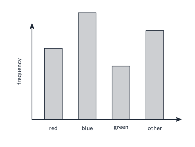
bar chart 条形图 a bar for each category; height is the frequency
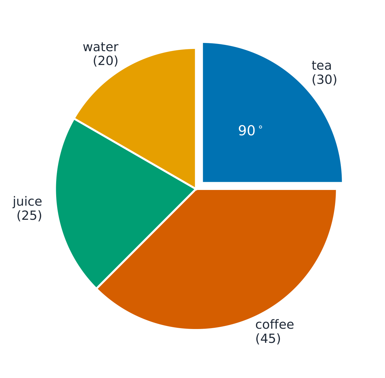
pie chart 饼图 a circle split into slices, each a fraction of $360^{\circ}$
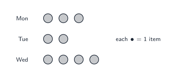
pictogram 象形图 uses a symbol to stand for a number of items
stem-and-leaf diagram 茎叶图 keeps the digits of ordered data, with a key
frequency distribution 频数分布 a table of values and their frequencies

Worked example (pie chart). Out of $120$ people, $30$ chose tea. Find the angle of the tea slice.

$$\frac{30}{120} \times 360^{\circ} = 90^{\circ}.$$
ไทย
กระดาน Galton สร้างรูปร่างระฆัง
กระดาน Galton แสดงให้เห็นว่าข้อมูลสะสมเข้าเป็นการแจกแจงอย่างไร
แผนภูมิสัญลักษณ์ที่วงกลมแต่ละวงแทนหนึ่งรายการ
Pictogram ใช้สัญลักษณ์เพื่อแทนจำนวนสิ่งของ
แผนภูมิแท่งแสดงสีที่ชอบ
กราฟแท่งแสดงความถี่ของแต่ละกลุ่ม
แผนภูมิ สิ่งที่แสดง
แผนภูมิแท่ง แท่งสำหรับแต่ละหมวดหมู่; ความสูงคือความถี่
แผนภูมิวงกลม วงกลมแบ่งเป็นชิ้นส่วน แต่ละชิ้นเป็นส่วนหนึ่งของ $360^{\circ}$
แผนภูมิสัญลักษณ์ ใช้สัญลักษณ์เพื่อแทนจำนวนรายการ
แผนภูมิก้านและใบ เก็บหลักเลขของข้อมูลที่เป็นลำดับ มีคำอธิบายสัญลักษณ์
ตารางการแจกแจงความถี่ ตารางของค่าและความถี่ของแต่ละค่า

ตัวอย่างวิธีทำ (แผนภูมิวงกลม). จาก $120$ คน, $30$ เลือกชา หามุมของชิ้นชา

$$\frac{30}{120} \times 360^{\circ} = 90^{\circ}.$$
แผนภูมิวงกลมของเครื่องดื่ม 120 ชนิด แบ่งเป็นชา กาแฟ น้ำผลไม้ และน้ำ โดยชิ้นชาถูกกำหนดเป็น四分之一วงกลม 90 องศา
แต่ละชิ้นเป็นสัดส่วนของ $360^\circ$; ชาคือ $\tfrac{30}{120}\times360^\circ=90^\circ$
Explore · ⁨สำรวจ⁩

Pie-chart angles · ⁨มุมของวงกลม (Pie-chart angles)⁩

Each slice's angle is its share of the whole turned into degrees — frequency ÷ total × 360 — and the slices always add to 360°. · ⁨มุมของแต่ละชิ้นส่วนคือสัดส่วนของมันเทียบกับทั้งหมดที่แปลงเป็นองศา — ความถี่ ÷ รวม × 360 — และชิ้นส่วนทั้งหมดต้องรวมกันได้ 360° เสมอ⁩

Explore · ⁨สำรวจ⁩

Chart choice lab · ⁨ห้องปฏิบัติการเลือกแผนภูมิ⁩

Choose the chart that fits the kind of data. · ⁨เลือกแผนภูมิที่เหมาะกับประเภทของข้อมูล⁩

Vocabulary · ⁨คำศัพท์⁩ Train · ⁨ฝึกฝน⁩
English ไทย
bar chart/bɑː tʃɑːt/ กราฟแท่ง
pie chart/paɪ tʃɑːt/ กราฟวงกลม
pictogram/ˈpɪktəɡræm/ แผนภูมิภาพ
stem-and-leaf diagram/stem ænd liːf ˈdaɪəɡræm/ แผนภูมิก้านและใบ
frequency distribution/ˈfriːkwənsi ˌdɪstrɪˈbjuːʃn/ การแจกแจงความถี่
scatter diagram/ˈskætə ˈdaɪəɡræm/ แผนภูมิกระจาย
9.5

Scatter diagrams and correlation · ⁨แผนภาพกระจายและสหสัมพันธ์⁩

Syllabus · ⁨หลักสูตร⁩
English
Subject content Notes and examples
1 Draw and interpret scatter diagrams. Plotted points should be clearly marked, for example as small crosses (×).
2 Understand what is meant by positive, negative and zero correlation.
3 Draw by eye, interpret and use a straight line of best fit. A line of best fit: • should be a single ruled line drawn by inspection • should extend across the full data set • does not need to coincide exactly with any of the points but there should be a roughly even distribution of points either side of the line over its entire length.
ไทย
เนื้อหารายวิชา หมายเหตุและตัวอย่าง
1 วาดและตีความแผนภาพกระจาย. จุดที่insuranceควรแสดงชัดเจน เช่น ด้วยเครื่องหมายกากบาทเล็ก (×).
2 เข้าใจความหมายของความสัมพันธ์เชิงบวก เชิงลบ และศูนย์.
3 วาดโดยสายตา ตีความ และใช้เส้นแนวโน้ม (line of best fit). เส้นแนวโน้ม: •ควรเป็นเส้นตรงเดียวที่วาดโดยการตรวจสอบ •ควรครอบคลุมข้อมูลทั้งหมด •ไม่จำเป็นต้องผ่านจุดข้อมูลใดๆ โดยตรง แต่ควรมีการกระจายของจุดทั้งสองข้างของเส้นอย่างสม่ำเสมอตลอดทั้งเส้น.
English
Subject content Notes and examples
1 Draw and interpret scatter diagrams. Plotted points should be clearly marked, for example as small crosses (x).
2 Understand what is meant by positive, negative and zero correlation.
3 Draw by eye, interpret and use a straight line of best fit. A line of best fit: • should be a single ruled line drawn by inspection • should extend across the full data set • does not need to coincide exactly with any of the points but there should be a roughly even distribution of points either side of the line over its entire length.
ไทย
เนื้อหารายวิชา หมายเหตุและตัวอย่าง
1 วาดและตีความแผนภาพกระจาย. จุดที่กราฟควรทำเครื่องหมายให้ชัดเจน เช่น ด้วยเครื่องหมาย x เล็กๆ.
2 เข้าใจความหมายของความสัมพันธ์เชิงบวก เชิงลบ และศูนย์.
3 วาดโดยสายตา ตีความ และใช้เส้นแนวโน้ม (line of best fit). เส้นแนวโน้ม: •ควรเป็นเส้นตรงเดียวที่วาดโดยการตรวจสอบ •ควรครอบคลุมข้อมูลทั้งหมด •ไม่จำเป็นต้องผ่านจุดข้อมูลใดๆ โดยตรง แต่ควรมีการกระจายของจุดทั้งสองข้างของเส้นอย่างสม่ำเสมอตลอดทั้งเส้น.

Source: Cambridge International syllabus · ⁨แหล่งที่มา: หลักสูตร Cambridge International⁩

English

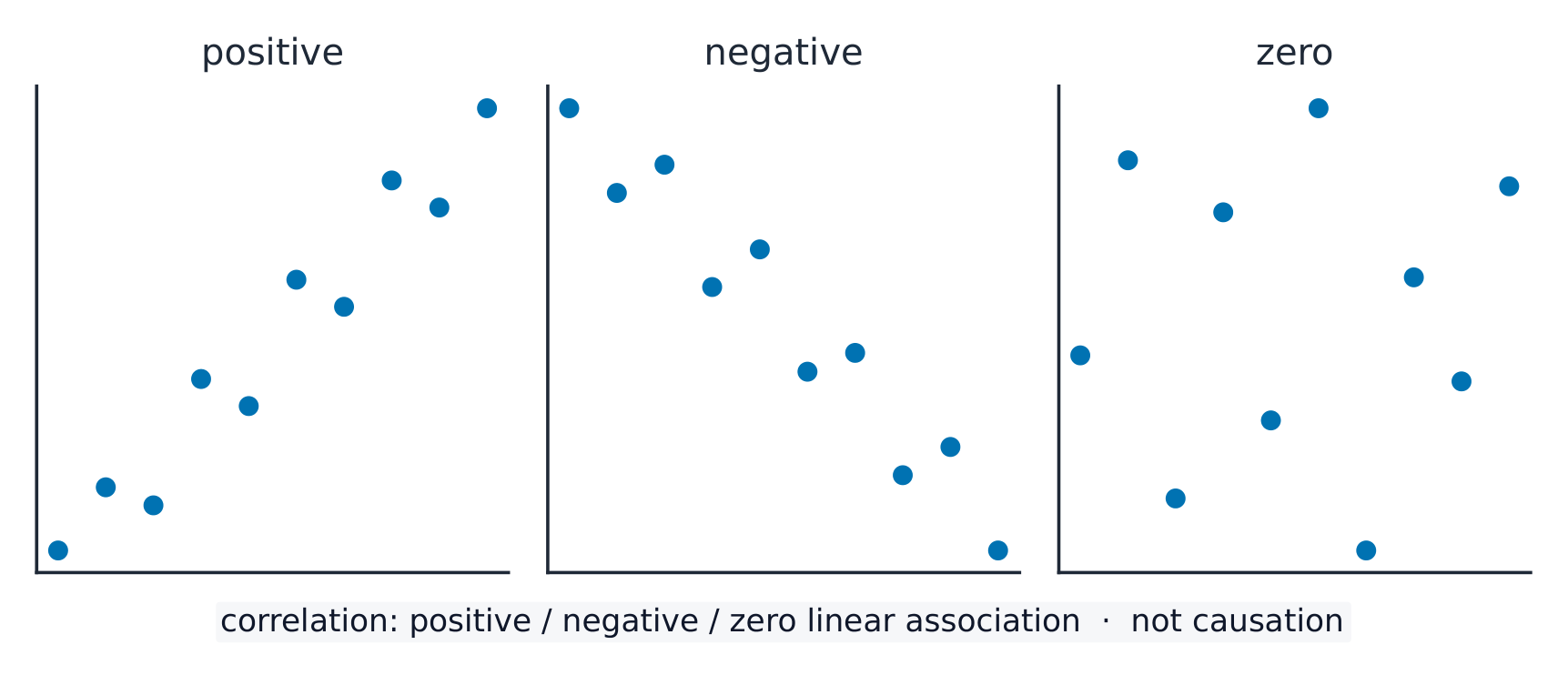
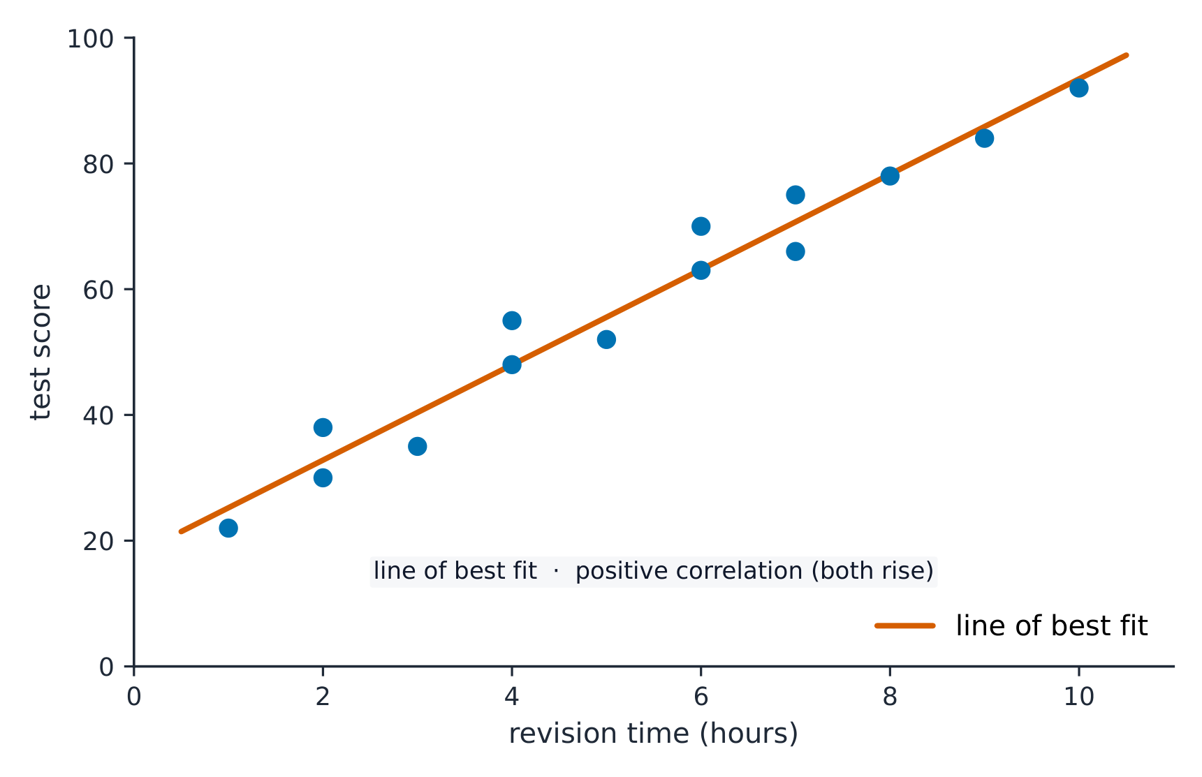
A scatter diagram 散点图 plots pairs of values as points to show whether two things are linked. The link is the correlation 相关性:

  • positive correlation 正相关 — as one goes up, the other goes up.
  • negative correlation 负相关 — as one goes up, the other goes down.
  • zero correlation 零相关 — no clear link.

If there is correlation, draw a line of best fit 最佳拟合线: one straight ruled line through the middle of the points, with about the same number of points on each side. Use it to predict values.

ไทย

แผนภาพกระจาย แปรคู่ของค่าเป็นจุดเพื่อดูว่าสองสิ่งเชื่อมโยงกันหรือไม่ การเชื่อมโยงนี้คือ สหสัมพันธ์:

  • สหสัมพันธ์บวก — เมื่อสิ่งหนึ่งเพิ่มขึ้น สิ่งอื่นก็เพิ่มขึ้น
  • สหสัมพันธ์ลบ — เมื่อสิ่งหนึ่งเพิ่มขึ้น สิ่งอื่นจะลดลง
  • สหสัมพันธ์ศูนย์ — ไม่มีความเชื่อมโยงชัดเจน
สามแผนภาพกระจาย: แบบหนึ่งจุดเพิ่มขึ้นพร้อมกัน, แบบหนึ่งจุดลดลง, และแบบหนึ่งจุดกระจายไม่แสดงแนวโน้ม
สหสัมพันธ์บวกเพิ่มขึ้นพร้อมกัน; ลบลดลงเมื่ออีกสิ่งเพิ่มขึ้น; ศูนย์ไม่แสดงความเชื่อมโยงชัดเจน

หากมีความเชื่อมโยง ให้วาด เส้น拟合ที่ดีที่สุด: เส้นตรงหนึ่งเส้นผ่านกลางจุด โดยมีจำนวนจุดด้านละเท่าๆ กัน ใช้มันเพื่อทำนายค่า

แผนภาพกระจายของเวลาทบทวนเทียบกับคะแนนสอบ พร้อมเส้น拟合ที่ดีที่สุดลากผ่านกลางจุด
เส้น拟合ที่ดีที่สุดคือเส้นตรงหนึ่งเส้นผ่านกลางจุด; ใช้มันเพื่อทำนาย
Explore · ⁨สำรวจ⁩

Scatter and correlation · ⁨กราฟกระจายและสหสัมพันธ์⁩

Change the strength of the relationship and add a line of best fit to spot the trend. · ⁨เปลี่ยนความแข็งแกร่งของความสัมพันธ์และเพิ่ม เส้นแนวโน้ม เพื่อดูแนวโน้ม⁩

Vocabulary · ⁨คำศัพท์⁩ Train · ⁨ฝึกฝน⁩
English ไทย
correlation/ˌkɒrɪˈleɪʃn/ ความสัมพันธ์เชิงสหสัมพันธ์
positive correlation/ˈpɒzɪtɪv ˌkɒrɪˈleɪʃn/ ความสัมพันธ์เชิงบวก
negative correlation/ˈneɡətɪv ˌkɒrɪˈleɪʃn/ ความสัมพันธ์เชิงลบ
zero correlation/ˈzɪərəʊ ˌkɒrɪˈleɪʃn/ ไม่มีความสัมพันธ์ (ศูนย์)
line of best fit/laɪn ɒv best fɪt/ เส้นแนวโน้มที่ดีที่สุด
9.6

Cumulative frequency diagrams (Extended) · ⁨แผนภาพความถี่สะสม (ส่วนขยาย)⁩

Syllabus · ⁨หลักสูตร⁩
English
Subject content Notes and examples
1 Draw and interpret cumulative frequency tables and diagrams. Plotted points on a cumulative frequency diagram should be clearly marked, for example as small crosses (x), and be joined with a smooth curve.
2 Estimate and interpret the median, percentiles, quartiles and interquartile range from cumulative frequency diagrams.
ไทย
เนื้อหารายวิชา หมายเหตุและตัวอย่าง
1 วาดและตีความตารางและแผนภาพความถี่สะสม. จุดที่กราฟบนแผนภาพความถี่สะสมควรทำเครื่องหมายให้ชัดเจน เช่น ด้วยเครื่องหมาย x เล็กๆ และเชื่อมต่อกันด้วยเส้นโค้งเรียบ.
2 ประมาณค่าและตีความ Median,百分位,ควอไทล์ และช่วงระหว่างควอไทล์ จากแผนภาพความถี่สะสม.

Source: Cambridge International syllabus · ⁨แหล่งที่มา: หลักสูตร Cambridge International⁩

English

The cumulative frequency 累积频数 is a running total of the frequencies. Plot it against the upper end of each class and join the points with a smooth curve.

From the curve you can read the median (at half the total), the quartiles (at one quarter and three quarters), and any percentile 百分位数 (for example, the $90$th percentile is at $90\%$ of the total).

ไทย

ความถี่สะสม เป็นผลรวมสะสมของความถี่ แปร它对กับปลายบนของแต่ละชั้น และเชื่อมจุดด้วยเส้นโค้งเรียบ

จากเส้นโค้งคุณสามารถอ่านค่ามัธยฐาน (ที่ครึ่งหนึ่งของผลรวม), ควอไทล์ (ที่หนึ่ง四分之一และสาม四分之一), และ เปอร์เซ็นต์ิล ใดๆ (เช่น เปอร์เซ็นต์ิลที่ $90$ อยู่ที่ $90\%$ ของผลรวม)

เส้นโค้งความถี่สะสมรูปตัว S พร้อมเส้นประอ่านค่าควอไทล์ล่าง, มัธยฐาน และควอไทล์บนจากแกนตั้งลงไปที่ค่า
อ่านค่ามัธยฐานที่ครึ่งหนึ่งของผลรวม และควอไทล์ที่หนึ่ง四分之一และสาม四分之一: ข้ามไปยังเส้นโค้ง แล้วลงมา
Explore · ⁨สำรวจ⁩

Cumulative frequency route · ⁨ขั้นตอนความถี่สะสม⁩

Follow raw data into a cumulative frequency curve and percentile reading. · ⁨แปลงข้อมูลดิบไปสู่โค้งความถี่สะสมและการอ่านค่าเปอร์เซนไทล์⁩

Vocabulary · ⁨คำศัพท์⁩ Train · ⁨ฝึกฝน⁩
English ไทย
cumulative frequency/ˈkjuːmjʊlətɪv ˈfriːkwənsi/ ความถี่สะสม
percentile/pəˈsentaɪl/ เปอร์ไทล์
9.7

Histograms (Extended) · ⁨ฮิสโตแกรม (ส่วนขยาย)⁩

Syllabus · ⁨หลักสูตร⁩
English
Subject content Notes and examples
1 Draw and interpret histograms. On histograms, the vertical axis is labelled 'Frequency density'.
2 Calculate with frequency density. Frequency density is defined as $\text{frequency density} = \text{frequency} \div \text{class width}$.
ไทย
เนื้อหารายวิชา หมายเหตุและตัวอย่าง
1 วาดและตีความฮิสโตแกรม. แกนตั้งของฮิสโตแกรมระบุชื่อ 'ความหนาแน่นของความถี่'.
2 คำนวณด้วยความหนาแน่นของความถี่. ความหนาแน่นของความถี่นิยามว่า $\text{frequency density} = \text{frequency} \div \text{class width}$.

Source: Cambridge International syllabus · ⁨แหล่งที่มา: หลักสูตร Cambridge International⁩

English

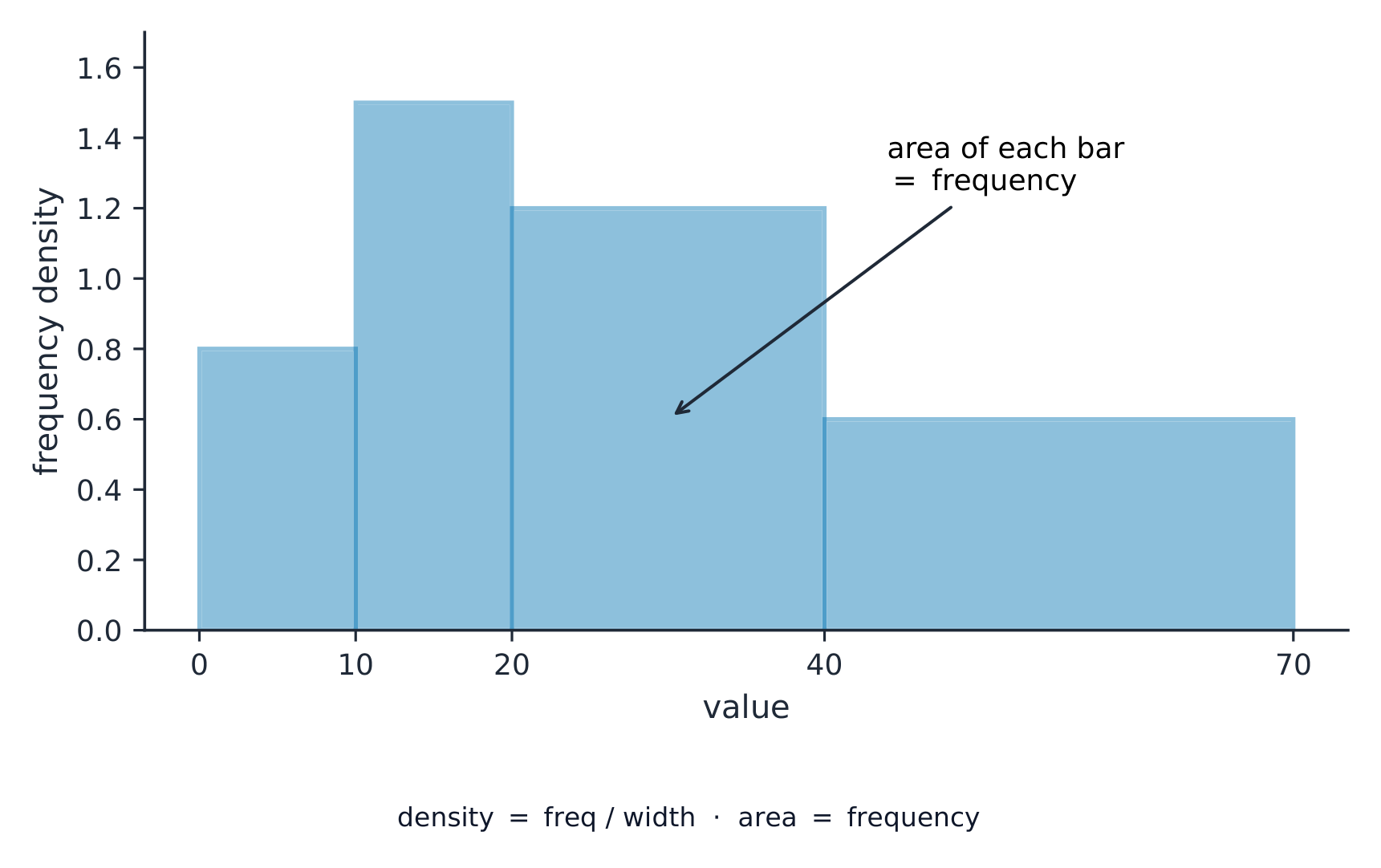
A histogram 直方图 looks like a bar chart, but the bars can have different widths and the area of each bar (not its height) shows the frequency. The vertical axis is the frequency density 频数密度:

$$\text{frequency density} = \frac{\text{frequency}}{\text{class width}}.$$

Worked example. A class has class width 组距 $10$ and frequency $25$. Find the frequency density.

$$\text{frequency density} = \frac{25}{10} = 2.5.$$
ไทย

ฮิสโตแกรม ดูคล้ายแผนภูมิแท่ง แต่แท่งสามารถมีความกว้างต่างกัน และพื้นที่ของแต่ละแท่ง (ไม่ใช่ความสูง) แสดงความถี่ แกนตั้งคือ ความหนาแน่นของความถี่:

$$\text{frequency density} = \frac{\text{frequency}}{\text{class width}}.$$
ฮิสโตแกรมที่มีแท่งความกว้างต่างกัน โดยแกนตั้งคือความหนาแน่นของความถี่ พื้นที่ของแต่ละแท่งจึงให้ความถี่
กับความกว้างชั้นที่ไม่เท่ากัน พื้นที่แท่ง (ไม่ใช่ความสูง) คือความถี่ ดังนั้นแกนนั่นคือความหนาแน่นของความถี่

ตัวอย่างวิธีทำ. ชั้นเรียนหนึ่งมี ความกว้างชั้น $10$ และความถี่ $25$. หาความหนาแน่นของความถี่

$$\text{frequency density} = \frac{25}{10} = 2.5.$$
Explore · ⁨สำรวจ⁩

Frequency-density histogram · ⁨ฮิสโตแกรมความหนาแน่นความถี่⁩

With unequal class widths the bar height is frequency density, so the area (not the height) represents the frequency. · ⁨เมื่อความกว้างชั้นไม่เท่ากัน ความสูงของแท่งคือความหนาแน่นความถี่ ดังนั้นพื้นที่ (ไม่ใช่ความสูง) จึงแทนค่าความถี่⁩

Vocabulary · ⁨คำศัพท์⁩ Train · ⁨ฝึกฝน⁩
English ไทย
histogram/ˈhɪstəɡræm/ ฮิสโตแกรม
frequency density/ˈfriːkwənsi ˈdensɪti/ ความถี่ต่อหน่วยความกว้าง
class width/klæs wɪtθ/ ความกว้างของชั้น
9.7

Exam tips · ⁨ข้อแนะนำสำหรับการสอบ⁩

English
  • Know the three averages: mean (add up ÷ how many), median (the middle value when in order), mode (the most common). The range is highest − lowest.
  • From a frequency table the mean is $\frac{\sum fx}{\sum f}$ — divide by the total frequency, not the number of rows.
  • On a scatter diagram, describe the correlation as positive, negative or none, and draw the line of best fit through the mean point.
  • For a histogram with unequal class widths, the height is the frequency density (frequency ÷ class width), not the frequency.
ไทย
  • รู้จักค่าเฉลี่ยสามชนิด: ค่าเฉลี่ย (รวม ÷ จำนวน), มัธยฐาน (ค่าตรงกลางเมื่อเรียงลำดับ), โมด (ค่าที่พบบ่อยที่สุด) ช่วง คือค่าสูงสุด − ต่ำสุด
  • จากตารางความถี่ ค่าเฉลี่ยคือ $\frac{\sum fx}{\sum f}$ — หารด้วย ความถี่รวม, ไม่ใช่จำนวนแถว
  • ใน แผนภาพกระจาย อธิบายสหสัมพันธ์ว่าเป็นบวก ลบ หรือไม่มี และวาดเส้น拟合ที่ดีที่สุดผ่านจุดค่าเฉลี่ย
  • สำหรับ ฮิสโตแกรม ที่มีความกว้างชั้นไม่เท่ากัน ความสูงคือ ความหนาแน่นของความถี่ (ความถี่ ÷ ความกว้างชั้น) ไม่ใช่ความถี่

Interactive lessons on this topic · ⁨บทเรียนเชิงโต้ตอบสำหรับหัวข้อนี้⁩

Work through it step by step, with instant-check exercises. · ⁨ทำทีละขั้นตอน พร้อมแบบฝึกหัดตรวจสอบผลทันที⁩

Past Papers · ⁨ข้อสอบย้อนหลัง⁩

More topics in IGCSE Mathematics · ⁨Mathematics IGCSE⁩ · ⁨หัวข้อเพิ่มเติมใน IGCSE Mathematics · ⁨Mathematics IGCSE⁩⁩

Log in or create account · ⁨เข้าสู่ระบบหรือสร้างบัญชี⁩

IGCSE, A-Level & AP