Scope and prerequisites
ACT framework, February 2026 revision. Original classroom cases are not an official form; preserve the scored/field-test boundaries of each source form.
- Read centre, spread and shape from labelled data displays
- Interpret a normal model using mean and standard deviation
- Distinguish two-variable association from causal evidence 证据
Prerequisites: Ordered data; frequency 频数; mean and median 中位数.
Explain and choose the method
The mean weights all observations; the median uses their ordered middle. A histogram groups numeric values into intervals, a box plot displays quartiles and a bar chart compares categories. Inspect units, scale and frequencies before comparing apparent width or height. Use the task’s stated quartile convention where calculation is required.
Adding a constant shifts mean and median but leaves standard deviation unchanged; multiplying values by a positive factor scales both centre and spread. For a normal model, the mean is at the symmetric centre; approximately 68% lie within one standard deviation and 95% within two. These approximations concern a stated normal model, not every vaguely symmetric dataset.
A scatterplot pairs quantitative measurements. A fitted line predicts a response; a residual 残差 is observed minus predicted. A two-way table instead compares categories and conditional shares. A trend can show association without proving cause, because other variables or selection may explain the relationship.
An informal fitted line should follow the main trend, not join every point. Describe direction, shape and unusual points. Interpolation inside the observed range is better grounded than distant extrapolation. Changes in graphical scale can make an unchanged relationship look stronger or weaker, so read the actual coordinates and axes.
A frequency counts repeated observations. Values 1, 3, 7 with frequencies 2, 1, 1 represent four observations: 1, 1, 3, 7. $\bar x=\sum fx/\sum f=(2(1)+1(3)+1(7))/4=3$. The median is $(1+3)/2=2$; it need not equal the mean.
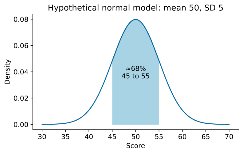
Existing worked example: A normal-model score distribution with mean 50 and standard deviation 5 places about 68% between 45 and 55 and about 95% between 40 and 60. Adding 10 shifts the mean to 60 but keeps standard deviation 5. For y=2x+4 at x=3, predicted y=10; an observed value 12 gives residual +2. These are hypothetical teaching models.
Complete original context
Every transfer question states all data it needs.
Independent practice and checked reasoning
Transfer 1
A normal model has mean 80 and standard deviation 6. Give approximate central 68% and 95% intervals. Every score is changed to $z=2x+5$; give the transformed mean and standard deviation.
Reasoning: Under the stated normal model, about 68% lie in 74–86 and 95% in 68–92. Transformed mean is $2(80)+5=165$ and standard deviation $2(6)=12$. These are model proportions, not guarantees for a finite sample.
Transfer 2
A fitted model is $y=4x+3$. At $x=5$ observed $y=20$. Find predicted output and residual. Can a positive slope alone prove causation?
Reasoning: Prediction is $4(5)+3=23$. Residual $e=y_{obs}-y_{pred}=20-23=-3$. A positive slope gives association under the fit; confounding or selection can explain it without a direct cause.
Transfer 3
Data are 2,4,4,6,9,11,12,16. Using medians of the lower and upper halves, find the five-number summary and interquartile range. Which display preserves this summary: a box plot, a category bar chart or a scatterplot?
Reasoning: Median $Q_2=(6+9)/2=7.5$. Lower half 2,4,4,6 has $Q_1=4$; upper half 9,11,12,16 has $Q_3=11.5$. Five-number summary is $(2,4,7.5,11.5,16)$ and $IQR=Q_3-Q_1=7.5$. A box plot displays these values. A category bar chart compares categorical counts; a scatterplot needs paired quantitative measurements. Neither directly displays this univariate five-number summary. The stated quartile convention prevents disagreement between other valid conventions 语言规范.
Transfer 4
A hypothetical histogram has equal-width bins [0,10), [10,20), [20,30] with frequencies 2,6,2. State the proportion below 20 and whether the exact mean is determined. A scatterplot of hours and output rises with a curved trend and one high outlier: explain why a straight line joining every point is unsuitable.
Reasoning: Below 20 there are 2+6=8 of 10 observations, so 80%. The exact observations within bins are unknown, so no exact mean follows; midpoint estimates must be labelled estimates. A scatterplot represents pairs, and a fitted relation should describe its main shape with the unusual point considered. Joining every observation invents a path between separate cases and ignores the curved trend. Inspect actual axis scales and the outlier before fitting or extrapolating.
Limits and next use
Do not use normal percentages without a normal-model condition or interpret a scatterplot slope as an automatic causal effect.
All tasks here are public original practice with authored guidance. They are not official questions or fresh diagnostics. Existing protected tests and mocks remain separate.